Busan Opera House Proposal by Columbia University Team
By Bustler Editors|
Friday, Aug 26, 2011

Related
In the past few days, we've received many exciting entries to the South Korean Busan Opera House competition. The entry "Filtration" from graduates of Columbia University received the second prize in the competition's student category. The design team included Paul Tse, Sarah Chung, Steven Tsai, Xander Lu, and Evelyn Ting.
Project Description from the Architects:
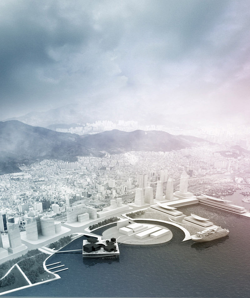
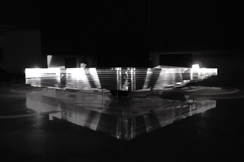
An opera house at its simplest is a black box. It is a container, a vessel in which to deliver and absorb a performance. At the same time, the opera house is a significant contributor to a city’s image, often considered a measure of a city’s cultural agenda. Our proposal highlights the intersection of these two facets– the idea of the opera house as both event and place– in the most literal sense, a large square elevated above the water that is punctured by the theaters and public amenities such as a café, ballroom, and gallery. Instead of building an island for the opera house, our opera house becomes the island itself through which people are filtered. While it functions as a public deck above and houses the back of house and rehearsal rooms within, its underside is also utilized as an undulating roof to a connection of piers where people exit after the performance.


Our opera house emphasizes the performance as a pivotal experience so that the space accessed before and after the performance contrast in form and scale. The masses on the roof level are oriented parallel to the city grid to soften the transition between the city and the new waterfront district. Prior to the performance, visitors wander freely on the roof level, where amphitheaters and green space are dispersed among café, ticket office, gallery, and multiple entrances to the theater below. Also puncturing the roof surface is a skylight to a rehearsal room on the lower level. Where the back of house is typically hidden away from public view despite taking up a large part of the opera house, our proposal brings this integral component to the forefront by placing it within the large floating square. The square’s continuous glass façade opens up the back of house and allows people to see and visualize the process of putting together a performance. From the roof level, glass cuts into the black boxes as well to reveal glimpses into the main theater space and rehearsal room. The theater crew too benefits from this transparency, being just as connected to the surrounding waterfront views as the public rather than being hidden away in the interior of a building.


To preserve the privacy needed by the crew, two main types of circulation differentiate the public and the theater crew despite their visual interconnectedness. The crew moves horizontally across the square to access the back of house, workshops, dressing rooms and rehearsal rooms. On the other hand, the public is led through a vertical procession, from the open deck, down to an interior lobby space and the main theaters, then out onto a connection of piers just above the water. In essence, the back of house, the main engine that runs the opera house, functions as a filter for the audience. They transition from a public deck to a much more intimate gathering space after the performance, with a soft wave-shaped roof that mimics the water surface.
Filtration visualizes the contradictions of the opera house as a place for both projecting out and tuning in.
Find more plans, sections and diagrams in the image gallery below. All images courtesy of Paul Tse, Sarah Chung, Steven Tsai, Xander Lu, Evelyn Ting.


Share
0 Comments
Comment as :