Daegu Gosan Public Library Entry by Sunggi Park
By Bustler Editors|
Thursday, Oct 18, 2012
Related
A few days ago, Bustler published jaja architects' high-scoring proposal for the new Daegu Gosan Public Library in South Korea. Today we're excited to share one of the competition's honorable mentions, designed by Harvard GSD student Sunggi Park who currently works as a design assistant at BIG, Bjarke Ingels Group in Copenhagen.
Project Description from Sunggi Park:
Turbulence
The concept of this project lies in the idea that the rapidly changing and constantly developing current society needs a library with the unprecedented functions more than merely contemporary functions of saving or distribution of knowledge. Industrial Revolution, which enabled mass production of items, is followed by the Information Age that has facilitated the access among people, transportation, and information.
The aim of the design is to create a new quality of public life, reflect the present in this city and social interaction for the citizens of Daegu and express an openness that includes all ages and attracts new users including tourists. The project represents a library that is able to accelerate and, at the same time, maintain sharing of information within the era, in which the way of conveying information has changed and confusions rise from the flood of indiscriminate information. Libraries should break out and advance forward from its current and past functions of storing information and from the era of linking information, so called ‘hyperlinks.’
Main principles
1. Architectural ethics (Share and Preservation)
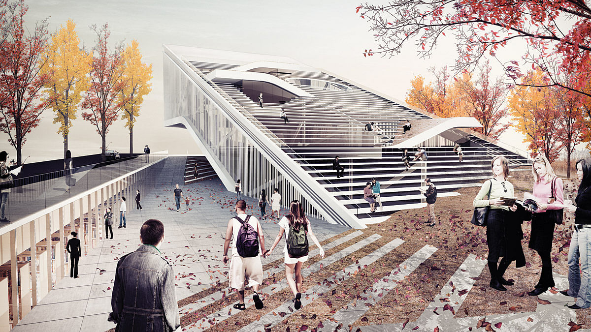
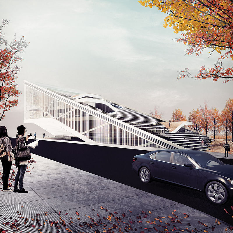
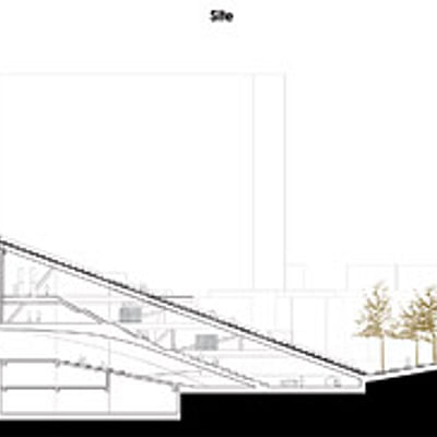
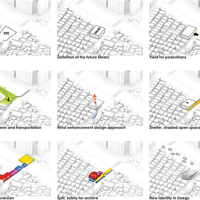
The pedestrian street lowers the corridor in order to create an open linear passage to the main library and the preservation room. Creating a visible space of valuable books is linked to the creation of a new, enriched sense of public values. All public space and general collections space are accessible from this circulation route. These spaces, including public lobbies, promote social exchange, much like a community center. This massive one volume serves as a reading space while keeping with the mood and setting of a library. Lifted building facilitates maximum shaded public space, allowing the library to take advantage of its location, while the visible, interactive roof top terraces, reflects the library’s radical identity, basin in Daegu. Instead of interpreting the constant change as destruction, we provide a site that will efficiently contain both the media’s change and expansion. The design shelters in site, and opens them in different ways to the public.
2. Wind enhancement design approach
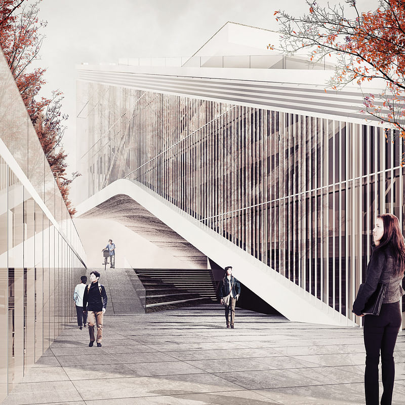
Raised south-east corners of the building penetrate and improve interior wind ventilation, integral for the summers in Daegu, one of the most hot and humid city in South Korea. The design shape is based on the wind direction and acceleration. Natural ventilation reduces the AC energy consumption and provides fresh and clean air from the outdoors.
3. Context, place
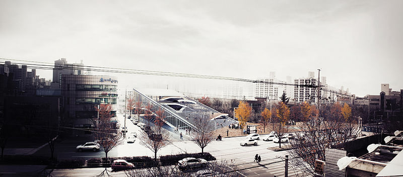
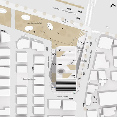
Proposed prototype is appropriate to the climate in this region, and Korea since summer is when most people feel extremely uncomfortable. High humidity is common because of Korea’s geographic shape of the peninsula and the surrounding bodies of water. Daegu is located in the basin with highest temperature and humidity. Aligning the building to the direction of the summer wind, the design enables wind from the lowest part of the courtyard to rise and move between layers. Lowering the level of the 1st floor does not only align the building to the acceleration of the wind but also attracts civilians from the highway, Dalgubeol main road, connecting east and west. The preservation room and general collection room are planned to bestow the users to a place of meditation and reflection.
4. Program
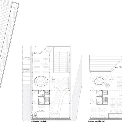
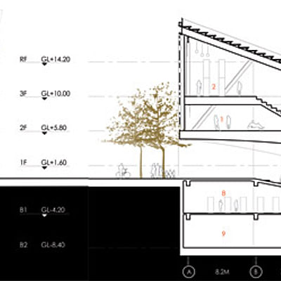
The library’s two main programs are general collection use and preservation, maintaining valuable knowledge and information intact. At first, the preservation room located in underground easily can be controlled humidity and temperature as well as the safety. Even though valuable archive is exhibited to all visitors visually, the condition of media can be maintained without any physical damage. On the other hand, linear rectangular plan and deep continuous floor plans in one mass allow for a very efficient, flexible generic layout capable of accommodating countless conversions for general collection use.
5. Circulation, Openness
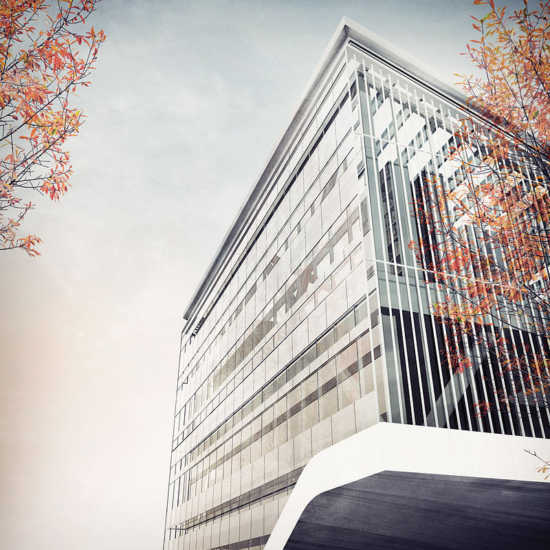
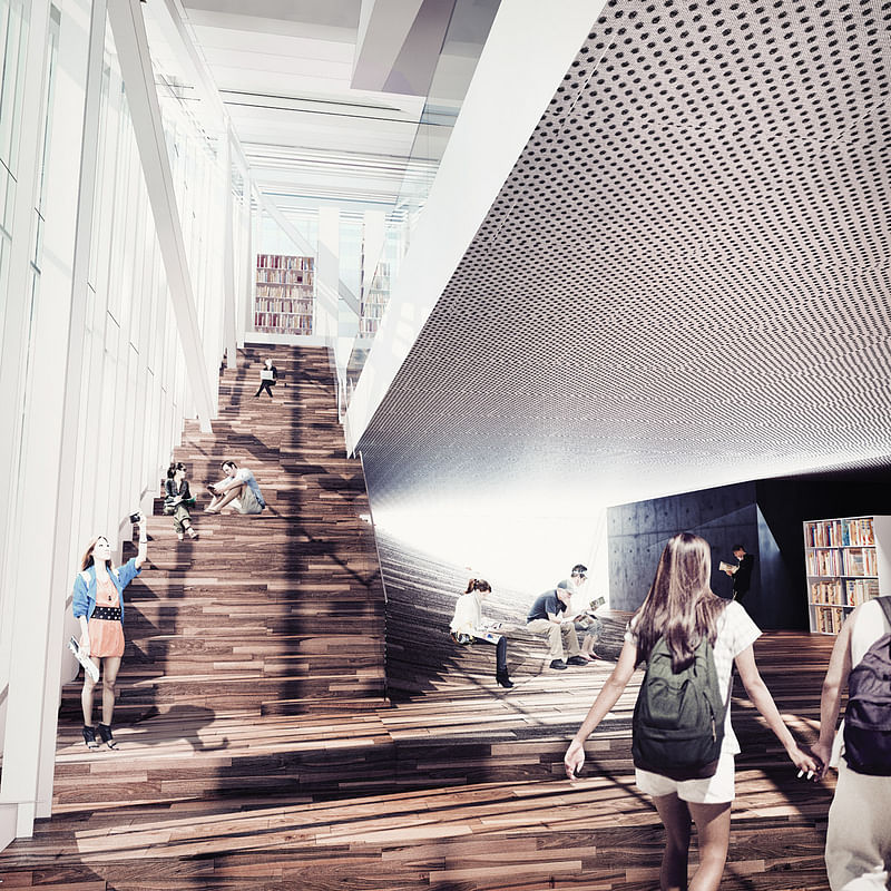
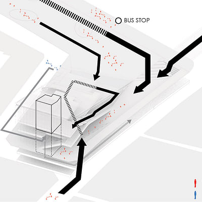
Sunken, intervenes from main road, created for the future demanding of visitors as well as accelerating wind speed. At the same time with providing visual impact while they walk along the preservation room through the glass wall. Parallel paths, circulation happens in parallel inside and outside the building. Interior path of stairs optimizes the underside of public space. For librarian, entrance clearly divided from the public and located closely from parking space for convenience.
6. Structure, Integration
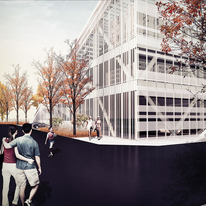
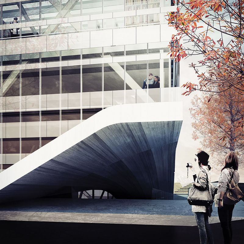
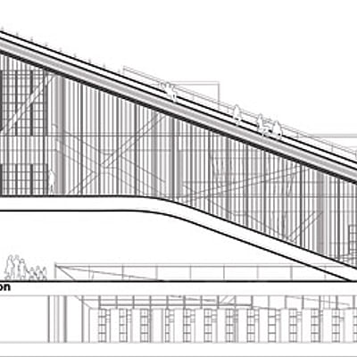
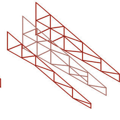
The super structure is designed as a simple lattice structure beams, allows plans free from structural constraints. This structure in the direction east and south is able to lift the building up above the ground.
7. Sustainability, Passive Design
- Natural ventilation - Avoid accumulation of heat and pollutant inside building.
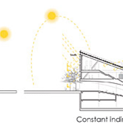
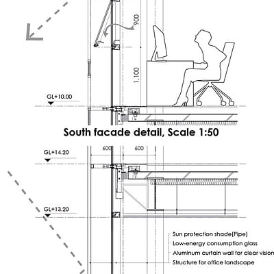
- Louvers - The fully louvered facade combines minimum solar gain and glare with maximum daylight and transparency. The passive shading will reduce the cooling needs, AC energy consumption.
- Shaded public area - Underneath space of the floated mass provides shade and a cool place to rest from the summer sun.
- Rainwater recycled - A system of drains behind the louvers collects rain then carried down to storage tanks in basement. This grayed water can be recycled for flushing.
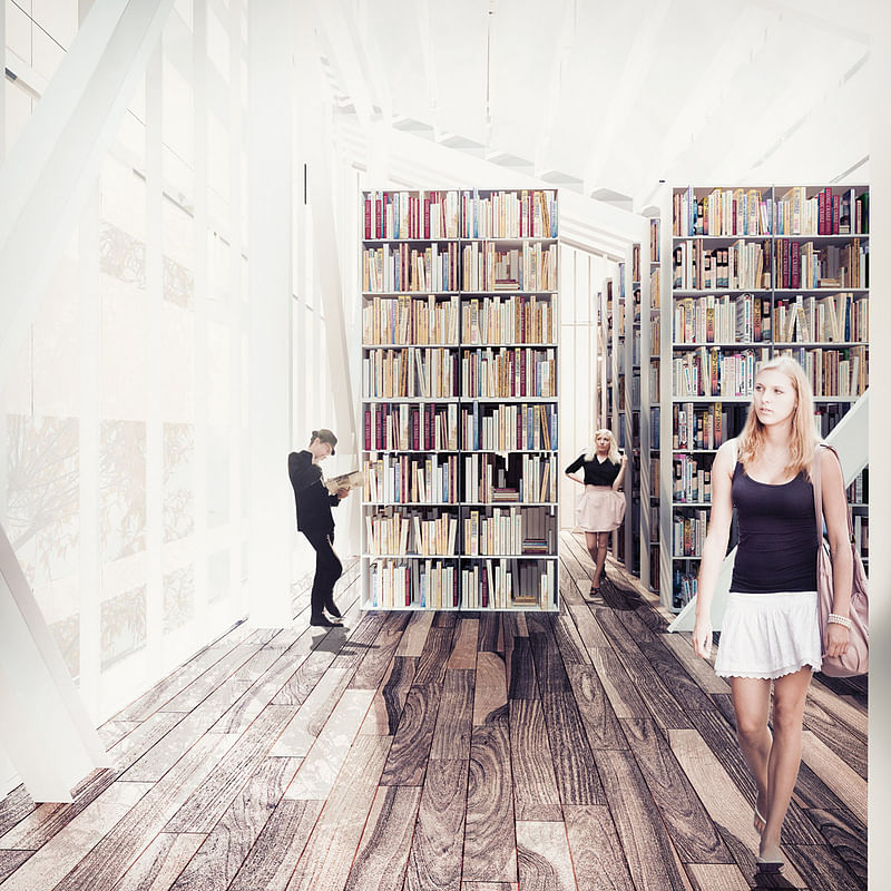
Find also drawings and diagrams of the proposal in the image gallery below.

Share
0 Comments
Comment as :