Keelung Harbor Service Building Entry by PAR and Sériès et Sériès
By Bustler Editors|
Friday, Sep 28, 2012

Related
The results of the Taiwanese Keelung Harbor Service Building competition were announced a few days ago with Neil M. Denari Architects taking the First Prize (previously on Bustler). Today we're very excited to also publish one of the five finalist entries, designed by LA-based Platform for Architecture + Research in collaboration with joint tenderer Sériès et Sériès. The design team's engineering partner is Buro Happold.
Project Description from the Architects:
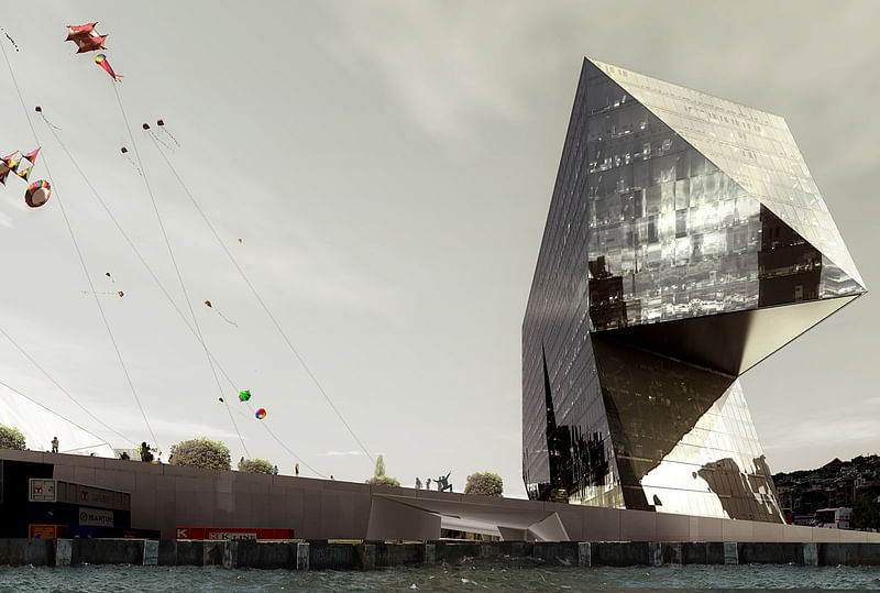
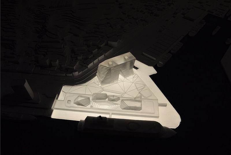
The site is located at the very end of Keelung’s harbor master plan, where the mountain meets the sea. Keelung is a gateway that through its history, climate and the customs of its inhabitants, is predestined to make use of its exterior space. For this reason, we decided instead of planning the building as an independent object within an open space, we would propose buildings that will generate and structure this open space. The design frames the harbor and the water beyond with an asymmetrical tower defining the northern perimeter of the facility, connected to the terminal by plazas at the ground and concourse levels. The project form, together with the lighting, aims to provide a dramatic entry experience to Taiwan from both the sea and the city of Keelung.


The new harbor project is only one piece in a larger green network that links public open space with waterfront amenities throughout the city. The design of the Keelung Harbor Terminal interposes this by providing continuous open space at the water’s edge. Terminal Halls emerge like prisms through the building’s green roof generating a condition that is both building and landscape. In this way, new urban developments and public spaces can grow without displacing natural recreational land. By maintaining this continuity of the network, the waterfront and the port terminal development will be within easy reach of many residents in the central city.


The structure of the buildings rub against each other like continental shelves making it possible for the complex of public, transit and industrial activities to coexist. This is one architectural element: a permeable, open architecture of maximum efficiency encompassing the tower, terminal and cargo storage. Parallel to the harbor, transit is organized by one large band. Split arrival and departure bands organize traffic to and from the ships with maximum efficiency; while separate tower and cargo access ensure utilitarian viability.


Its chosen theme, A Mixing Chamber, reflects Taiwan’s contemporary ambition: its different cultures – the users of the terminal – embarking on a unified future. A collection of prisms crown the terminal’s Departure, Domestic and International Halls with luminous, vaulted spaces. Cutting diagionally through the terminal platform, multiple relations between the concourse level and other levels of the building are established, while always permitting new angles of vision and a changing play of light. Derived from the interstial space between the Domestic and International Halls, a second architectural element, the Marine Plaza projects inward bringing the outside in. The interiors of the terminal and the roof mezzanine are designed as hybrid spaces, not only blurring the boundaries between exterior and interior, but which also easily adapt to the variable program. Existing public, pedestrian flows along the western edge are enhanced, rather than interrupted by creating a continuous elevated public plaza adjacent to the concourse with independent circulation. Cruise functions, meanwhile, are located on all 3 levels yet kept distinct to maintain secure areas for departing and arriving passengers. Overall, an experience of directed yet functionally separated flows lends an aura of energy to the terminal building.


To become a landmark, this project adopts a form that resists easy classification to free-associate with successive symbols of the utilitarian, the industrial, the poetic. It combines maximum artistry with maximum efficiency. A third architectural element, the Harbor Tower, is a clearly identifiable landmark. It’s portal becomes a framing devise for the city while providing passage for the plaza. Given it’s location and placement, the figure of the tower takes a geometrical stand in relation to the mountains and transit network. Oriented to true north with the widest elevation on the Land-Sea Axis, the tower is literally the hinge between harbor and city. Tilting five degrees eastward, the buildings broadest facades dematerialize into reflections of water or sky. A global gateway, the tower represents Taiwan’s cultural progress, innovation, and modern commerce.


Project Details:
Project title: Keelung Harbor Service Building
Type: Transit, Office
Client: Taiwan International Ports Corporation
Location: Keelung, Taiwan
Status: 2012 Competition, Honorable Mention
Area: 120,000 M2
Budget: 211 Million USD

Project Credits:
Design Architect: Platform for Architecture + Research and Sériès et Sériès
Executive Architect: Ricky Liu Associates
Structural, Environmental & Facades Engineering: Buro Happold
Local Structural Engineer: Envisions
Waterborne Transit: Moffatt & Nichol, LandDesign, Mega Trans
Renderings & Animation: Labtop
Images: PAR, Labtop
PAR AND SERIES ET SERIES KEELUNG HARBOR COMPETITION ENTRY from Labtop on Vimeo.
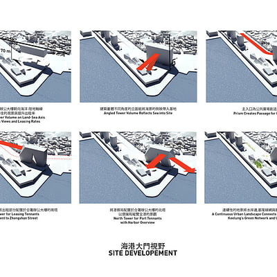
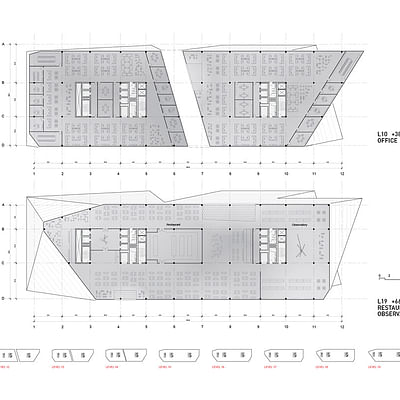
Find more plans and diagrams of the proposal in the image gallery below.


Share
0 Comments
Comment as :