Six finalist teams for The Quad 2017 competition announced
By Justine Testado|
Monday, Jun 19, 2017
Related
The 2017 Quad Competition is already underway. Launched by urban design research group WHAT'S IN, the global competition seeks a sustainably designed architectural installation that will serve as a social space during the yearly ArchitectureBoston Expo in November. Most recently, the six finalist teams have been chosen to advance to phase two, wherein the teams will be provided with a budget to create a full-scale mock-up of their proposal, and incorporate the judges' feedback for the final selection. The winning team will then get to have their proposal realized for the expo.
Have a look at the finalist proposals below.
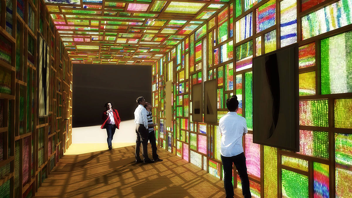
Colored Pavilion: Christophe Cormy, Marilyn Donat, Martine Nicoletti, Edouard Saussac - On Ground Studio: Paris, FR
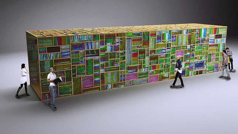
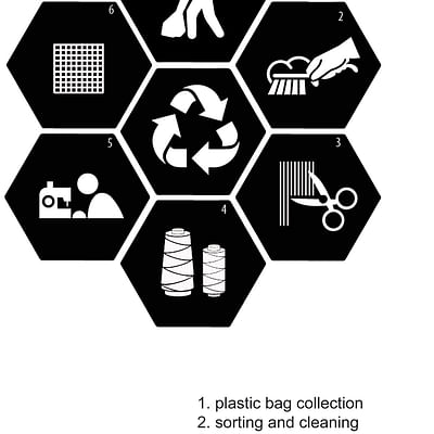
Project description: “The pavilion will be built entirely from sustainable materials and re-purposed plastic bags woven into brightly colored, intricate panels. The form and detail of the building will naturally intrigue viewers, enticing them to take a closer look. Upon inspection, visitors will see the familiar logos and brands of their favorite supermarkets and clothing stores, woven into the fabric of our building. The kaleidoscope installation will intrigue, educate, and engage visitors, inspiring them to rethink their habits and redesign their lives. The project will first and foremost demonstrate the power of recycling. Informative write-ups and displays will educate visitors on the production process. The pavilion will serve as an exhibition venue, featuring a report on plastic pollution and a video projection illustrating the stages of construction.”
Bee Land: Longhuan Xu, Ziye Zhong - University of Illinois: Champaign, IL
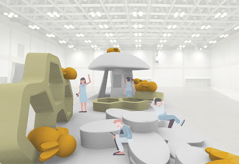
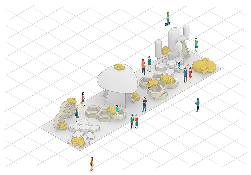
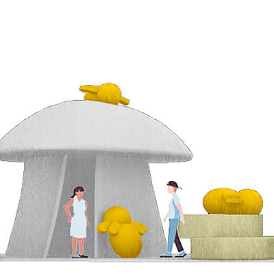
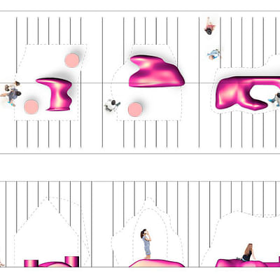
Project description: “The installation is aimed to create a vivid and playful landscape, as well as a social space in a restrained exhibition area. It is based on natural environments including: bees, flowers, the mushroom, and rocks. By simplifying the shapes and varying sizes of these natural elements, the installation is designed to be an interesting corner to stimulate people's imagination of being creatures surrounded by big nature, and to have fun in such a serious occasion. While most of the parts are movable, how people occupy the space, is undefined. It encourages people to think like a kid, to act like a kid, to merge like a kid, and to be spontaneous like a kid.”
Brain Wash: Amber Watkins, Myah Price - University of Illinois: Champaign, IL
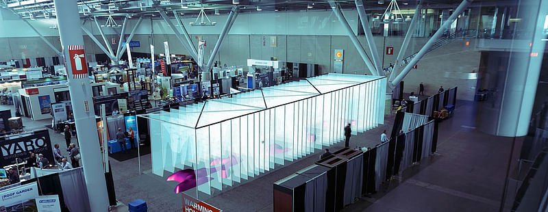

The purpose of this space is to create an intimate social environment by guiding visitors to the enclosed interior voids. The design also promotes an interactive tactile experience through the use of stretched fabric. The fabric is arranged in short intervals giving visitors the opportunity to squeeze and feel their way through the installation. The WHAT’S IN research would be presented on the fabric or between each structure of the fabric. Each piece of fabric will be stretched between two vertical members to give it a clean and distinct appearance. This design takes a different approach to the design of space. A space isn’t always a space but rather a void, an absence rather than a presence. This design is asking a question of transparency in relation to voids.
[re]ACTIVE: Artem Batuyev, Timothy Choi, Joel McCullough, Sinead Gallivan, Abigail Jones, Danielle Lax - Gensler: Boston, MA
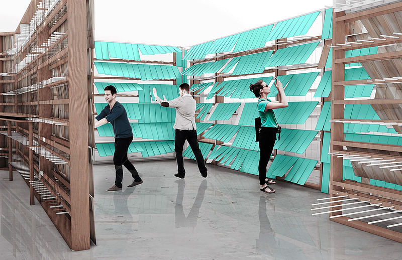
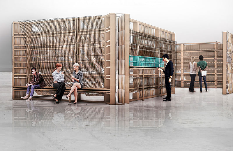
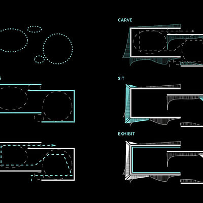
Project description: “[re]ACTIVE distills the essence of the quad and interprets it as a series of open spaces with interactive boundary edges and loosely defined paths; a place that allows users the ability to define their own space within the greater area. The agglomerative impact of these personalized spaces form the overall holistic experience of the pavilion, so that all users contribute to the form and spatial experience at any given moment. Interactive walls reinvent the traditional New England shingle as a movable, user-engaged tectonic system, constantly shifting, changing, and broadcasting activity from one side of surfaces to the other. The ever-changing skin system, combined with exhibition material and seating areas create layers of engagement which provide myriad opportunities for social interaction.”
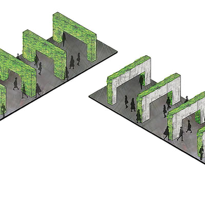
Communal Courtyard: Ilaria Elena Catalano, Carla Motola, Neba Sere - WUH Architecture: London, UK
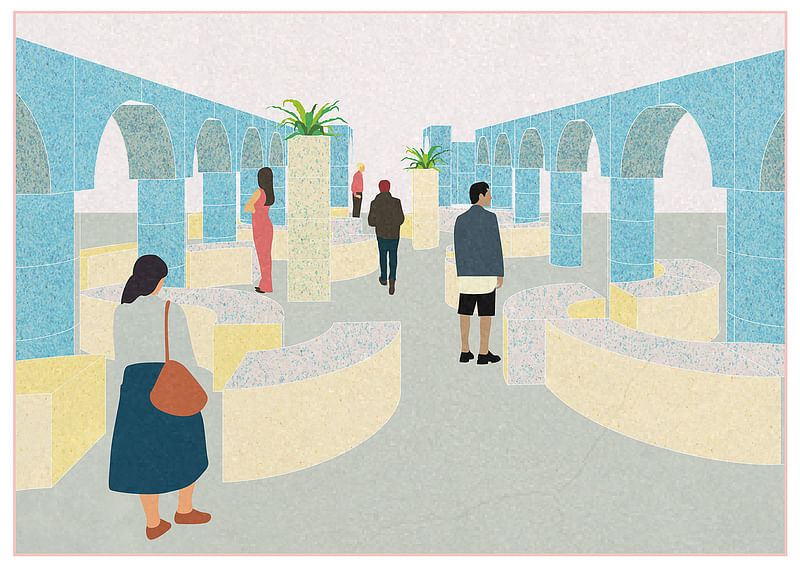
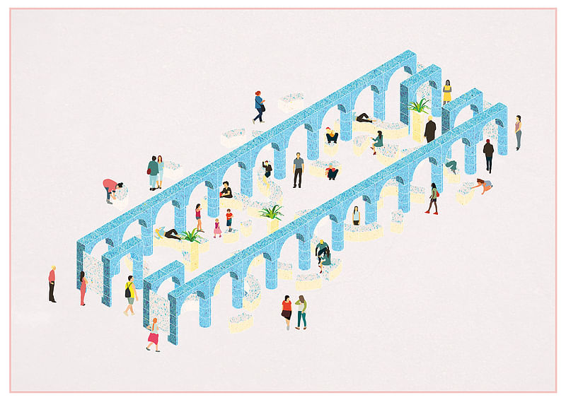
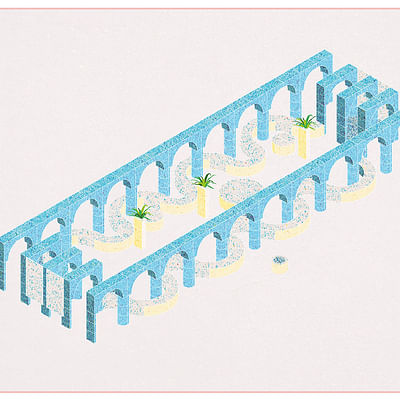
Project description: “As Bostons Neighborhoods are struggling more and more with limited living space, the idea is to offer a generous public space to residents to accommodate everyday life needs that need larger spaces. Things like doing a birthday party for children/parents or a dance-contest between teens or gardening or having a jumble sail or simply inviting family over can become almost impossible in such small homes. The Communal Courtyard is perfect for basketball, sport, gardening, a picnick or group discussions.”
(Un)Flushed Walls: Katie Donahue, Katharina Hoerath - MYKA: New York City, NY
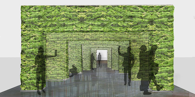
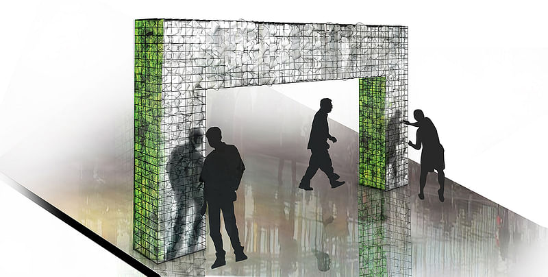
Project description: “Unflushed Walls explores the inherent characteristics and potential design applications of cellulose fiber, or paper pulp. Lignocellulose, or dry biomass plant matter, is considered the most abundant raw material on the planet. Its carbon footprint is far less than other major building materials, and is considered far more renewable than things like concrete or steel. This installation considers how under-utilized paper is as a material in many applications, but particularly fields that span architecture, construction, art, and various forms of community place-making. It considers this everyday and commonplace material - paper - and its capacities for reuse and re-constitution. This project also considers our human behavior and the economic drivers that play into the life cycle of materials.
As described above, many large companies like malls and airports have found that seemingly trivial characteristics - like the way we design our bathrooms and toilet paper holders - influence the logistics of resources. Those companies will discard perfectly good (unused) partial rolls of toilet paper to replace them with full rolls at one time to cut down on labor costs of janitorial staff who would otherwise need to check for empty-only rolls more often. Unflushed Walls reflects on suggested themes that walls can be the things that bring us together rather than divide us, and that they can be a platform for dialog that becomes an agent for change and improvement, growth, and development, forward progress - regarding the way we consume resources as well as the way we look at ourselves and one another.”
Find more project images of each finalist entry in the gallery below, or check out previous Quad winners in the links below!
All images courtesy of WHAT'S IN.
RELATED COMPETITION The Quad: A Design Competition to Create a Sustainable Social Space

RELATED NEWS KiKi ARCHi's “Folding Paper” wins The Quad competition


Share
0 Comments
Comment as :