Herzog & de Meuron / TFP Farrells Win M+ at West Kowloon Cultural District
By Bustler Editors|
Friday, Jun 28, 2013
Related
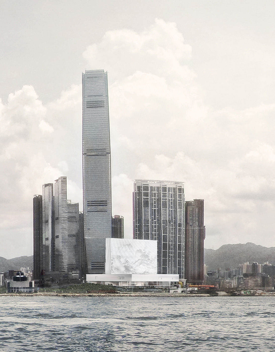
The team Herzog & de Meuron + TFP Farrells is the winner of the international competition to design M+, Hong Kong's future museum for visual culture in the West Kowloon Cultural District. The winning team will work closely with the West Kowloon Cultural District Authority over the next four years to design and deliver the ambitious project which is scheduled for completion in 2017.
Six teams were shortlisted in December last year and invited to submit conceptual designs for the building (previously on Bustler), including the international design heavy hitters Kazuyo Sejima + Ryue Nishizawa/SANAA, Renzo Piano Building Workshop, Shigeru Ban Architects + Thomas Chow Architects, Snøhetta, and Toyo Ito & Associates, Architects + Benoy Limited.
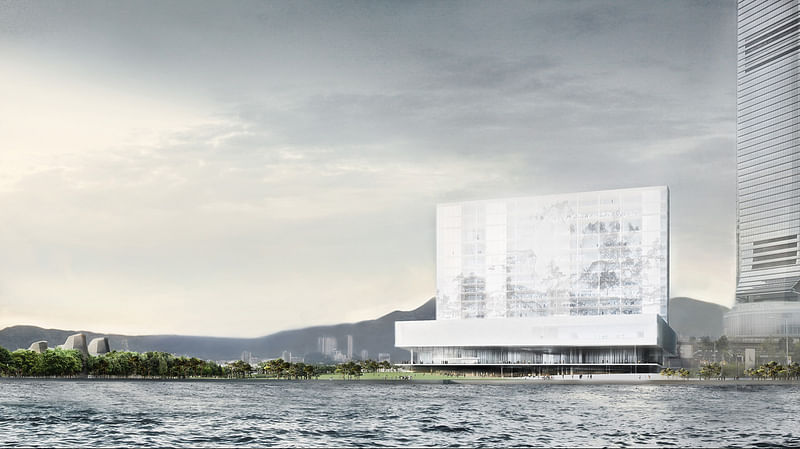
The scale of the M+ museum building alone, at around 60,000 square meters, will be on par with the Museum of Modern Art in New York. Situated on the waterfront of the Victoria Harbor at the edge of a 14-hectare park, it will be one of the first batch of arts and cultural venues to be completed in the West Kowloon Cultural District. M+ will be the flagship hub for visual culture from the 20th and 21st century, alongside major performance spaces, creating interdisciplinary exchange between the visual arts and the performing arts in the city.
The Herzog & de Meuron + TFP Farrells team was unanimously selected by the panel as winner for they had submitted a “memorable design that draws power from the simplicity and clarity of its parti and the internal layout is inviting to the public, offering a spatial organization that is easy to understand and navigate.”
Welcoming the result, Michael Lynch, CEO of WKCDA, said, “Today’s announcement of world-class architects for the design of M+ represents a fantastic commitment by Hong Kong to develop cultural infrastructure. With the M+ design now unveiled and the ground breaking for the Xiqu Centre this Autumn, we begin to see a vision of the future, with WKCD as an important site for cultural exchange, artistic development and education.”
On the design, Jacques Herzog of Herzog & de Meuron, said, “For art to enter into the life of a city like Hong Kong it has to come from below, from its own foundations. Our M+ Project does exactly that, by literally emerging from the city's underground."
Pierre de Meuron of Herzog & de Meuron, said, “We have made the underground tunnel of the Airport Express the raison d’être of a rough, large-scale exhibition universe that literally anchors the entire building in the ground. The tunnel has been uncovered, creating a radical space for art and design, installation and performance; it is a space of unprecedented potential and a challenge to artists and curators alike.”
Ascan Mergenthaler of Herzog & de Meuron, said, “The outcome is a building that is not simply anchored in its surroundings; it is also formed by them. It is a clearly defined, almost archaic structure that echoes the iconic tradition of Kowloon’s skyline and transforms it into a beacon of art and artists. M+ is a public space, a forum, a built natural environment for people and art.”
Project Description from the Architects:
M+ is not just another museum. M+ is a cultural center for 20th and 21st century art, design, architecture and the moving image. As such, it embraces the entire spectrum of spaces, means of display and activities related to exhibiting and viewing these media. They range from the conventional white cube, reconfigurable spaces, screening rooms and multipurpose facilities to so-called third spaces and even an “industrial" space. It was the special request for this “industrial” space that motivated us to take a closer look at the specificity of the center's future location. How should a post-industrial space be created from vacant land? A mere 20 years ago, the ground occupied by the WKCD was part of the seaport. Section by section, the land has been reclaimed from the sea and the natural harbor filled with earth. This artificial piece of land is now the construction site for the new buildings of the WKCD. What can lend authenticity to reclaimed land? Paradoxically, yet another work of engineering defines the specificity of this place: the underground tunnel of the Airport Express. Initially an obstacle that complicated planning, this distinctive feature has become the raison d'être for our project, consisting of a rough, large-scale exhibition universe which quite literally anchors the entire building in the ground. By uncovering the tunnel, a spectacular space is created for art and design, installation and performance; the excavations reveal nature of a “second order”, a “Found Space” that is a challenge to artists and curators alike, a space of unprecedented potential. Together with an adjacent, L-shaped Black Box, a flexible, easily reconfigurable Studio Space, direct access to the loading dock and a large part of the storage area, a sunken forum and exhibition topography have been created, which are not only tailored to the needs of art and design in the 21st century but also set the stage for a unique art experience, inseparable from the specific character of this location.
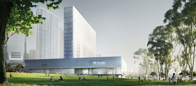
The horizontal building hovering above this “industrial” landscape houses the more conventional display spaces. As in a city, the arrangement of all the galleries is based on an orthogonal grid. A central plaza provides direct access to the entire exhibition area. This includes not only the temporary exhibitions but also three clearly defined Anchor Rooms. A tall Focus Gallery, with two lateral bands of daylight just below the ceiling, rises out of the horizontal exhibition building and plugs into the lower part of the vertical staff and education building. A sequence of galleries is accessed from each of the four corners of the central plaza. A specific space introduces each sequence: an elongated sky lit gallery, a courtyard with direct access to the roof terrace, a room with extensive glazing towards the Park and an auditorium facing Victoria Harbor. These distinguish and structure the sequence of exhibition spaces, which can in turn be combined or divided into smaller units by additional third spaces. The galleries themselves may be illuminated from above or from the sides; they may be introverted or extroverted. A variety of precise openings in the façade frame views of the Artist Square, the Park and the skyline of Hong Kong Island across the harbor.
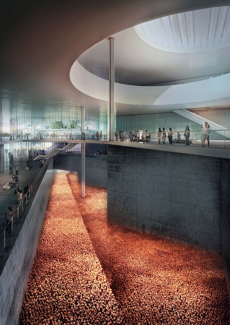
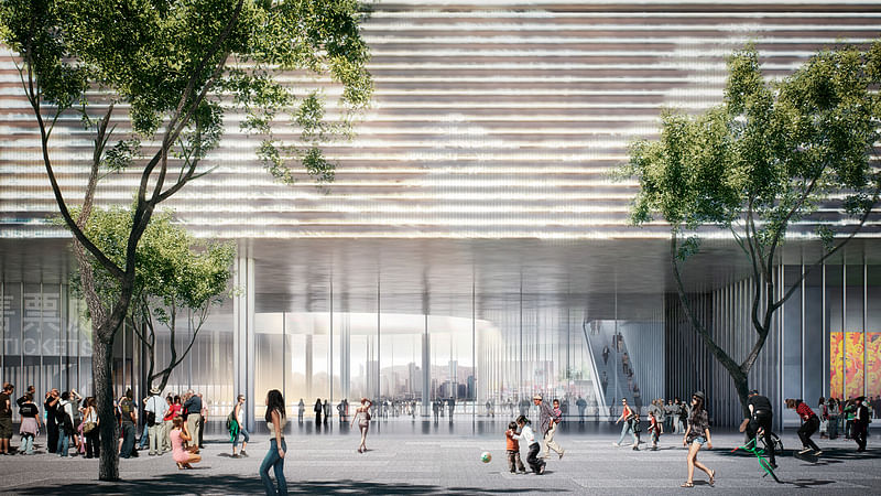
In the joint between the “Found Space” and the horizontal, floating exhibition building, there is a spacious entrance area for the public. Instead of building a solid object that blocks off access, light and views, this covered area forms a bright, welcoming platform that can be entered from all sides and levels: open and transparent yet shielded from direct sunlight. It becomes a forum and focal point between the West Kowloon Cultural District and the Park, the newly built Avenue and Victoria Harbor. Here visitors encounter all the uses and activities of M+ at a single glance. Specific functions are assigned to each quadrant of the platform. Ticketing, museum shop and information are situated in the corner next to Artist Square. The large temporary exhibition space faces the Park and is accessible directly from the main platform. Overlooking the waterfront promenade and Victoria Harbor, there is the auditorium on one side while, on the other, the glazed rotunda of the Resource Center receives interested visitors. A broad diagonal opening in the floor of the platform affords a view of the excavated “Found Space”. And through a large circular cut-out above, visitors see the exhibition level and also a view of the vertical building and open skies.
The vertical plane of the M+ building is centered on the horizontal slab of exhibition spaces and spans its entire width. The two elements form a single entity, fused into the shape of an upside down T. Making full use of the height specified in the master plan, the vertical building establishes M+ as part of the Victoria Harbor skyline. It is here that most of the educational facilities and museum offices are housed. Abundant daylight and expansive views make learning and working a special experience. A series of multistory interior courtyard spaces and meeting zones establish varied connections between front-of-house and back-of-house. The top floors of the vertical building contain restaurants, bars and a sky garden. Integrated into the sun-shading horizontal louvers of the façade, an LED lighting system activates the building as a coarse-grained, oversized display screen for works of art selected by curators or created especially for M+.
The resulting structure is not simply anchored in its surroundings; it is also formed by them. The precise and urban, almost archaic, shape reiterates the iconic character of Kowloon’s skyline on one hand, yet on the other hand, this convention is subverted by the transmitted message of the art and artists, visible from afar, that will consequently make M+ a site of constant renewal, rather than being locked to a predefined form. This is a universal place with an inner organization whose openness and transparency make it possible to link the complexities of the content and the space in many different ways. Through its specificity, it becomes a distinctive, singular and unmistakable piece of Hong Kong. But above all, M+ is a public forum, a built platform for the exchange, encounter and activity of people and art.

Share
0 Comments
Comment as :