The 2014 U.S. Venice Biennale pavilion reinterprets 100 years of American architecture
By Bustler Editors|
Thursday, Jun 12, 2014
Related
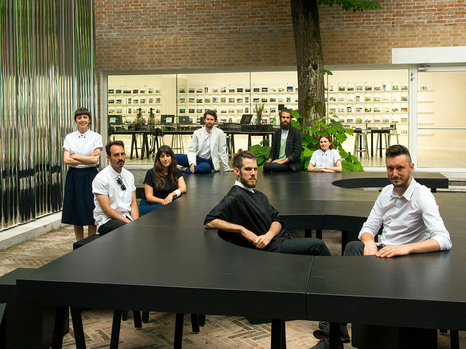
Styled after American corporate identity throughout the 20th century, our next featured 2014 Venice Biennale pavilion is "OfficeUS" representing the U.S. of A. Organized by NYC's Storefront for Art and Architecture in collaboration with PRAXIS Journal, the two-part exhibition will showcase and critically reinterpret the global influence of American architecture in the last century.
OfficeUS was selected for the U.S. pavilion from an open competition and under the recommendation of the Federal Advisory Committee on International Exhibitions (FACIE). The Leong Leong-designed exhibition includes works by plenty of familiar American firms like Frank Lloyd Wright, Gehry Partners, SOM, Saarinen, Jerde Partnership, Höweler + Yoon, and much more.
For each week of the Biennale -- which is open now through Nov. 23 -- OfficeUS will also address 25 issues relevant to its project archive.
Read more about the exhibition below.
"Collectively designed by New York based architects Leong Leong, graphic designer Natasha Jen/ Pentagram and technology consultants at CASE, Office US dwells on fundamental aspects of historical office corporate identity and design.
The office consists of 8 architects selected from an international open call, visiting experts, and outpost offices distributed worldwide. Over the 25 weeks of the Biennale, Office US will revisit the projects in the archive, their premises and conclusions, to construct an agenda for the future production of architecture."
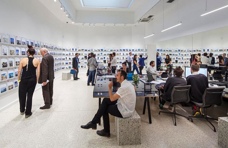
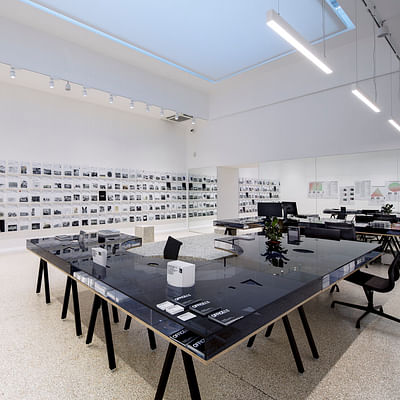
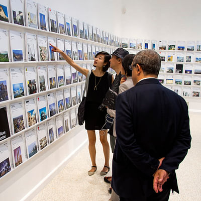
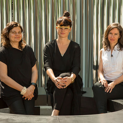
"Curators Eva Franch i Gilabert, Ana Miljački and Ashley Schafer re-imagine the U.S. Pavilion as an active, global, experimental architecture office that researches, studies, and remakes projects from an onsite archive of 1,000 buildings and the 200 U.S. based architecture offices engaged in their construction. Collectively, the projects in the archive tell multiple, imbricated stories of U.S. firms, typologies, and technologies."
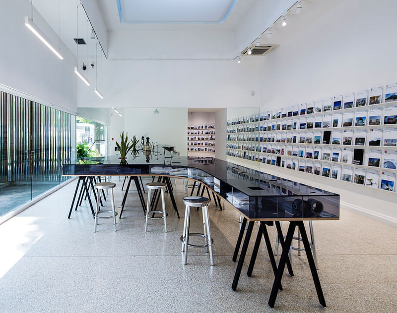
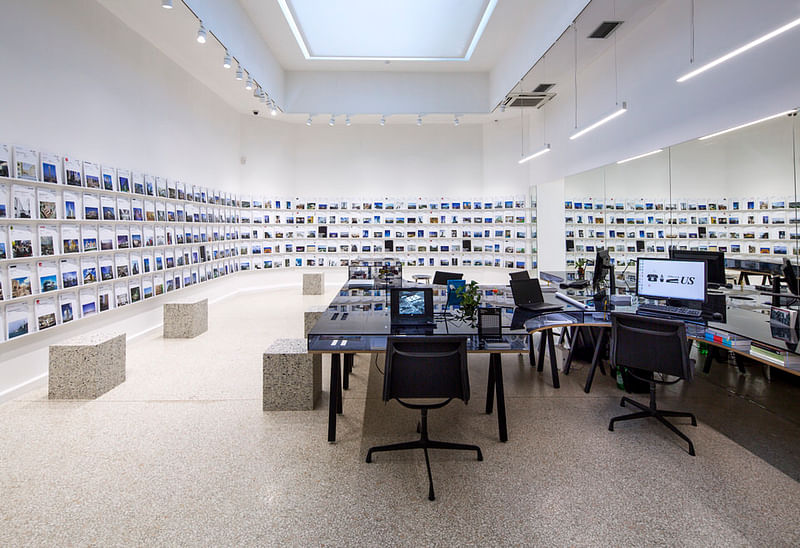
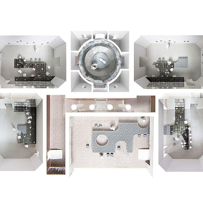
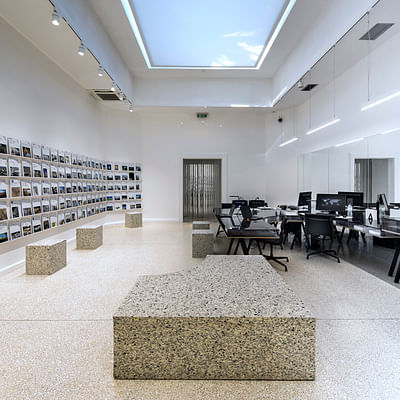
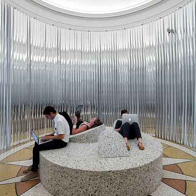
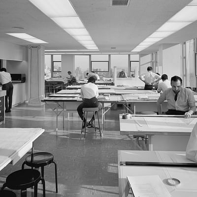
"The design features a wall of project binders housing architectural documentation of each project and disrupts the classical floorplan of the pavilion through a large, collective work-space that moves through each room — inverting interior and exterior — presenting a depth to collect and display historical materials and work produced by the partners working in the office."
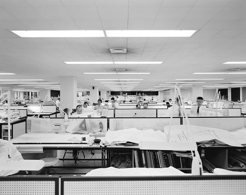
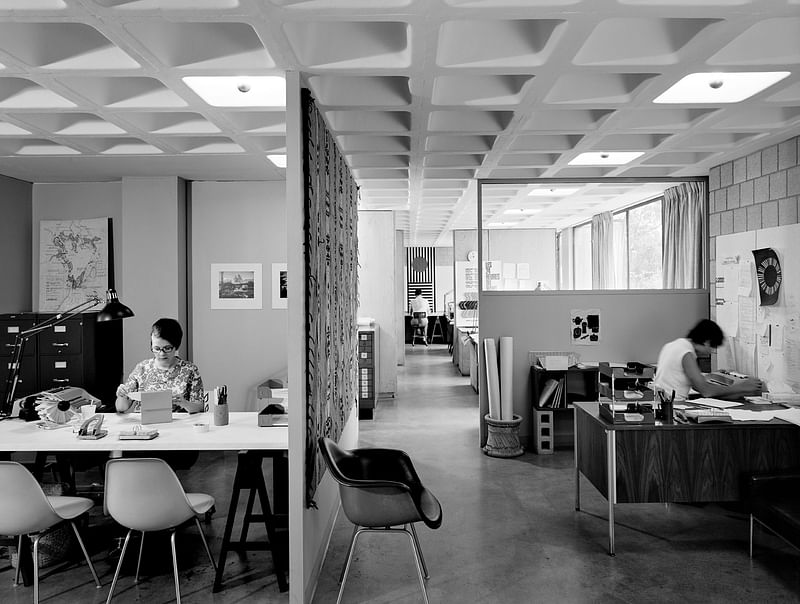
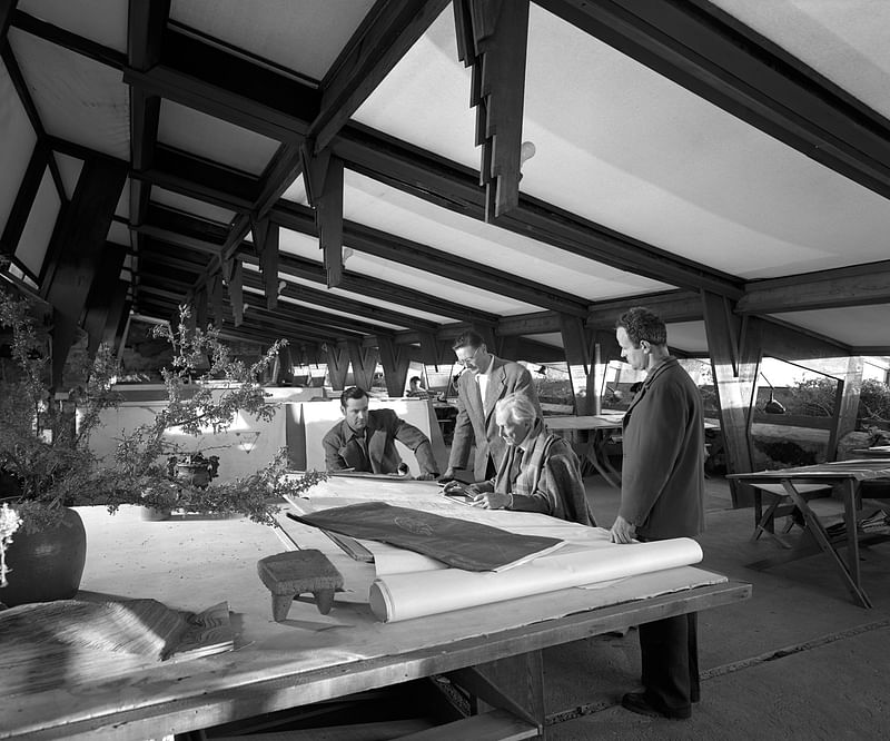
"Office US looks simultaneously backward and forward, rethinking both historical material and office protocols from the archive, while using the U.S. pavilion-based office, Office US, to develop new work and as a portal to host discussions and workshops."
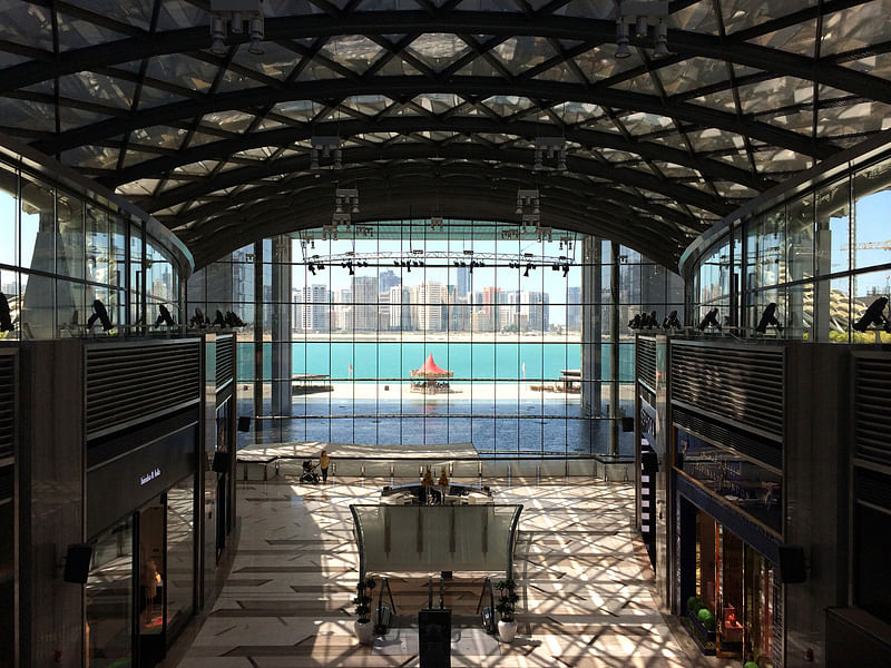
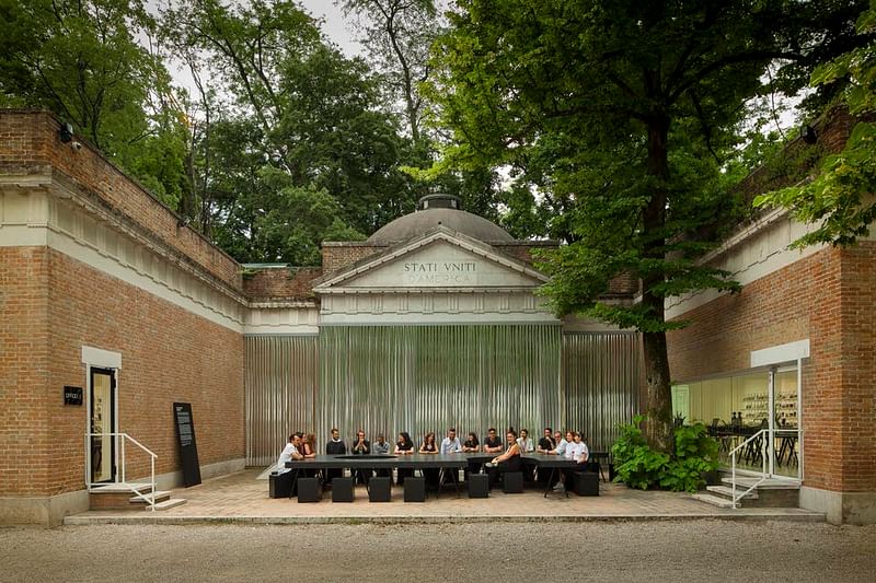
“'Taking history as its foundational ground, we envision Office US not just as an exhibition, but as the first headquarters for a new model of global architectural production. In these ways, Office US is an anti-exhibition, it turns the pavilion from presentation to demonstration. We are setting a stage for the architects and visitors to address and respond to the most pressing architectural anxieties of the last one hundred years,' say curators Franch i Gilabert, Miljački and Schafer."
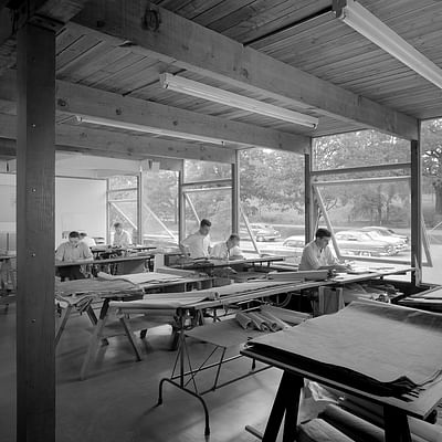
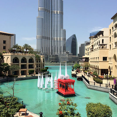
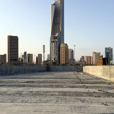
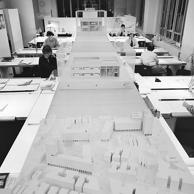
Click the thumbnails below for more photos.

Share
0 Comments
Comment as :