RIBA International Awards 2008 - Winners Announced
By Bustler Editors|
Tuesday, Jun 10, 2008
The winners of the 2008 RIBA International Awards:
Akron Art Museum, Ohio, USA
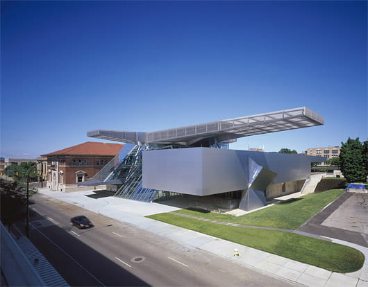
Akron Art Museum
Architect: COOP HIMMELB (L) AU
Client: Akron Art Museum
Copyright: Roland Halbe
Awards: RIBA International Award
How does a post-industrial city re-invent itself? It turns to a signature architect to provide itself with a new identity and self-belief. The brief called for the retention of the 1899 museum building (originally the Pony Express office). Co-op Himmelblau’s solution engaged with it by slashing open the back of the old building and connecting it to the new one by means of a glazed bridge – and then parking a massively cantilevered structure atop the two.
Inside it all works brilliantly. As well as providing seamless connections between the elements of the museum, the atrium (the ‘crystal’in Himmelblau-speak) can accommodate 1,800 guests for receptions. Because art galleries are no longer just about art, they have to engage with the city, and according to some they are part of the entertainment industry. The internal cladding is a delight: coated aluminium that folds with the crispness of origami. For all the geometry there is a sense of calm throughout – especially in the understated form-follows-function galleries. In the new building the architects have designed big flexible spaces for big modern works. Backstage there is none of the usual diminution in quality one comes to expect in arts buildings. In fact the storage area was designed so it could easily be converted into gallery space.
Architecture by no means has to be iconic, but if it is to work as an icon then it has to go for it – as this does. The architects have responded to the client’s desire for a building that announces itself to and embraces the city in which it is situated, and all parties are to be congratulated on that.
Casa Kike, Cahuita, Costa Rica
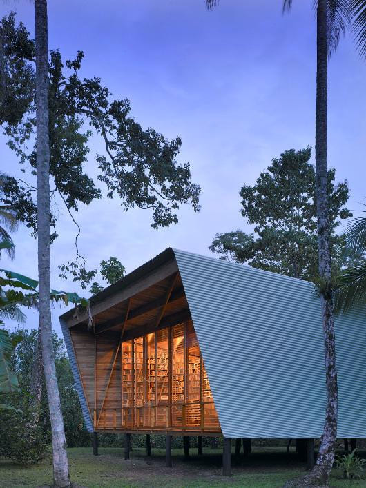
Casa Kike
Architect: Gianni Botsford Architects
Client: Keith Botsford
Copyright: Christian Richt
Awards: RIBA International Award
Casa Kike is a small scheme punching way above its weight. Too many schemes get lost in second thoughts. Here success is dependent on the absolute simplicity of the initial diagram and a refusal by the architect to over-complicate it. Two buildings, each a parallelogram, are orientated so their sides are parallel to the boundaries of the site. The glazed ends (and here’s the clever bit) are then twisted away from the meridian so as to catch the northerly sea breezes.
The house is built on 1.2-metre piles of the hardest of hard woods, Cachà , which is so dense that it sinks in water. As a result it is also termite proof, an important factor in these parts. The point about the house is books (17,000 of them) so the fact that the books and the structure are brought together in what are in effect structural bookcases is highly appropriate. The two pavilions are linked by a raised walkway which is long enough so that the smaller building is not in the wind shadow of the bigger one.
Issues of sustainability are impossible to ignore in Costa Rica, which has one of the best track records in this regard in the world. You cannot as much as take out a dead pine without government permission. So sourcing the three hardwoods needed for the house’s construction was problematic. At one point work stopped for three weeks while they awaited another delivery of the raw timber for the 10-metre long main roof beam.
For all the timber pyrotechnics of the roof structure and the irregularity of its shape, it is a calm and comfortable place to be. The project shows what can be achieved with a modest building type and a simple brief when placed in the hands of an imaginative and assured architect.
Contemporary Museum, Denver
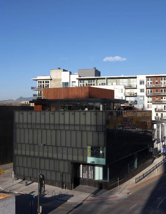
Museum of Contemporary Art, Denver
Architect: Adjaye Associates
Client: Museum of Contemporary Art, Denver
Copyright: Ed Reeve
Awards: RIBA International Award
The commission – Adjaye’s first in the United States – was to design a building that was a) environmentally efficient, b) ‘fiscally responsible’ (i.e. one that would come in within the tight $16.3 million budget – it did; and c) and most intriguingly, one that ‘supports rather than defines the museum’s mission’. Here, clearly, is a client who is not star-struck, for all the international eminence of the architect. Maybe too many arts clients are just that, meaning that the resulting buildings are better billboards than galleries, better at advertising themselves than showing off the art inside.
The emphasis within the 20,000 square feet of exhibition space both indoors and out, is on temporary exhibitions. This is tough for the architect who doesn’t know exactly what they are dealing with. The obvious solution is to go for neutral backgrounds and unchallenging spaces, but that is not the Adjaye way. There is a tough materiality to these white and black cubist spaces and timber soffits that can only enhance the art. And rather than adopting a one-side-fits-all approach, rooms are tailored volumetrically for different media. But it is in the acceptance of light – strong mid-western light at that – that the gallery differs from most. As well as a large T shaped roof light, there are two large south-east facing windows.
Borrowing the practice’s London work, at the top of the building is The Idea Box, where children can engage with art and discover it can be fun.
Externally the building is all about translucence. The outer layer of double glass skin is grey, the inner clear. Both inner faces are sand-blasted. Inside the glazing is a layer of insulating polypropylene.
Gardiner Museum of Ceramic Art, Toronto, Canada
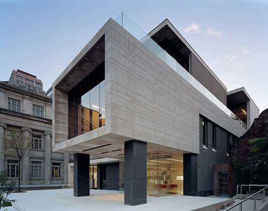
Gardiner Museum of Ceramic Art, Toronto, Canada
Architect: Kuwabara Payne McKenna Blumberg Architects
Client: Gardiner Museum of Ceramic Art
Copyright: Eduard Hueber
Awards: RIBA International Award
The Gardiner is one of the keystones of the cultural renaissance of Toronto. The city’s cultural quarter has been re-inventing itself over the past decade; the Gardiner is opposite the Libeskind-extended Royal Ontario Museum and round the corner from the Royal Conservatory of Music.
When Keith Wagland designed the Ceramics Museum in 1983, he made it future-proof by giving it a structure that would allow for upward expansion. Kuwabara Payne McKenna Blumberg have taken advantage – and side-stepped numerous planning constraints, including protected views of an adjacent neo-classical building – by putting the 14,00 square foot extension on top of the old museum. The extra space hosts a new gallery for large-scale contemporary works, better storage, a new studio and facilities for the museum’s research and community outreach activities. The existing building was re-configured to focus on the fine collection of ceramics.
The old and new work is all of a piece; the original pink granite cladding has been replaced by a stylish cream limestone, which complements the sleek glass and black granite columns. The scheme is further knitted together by some understated landscaping.
Internally the removal of a staircase in the entrance hall was the move which unlocked a series of solutions. The shop could move to the front to tempt in passers-by and circulation could be improved with a new lift/stair tower. Additionally a former underground car park was dug out to provide the extra metre of headroom for new ceramic studios and, above all this, on the roof of the second floor, a terrace was created serving the third floor pavilion. The whole scheme successfully adopts a palette of materials and textures that subtly comment on the nature of the ceramic exhibits.
New British High Commission, Kampala
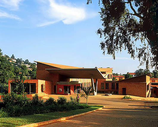
New British High Commission, Kampala, Uganda
Architect: Cullum & Nightingale Architects
Client: Foreign & Commonwealth Office
Copyright: Adrian Hobbs
Awards: RIBA International Award
The British High Commission building in Kampala is all about engaging with the local economy. Instead of ‘arriving in a box’ (as embassies so often do) they one arises out of an exploration by architect, client and local contractors of the vernacular and the ways in which it can be adapted to the needs of sophisticated building types such as this. By using and adapting local materials, this project seems literally to grow out of the red earth of Africa.
The scheme is held together by its sunken courtyard – one of the two most successful spaces in the scheme, the other being the semi-open visa hall. This is an ecclesiastical space, created by beautifully formed concrete columns which rise into a tangle of hi-tech white steel trees. The interview booths – more like confessionals – are lined with a rich warm local wood, locally sourced and certified like all the building’s timber.
Elsewhere the building has lost some of its planned openness – to the security advisors rather than the quantity surveyors. Hence the glazing of what should have been glassless windows. And hence the need for air conditioning in the offices which the architects had tried to persuade the Foreign Office should be naturally ventilated.
But it is down to the strength of the original idea and sheer persistence of the architect in dealing with problems others would have found insurmountable that the resulting scheme flies a flag not only for Britain but for quality architecture.

Share
0 Comments
Comment as :