Filling Station(s) winners rev up the gas station typology
By Bustler Editors|
Tuesday, Jun 30, 2015
Related
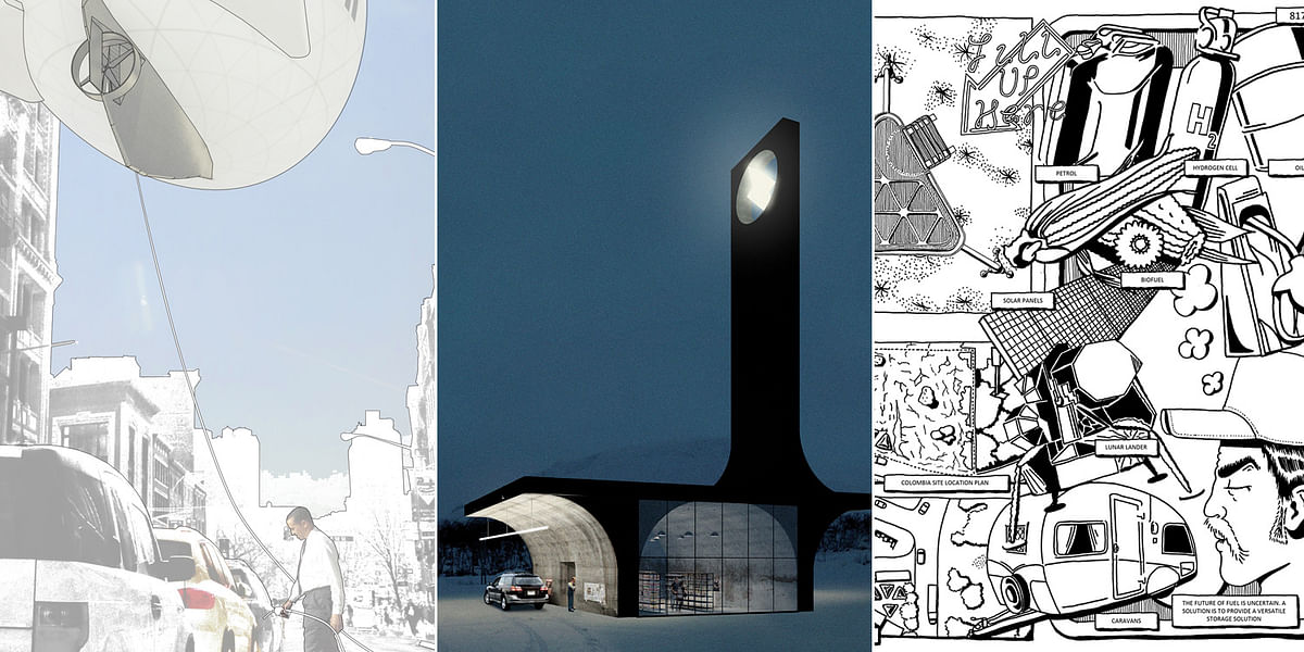
For most commuters who travel by car, a gas station is nothing more than a quick pitstop as they about their day. In their latest installment, Combo Competitions held the Filling Station(s) ideas competition that had participants rethink the gas station typology as such: "Is there an ideal contemporary filling station, and can it be designed to last both functionally and aesthetically?"
Read on for more.
Entrants worldwide designed two separate gas stations for a site in rural Colombia and another one in a location of their choice, including fictional places. The competition resulted in three prize winners and one honorable mention.
If Combo Competitions sounds familiar, they previously held competitions that focused on other typologies like houses of worship, movie cinemas, parking lots built with extra perks, and designs that fuse nature and the built environment.
Take a gander at the winning entries below.
1ST PRIZE: NU OIL
by FELIX YANG and THOMAS NOUSSIS
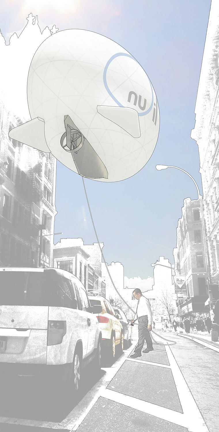
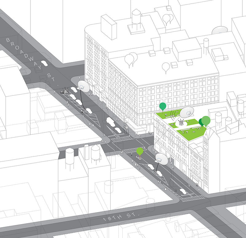
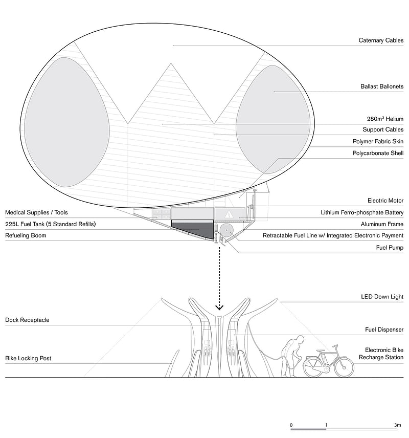
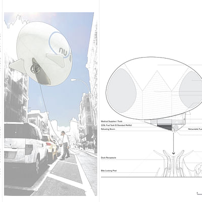
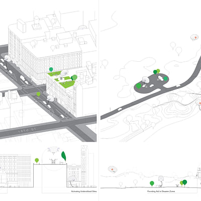
JURY'S COMMENTS: "Nu Oil not only envisions a new architecture for filling stations, but an entirely new method of distribution. By challenging the actual concept of refueling, this proposal at once disappears the typical filling station and adds a 'futuristic' one, full of potentials. Even the ground apparatus – referencing the gas-guzzling filling station typology of the past – supersedes its predecessor in a far more spatially efficient way. Much like Amazon’s delivery drones or Google’s proposed Wi-Fi blimps, this scheme is defined by a growing collective desire to be less connected to physical, built infrastructure and shaped more by the potential imbued in simple, semi-autonomous technologies. The floating vessel idea would eliminate the need for intrusive and expensive infrastructure by bringing fuel directly to the user. Underground oil tanks that leak and pollute, and unsightly power lines that are vulnerable in storms would no longer be needed. This must of course be seen in the light of having giant blimps full of fuel hovering over our cities and rural lands. It takes advantage of current technologies and offers new uses for them. As a floating refueling point, Nu Oil can provide fuel and other sustenance to people in all sorts of dire conditions. This additional feature of disaster and emergency response is precisely the type of bonus feature architecture should always strive to accommodate. The proposal is presented in a simple and straightforward way, clear and informative."
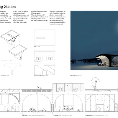
2ND PRIZE: MODULAR FILLING STATION
by MATTIAS DAHLBERG, ROBIN KRASSE, and KARL LAGERQVIST
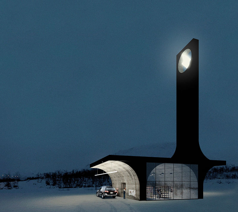
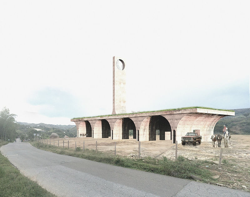
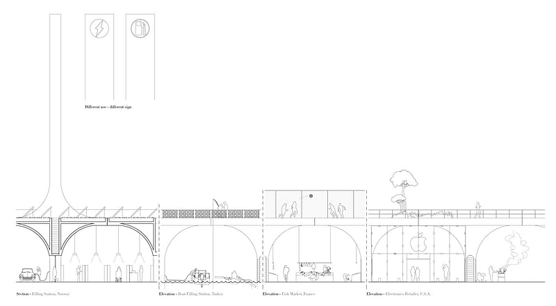
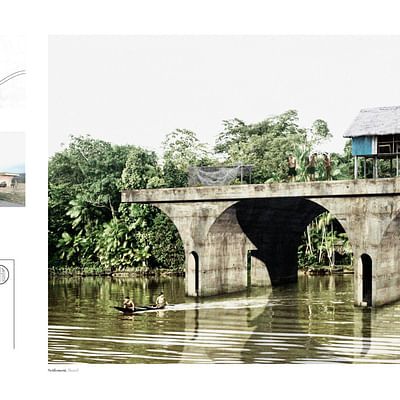
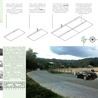
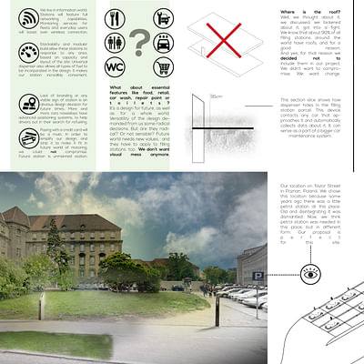
JURY'S COMMENT: "Modular Filling Stations has a pragmatic approach to the future of filling stations: there are no extravagant ideas, just a straightforward but thoughtful analysis of what a filling station is – and can be, depending on location. Passing over rethinking the actual concept of refueling, the proposal focuses mainly on a universal aesthetics for the typology. It evokes a traditional infrastructure form, linking the past to the future. Part ruin, part construction site, it provides spaces for a multitude of other programs, be it canoes, fishing huts or Apples stores. While the design clearly feels at home on relatively empty sites, an urban example would have been useful to gauge its adaptability to different environments. The concrete modules possess a timeless beauty, as if they have always been present: basic building blocks that seem as capable on their own as they are when being part of a substantial development. Although you could argue that the components are basic enough to be a viable option regardless of local economy, they do require an enormous amount of material to complete a simple task. The presentation effortlessly captures the essence of the design variations, and explains the concept satisfactory without using any descriptive text, save for en excerpt from a poem to set the tone."
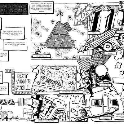
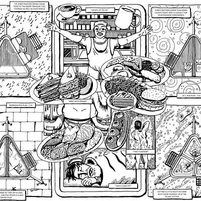
3RD PRIZE: FILL UP HERE
by ALEX COX
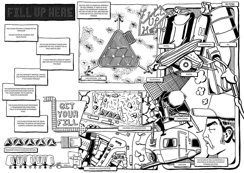
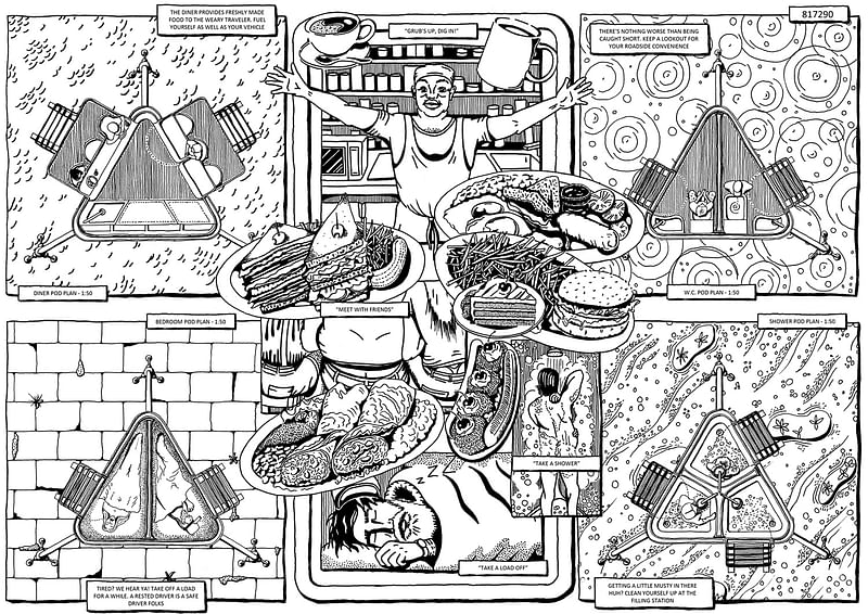
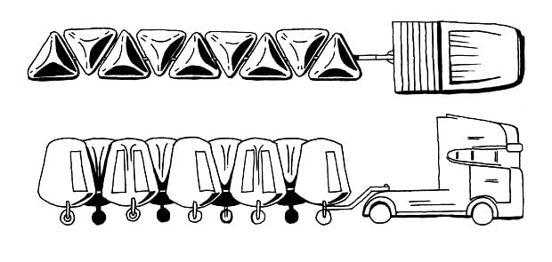
JURY'S COMMENT: "By placing people at the center of the design rather than vehicles, Fill Up Here shifts focus from present-day filling stations to those of the future. The increasing fuel efficiency of modern cars will slowly but surely put emphasis on refueling the travelers themselves rather than their vehicles. The function of the service station – whether it is to store fuel, serve food, or house people – is adapted to the pod. This opens up an interesting discussion about whether or not architecture should adapt to the user or if the user should be expected to adapt to the architecture. While the 'one size fits all' approach never seems to be the most ideal – it always requires so much compromise – it is convincing as a viable solution to any site. It deals with the activities that these pods can provide for an uncertain future, without focusing on the design too much – even though it has been considered in terms of dimensions of these activities. Another benefit of the pod approach is its allowing for technological changes in the future while still providing for a clear vision of the filling station and its accoutrements. Presentation-wise, the proposal does a great job of showing, rather than telling, through carefully selected vignettes. And while the graphic style is distinctly playful on the surface, the proposal reveals a deep understanding of the brief."
Check out the Honorable Mention + additional project images in the gallery below.

Share
0 Comments
Comment as :