Brooklyn’s Kentile Floors sign lives on in these retro fictional postcards
By Justine Testado|
Wednesday, Feb 24, 2016
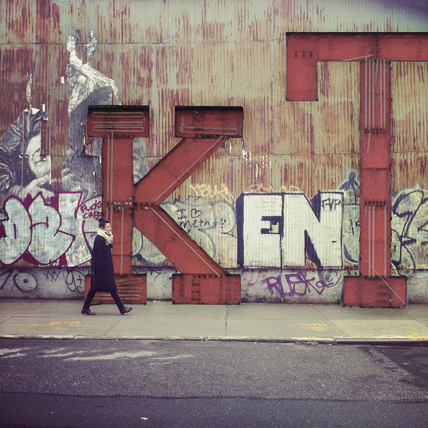
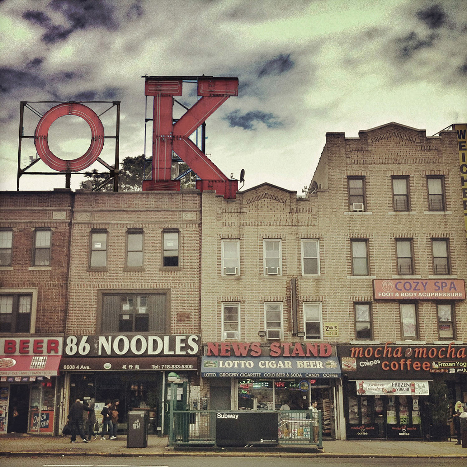
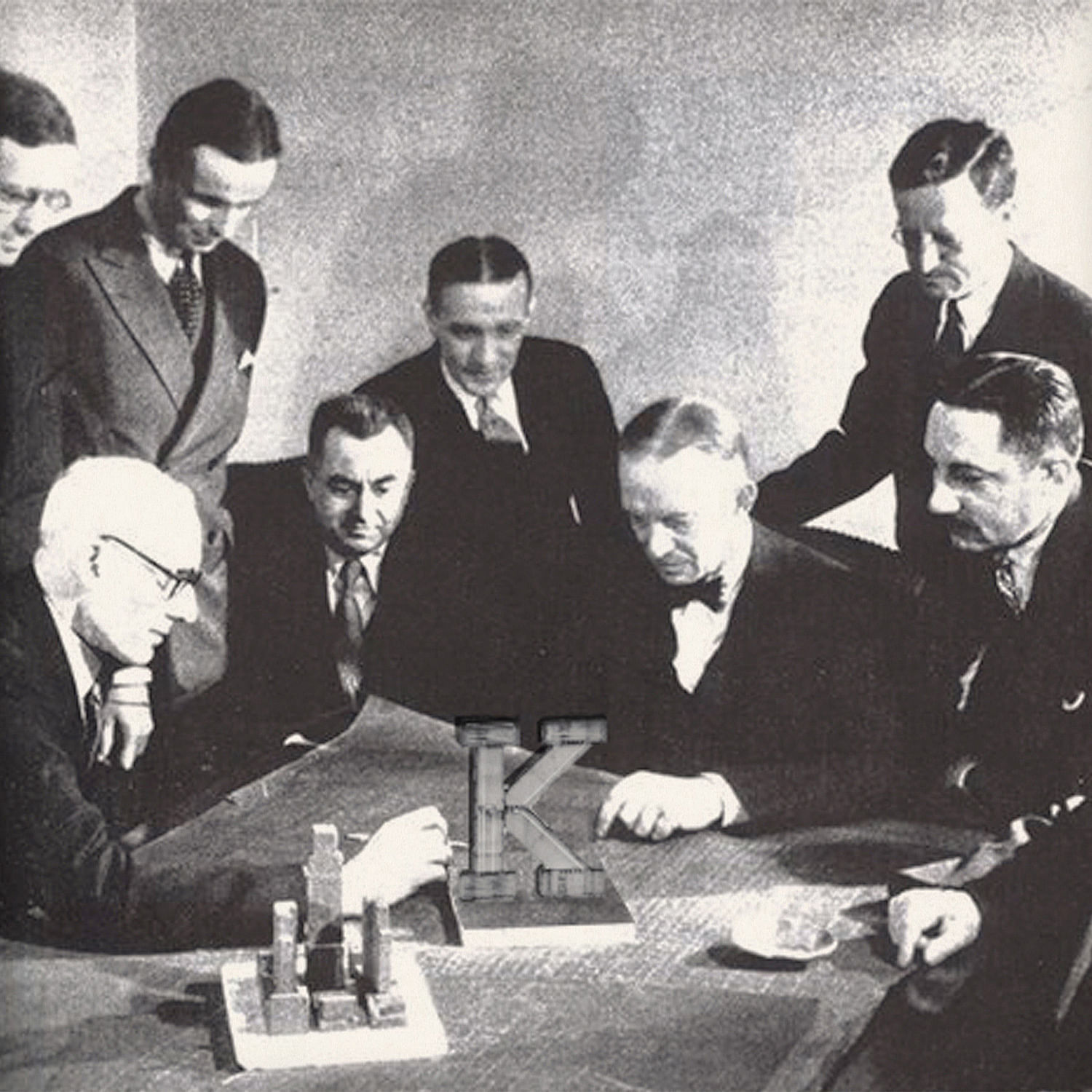
The Kentile Floors sign was a timeless symbol for the industrial roots of Brooklyn's Gowanus neighborhood. The iconic rusty-red letters made up the tile company's billboard, which was considered as a bold advertising move during the 1960s. The sign remained as is until all 13 letters were dismantled in 2014.
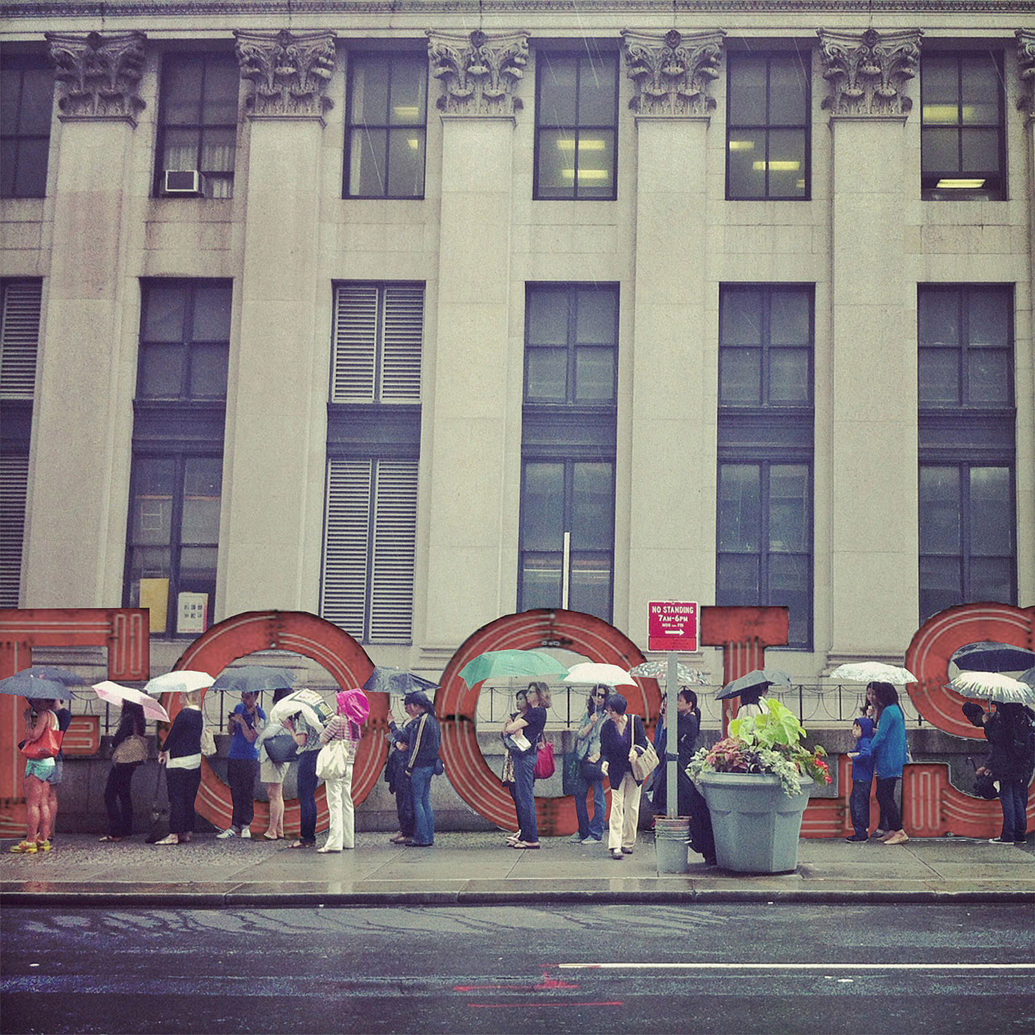
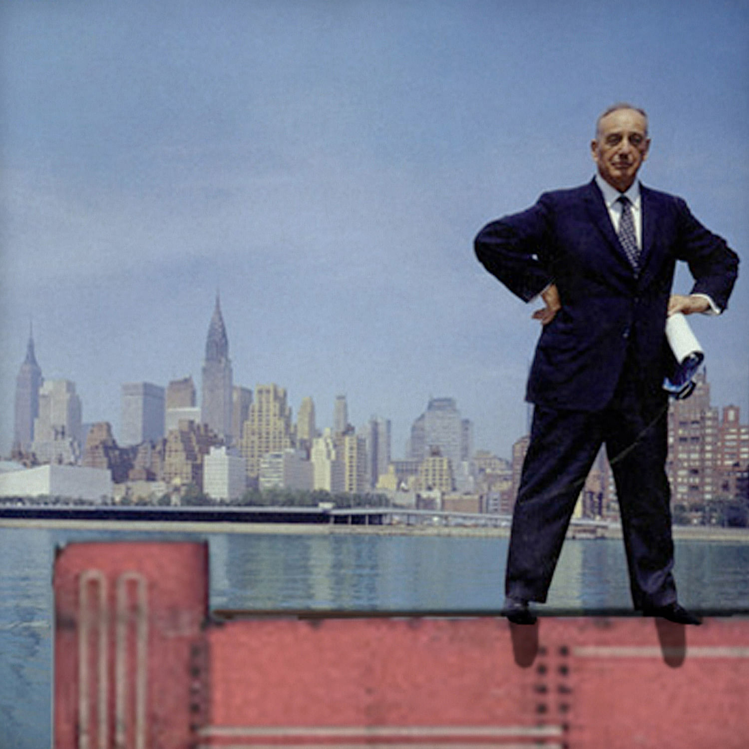
But the sign's legacy lives on. As a tribute, Aniket Shahane, Ivan Kostic, and Valentin Bansac of local practice Office of Architecture devised the "Kentile Kampaign". The Kampaign is a series of 40 retro-style, fictional postcards that "relocate" and reimagine the sign's 13 individuals letters in various spaces in NYC — including some recognizable images. In some of the postcards, the OA team rearranged the letters to spell out words as a subtle-but-not-so-subtle nudge of commentary to "the architectural characters of New York City", as the team put it.
The series bore from OA's "Gowanus Urban Field Station" competition entry that got an honorable mention in Axis Civitas last year. If you're in the area, the Site:Brooklyn Gallery just opened the Axis Civitas exhibition, which showcases the competition's urban strategies in a Gowanus Atlas as well as a new Urban Field Station.
Check out some of the Kentile Kampaign postcards below.

"Originally conceived as a bold advertising billboard in the 1960s for the Kentile Floor tile company, the 'Kentile Floors' sign in Gowanus, Brooklyn became an unwitting symbol of the grit and resiliency of its neighborhood. The scale of the sign; its font type and colors; and its location in the city rendered it a powerful urban marker, as its silhouette commanded the backdrop of a vibrant metropolis. In the summer of 2014, much to the dismay of many, all 13 letters that comprised the sign were dismantled."
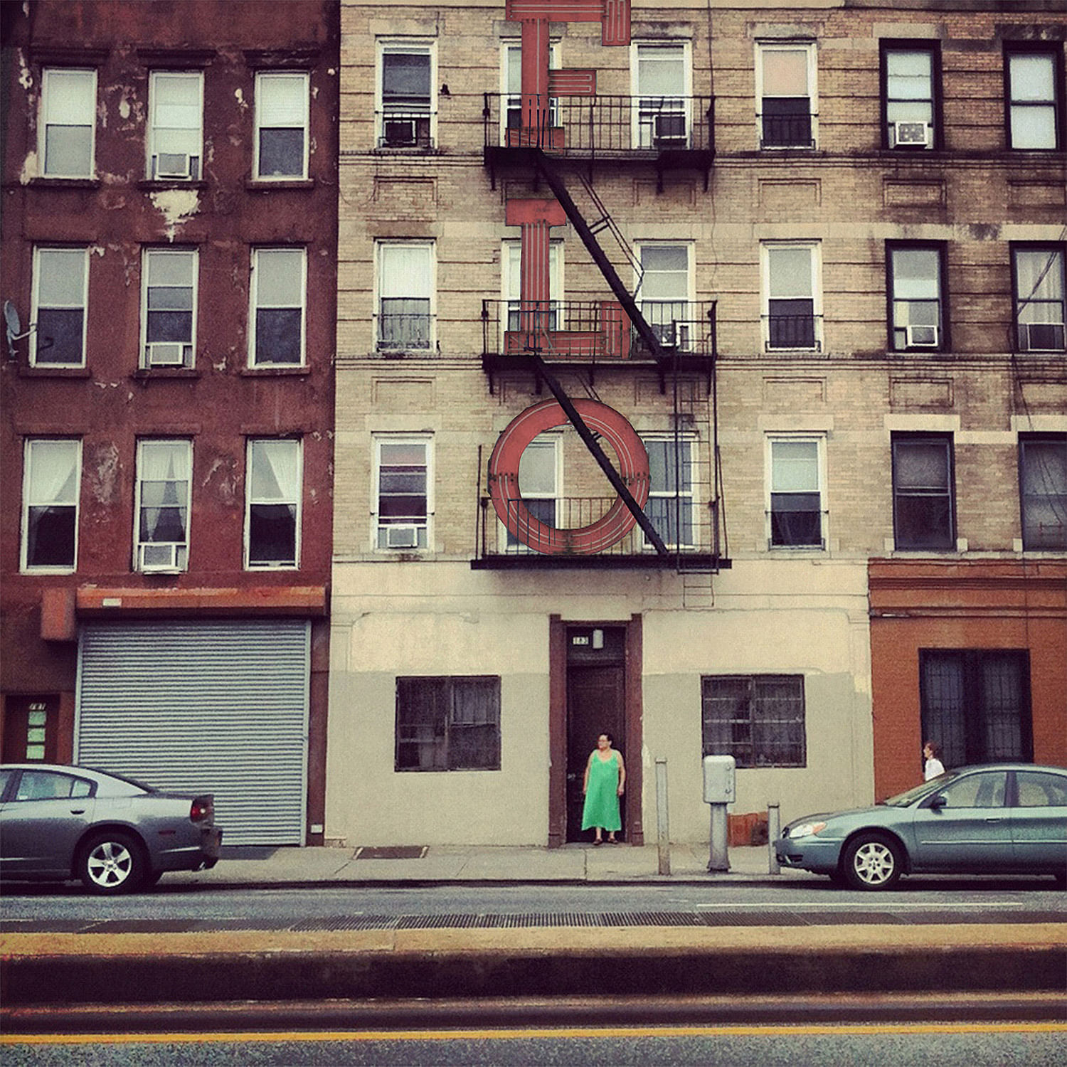
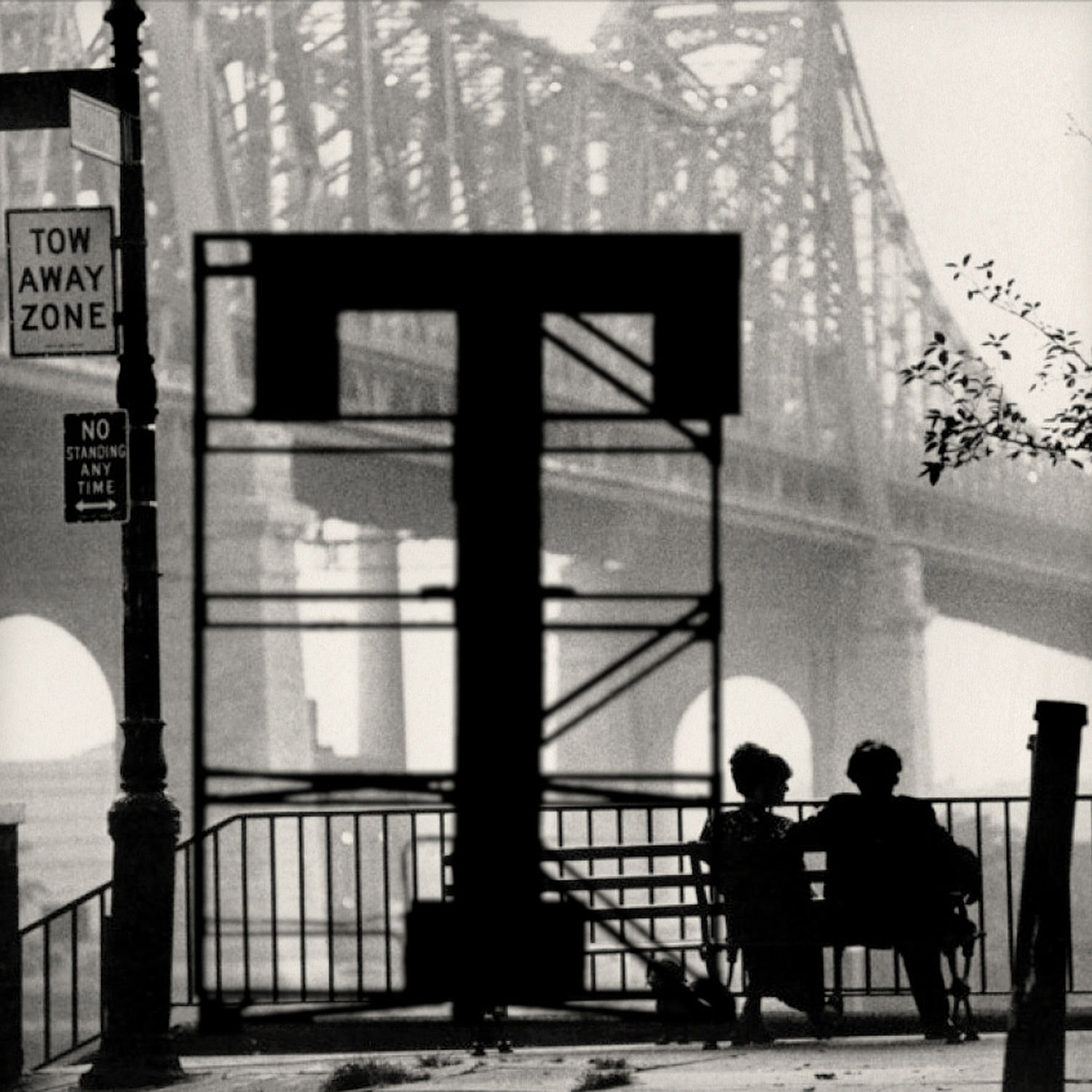

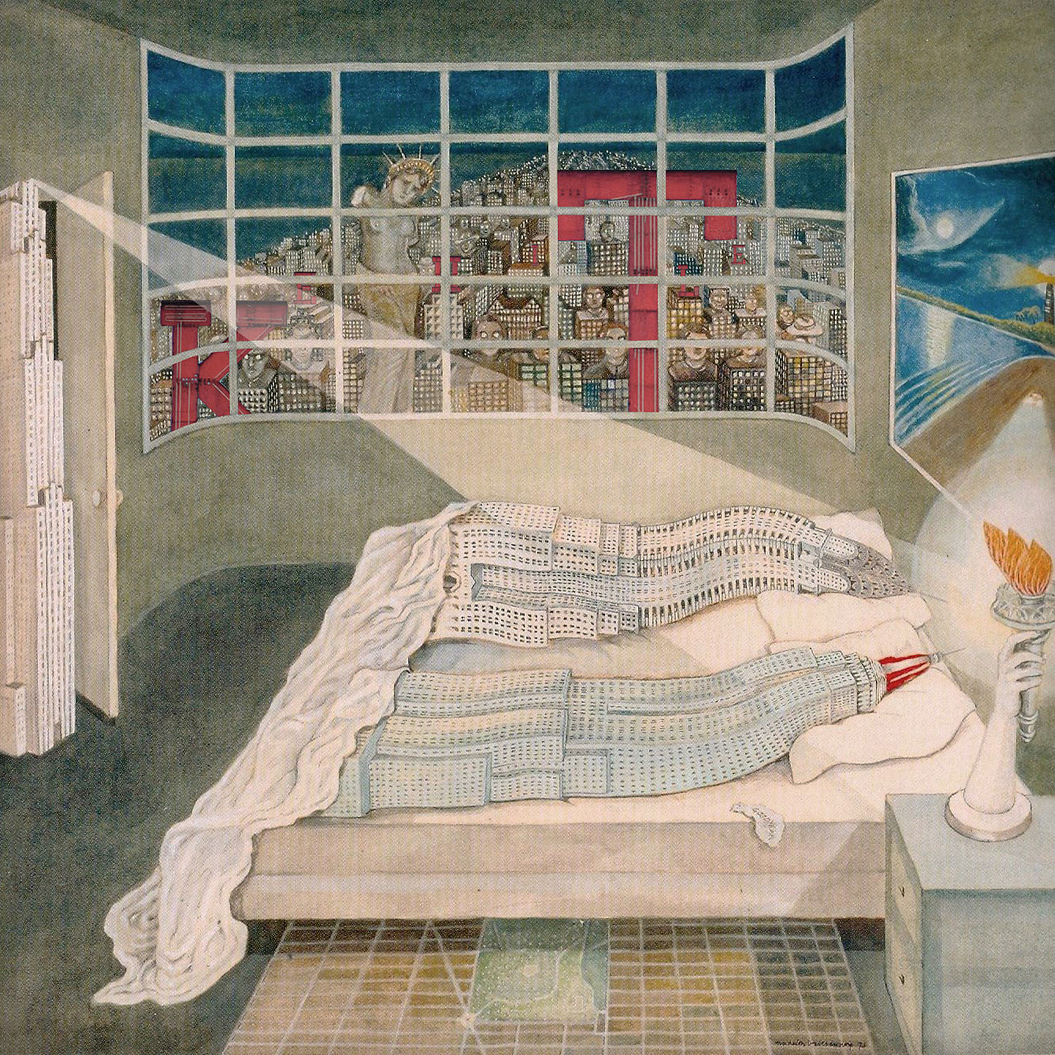
"The Kentile Kampaign [places] the 13 individual letters of the Kentile sign back into the space of New York City – the New York of our imagination as well as the city we encounter everyday. The Kampaign contends that in this city, little distinction lies between what we call banal and iconic."

"The Kentile sign was as meaningful a reflection of industrial Brooklyn as the Empire State building is of industrious Manhattan. [These images] are a tribute not only to the power of a sign, but also the characters – buildings and streets, bikes and cars, signs and lights, balconies and fire escapes, the hero and the everyman – that make our cities both memorable and commonplace at once."
All images courtesy of Office of Architecture.

Share
0 Comments
Comment as :