A’Design Award and Competition Winners
By Bustler Editors|
Wednesday, Sep 19, 2012

Related
As the standard deadline for the next edition of the A’ Design Award draws nearer (September 30, folks!), we've put together some of our favorite winning projects from the 2011-2012 edition. The A' Design Award is an annual showcase for the world's best architecture concepts, designs and finished projects and accepts submissions in 80 categories.
Artificial Topography Art Installation by Ryumei Fujiki
Project Description: "Big Furniture Like a Cave This is the award-winning project won the Grand Prize of Art in Container International Competition. My idea is to hollow out the volume inside a container in order to build amorphous space like a cave. It is made of only plastic material. About 1000 sheets of the soft plastic material of 10-mm thickness were cut down in contour line form and were laminated like stratum. This is not only art but also big furniture. Because all the portions are soft like a sofa, and person who enter into this space can relax by finding the place suitable for the form of its own body."
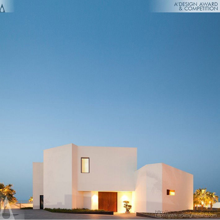
Star House Beach House by Agi Architects
Project Description: "Nestled into the landscape, this beach house blends with the natural topography of the coastline of Kuwait. Approaching from the desert, it slowly begins to unfold to the visitor. The formal structure of the house is designed to maximize views to the sea. Upon entry, one catches a glimpse of the sea whilst descending into the public space. On this lower level, the chalet extends into the landscape and the sea, accentuated by an infinity pool and surrounded by a garden. The private side, located at the entry level, is concealed from the visitors by a bamboo wall. Bedrooms and private living spaces remain isolated from daily activities. A three-way stair, placed at the center of the building, organizes the different flows of family, friends and guests"
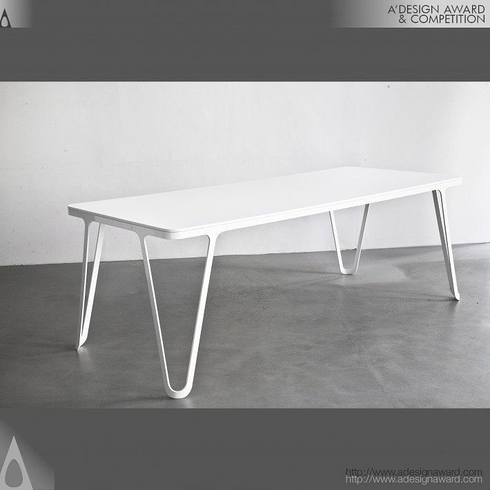
Aluminium Table Table by Sebastian Scherer
Project Description: "The Aluminium Series is comprised of open loops and sleek curves. The significant 8 mm water-cut aluminium frame was designed with the objective of folding the 2d cutout into a 3d shape. It´s elegant , continuous form makes it hard to judge where the material starts and ends."

Zip Tie Massimal Architectural Design Research Installation by Design Office Takebayashi Scroggin (d.o.t.s)
Project Description: "The Zip Tie Massimal is an architectural design research project that presents full-scale piece that explores the relationship between social engagement and built form. It invites the public to interact with it by touching, holding, and pulling and creates a spectacle in the form of a glowing volume comprised of over 20,000 zip ties."
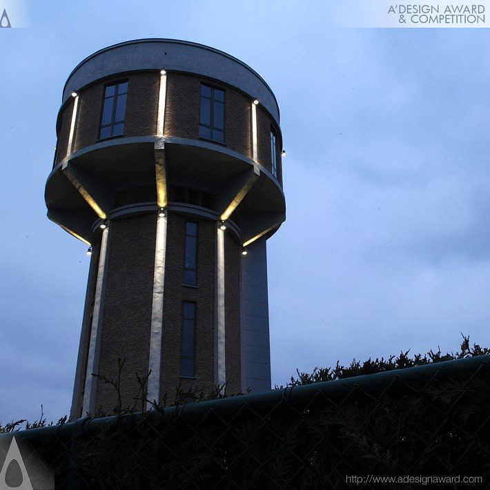
Chateau D'eau House by Mauro Brigham
Project Description: "Conversion of an old watertower into a house. A landmark building with huge efforts needed in isolation and integration of the technical installations and technology, a very diverse architecture language made of 8 sided spaces, cylindrical rooms, domes and 5meter high ceilings, a “vertical living life-style” and proximity of the national airport of less than 500 meters. These are the main ingredients of this very singular Project. The challenge was to create a home from an industrial building with strong character and unusual spaces. All visible concrete was painted in dark grey (almost black) while new wall covering (isolation) where painted in a light warm grey. Wengé floor was used in the living room area and in the main bedroom. 6th floor – Terrace with a panoramic view 5th floor – Living room and kitchen the tank was partially demolished (65%) in order to allow light to penetrate the living room, and kitchen. The space is wide open allowing the user to fully enjoy the 360° view. 4th floor – Bedroom open room with an integration of the dressing as a monolithic mirror that disappears and “creates” more windows and views to the exterior. 3rd floor – Bath room A huge walk in shower enclosed in black glass walls provide a sense of intimacy and coziness while multiplying the reflections of the windows 2nd floor – Gestroom & office Partially finished, the office furniture has not been installed 1st floor – Technical room Ground floor – Entrance hall and garage"
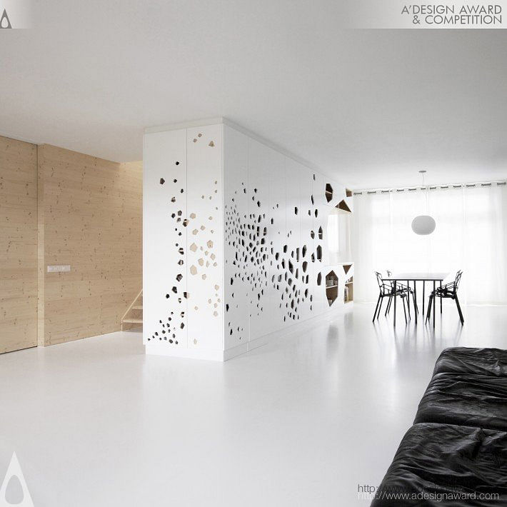
Home 07 An Interior by I29 Interior Architects
Project Description: "This single-family apartment for four people is situated in a stately building in southern Amsterdam, NL. The original structure, with rooms for staff, a double hall and long hallways with lots of doors has been transformed into a spacious, transparent dwelling full of light and air."

Origami Real Estate Agency by Kris Lin
Project Description: "This project would be more appropriate to proceed both architecture and interior work simultaneously . It’s a“realestate Agency”.In fact, this case is old building reuse, retains the original floor slab and structure columns of shops on Floor 1 and Floor 2, knock out all external walls and windows, repack the project. So from the facade to the interior, this case is also the whole concept of design at the same time, is (paper folding art) design concept as a whole, expand out based on the original building structure, make a cortex with the shape of (origami), wrap up the old building, so the transformation of an old building can't been seen, just like a brand new building, both the entire shape and the interior are used by irregular surface (origami) to form our space, form a whole from the wall, ceiling and outer facade."

Kyoto Silk Retail Shop by Keiichi Hayashi
This project was to convert "Machiya", a Japanese traditional wooden townhouse, in the centre of Kyoto, into a small shop. The original wooden frames were reinforced with steel frames because the original building was dilapidated. I focused on the way accommodating necessary functions of a beauty cosmetic shop within the space limitations of the original "Machiya".
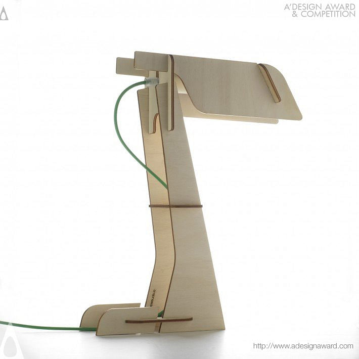
Zeta Table Lamp by Zp Studio
Zeta is a table lamp obtained from the lasercut of a 5 mm poplar plywood sheet. It is sold in a flat packaging and can be easily self-mounted by the customer: there is no need for glue or screws because pieces can be simply stuck togheter, while the waste of material is minimum.

The Abode of The Outside Temporary House by Anna Rita Emili
Bright and automatic house with sliding wall system. The form of this 80ms house derives from the tracks drawn on the ground. It is a simple shape, characterized by a pure geometry (the parallelepiped) and, like the rest of our projects, it is not governed by the quest for an architectural shape conceived exclusively like something changeable, what is the really matters is the expression of a concept represented in its essence. So the grid, characterized by 3x3 meter panes, becomes the location of the movement; a space in which the motion expression entrusted to the architectural elements generates a dimension of the "Undefined", a space "out of itself" in which total absence reigns. In one of his tales Blanchot describes a world in which the homes appear places without place, closed spaces, defended even though they’re left to the power of the winds. Along the grid made of steel tracks run the walls, also made of recycled steel (6 cm width isolated panels low environmental impact) that, in a relatively short period of time, can change the space and thus altering the perception, moving from total closure to absolute and complete opening. A computer placed at the centre of the housing complex determines these variations of movement, space and time. Inside-outside, close-open become extreme spatial conditions among which covered and opened spaces, open and uncovered spaces (by extending the partitions towards the outside of the structure's covering it is possible to create enclosed or open spaces, in which you stay in the open) or closed and open spaces can be laid out. As the external enclosure remains closed it is possible to modify the inner space, making it flexible and adaptable to various needs. The only fixed elements are the concrete platform, a floor-base on which the tracks on which the walls slide and the utilities are set. The theme of movement involves the changing of some elements in the architectural composition. Pillars can also be placed outside the house so it is possible to widen the domestic space adding transparent or opaque modules, weather vertical or horizontal.

Share
0 Comments
Comment as :