Red Dot Design Award Winners for Architecture and Interior Design
By Bustler Editors|
Wednesday, Jul 7, 2010

Related
Since 1955, the Design Zentrum Nordrhein Westfalen in Essen, Germany has been marking outstanding international product design with its famous dot. Manufacturers and designers of a wide variety of industrial products can enter their work all year round in different product groups for the coveted red dot award.
Following are the red dot: product design winners in the category Architecture and Interior Design:
Container Scope Oceanscope
Design: AnL Studio (Keehyun Ahn, Minsoo Lee), Korea
Art Direction/Planning: Gilhwang Chang, Busan, Korea, Incheon Metropolitan City, Korea


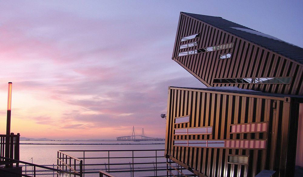
Ports all around the globe have something magical about them; they are passages to the world. While only one hundred years ago it was sailing ships that offloaded precious goods such as silk, pepper and cacao, today harbours are pivots of international trade, with goods being shipped in uniform-sized containers. The design of the Container Scope uses these containers and their symbolism for an architectonically interesting approach that relates them to human beings and the environment. The concept behind this is inspirational and visionary, as it expresses a clear assimilation of the reality in the port city of Incheon in South Korea. In order to lend the many unused containers in its port an architectural significance that the public too benefits from, these containers underwent “recycling”, so to speak: they establish observatory platforms by being stacked on top of one another to form geometrical constructions. Since these containers are located next to the historic “sunset place” of Incheon city, the concept centred above all on the view and the possibility to watch the sunset in the port. The arrangement of the containers followed the limitations of the building site, since the ground level was too low to allow a direct view of the sunset, the containers’ structures were set at various angles. Visitors are lead via the various staircases and rails upwards to higher positions, each with diverse viewpoints to watch the sun set in their city – in a symbiosis of limitations and imaginativeness thus emerged an architectural object of marked distinction, offering citizens a place in the sun.
Moving Moments – BMW 7 Series Dealer Drive Event
Manufacturer: BMW Group, Germany
Design: Blue Scope GmbH (Sylvia Demes, Uwe Prell, Christoph Schmuck, Mischa Schulze, Andreas Stephan, Gregor Siber), Germany


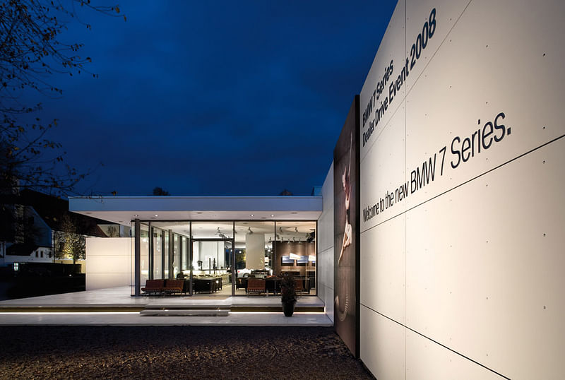
They represent luxury and splendid variety. Baroque castles like the castle grounds of Schleißheim near Munich were created in a time, when architecture dealt with manifold ornamenting elements, and abundance was a maxim. Between 1701 and 1726 the Schleißheim New Palace was built by order of Elector Max Emanuel following the plans of Enrico Zuccalli. With the largest ceiling painting of its time and an imposing flight of stairs it expresses Max Emanuel’s exalted attitude towards life as well as his claim to power. A similar aesthetic, and with it the implied lifestyle, is taken up in the temporary architecture for a six-week product presentation event for the BMW 7 Series, which too embodies an impressive scenario. Set against the monumental castle facade, which serves as both the setting for the presentation of the vehicle fleet and the gala dinners, the design aims at creating an atmosphere of luxurious and glamorous opulence. Even though this might at first surprise beholders as being a dramaturgically staged contrast, the concept still manages to harmoniously combine the castle facade with the other architectural elements: the pavilion for the presentation of the vehicles features a clear layout with flowing lines that make the outside and the inside spaces blend into one another, lending the architecture an exciting feel of transparency. The interior itself showcases a rather reduced design, yet with colossal luminaries that create a visual link to the large-size castle facade. “Innovation from Tradition” is thus realised in a highly subtle manner. The staging of a baroque life thus is brought in line with the aesthetics and the environment of the displayed products – the presentation, in the here and now, of a virtually royal stage.
Ornilux Mikado Bird-Protection Glass
Manufacturer: Glaswerke Arnold GmbH & Co. KG, Germany
In-house design: Christian Irmscher, Germany

They seem to “know” about the special senses of birds. Orb-web spiders, of which there are more than 2,800 species including the garden spider, for instance, protect their laboriously woven nets with a special UV-light reflecting silk from birds flying though them and destroying them. Birds can perceive these reflections of UV light and thus recognise the thin nets as obstacles. By now, ornithologists and engineers also take advantage of this effect with regard to glass architecture: since birds often hurt themselves when crashing unwillingly into transparent or reflecting surfaces, the idea was to use the bird’s special ability to perceive UV light and put it to use in protecting them. The design of the Ornilux Mikado bird-protection glass translates this profound discovery into an impressive product: it provides architecture with the possibility of making window panes and glass fronts safer from now on for all birds without the need to resort to special stickers. This innovative bird protection glass was developed in close collaboration with the Max Planck Institute for Ornithology at the Radolfzell ornithological station and its effectiveness was tested in a flight passage with real birds. The result of this collaboration is an innovative coating which is applied to the glass. The highly effective coating which, when looked at against a backlight, seems like a randomly unfolding layer of the game Mikado pick-up sticks, is barely visible to humans and integrates seamlessly into architecture – much like the missing link in the evolution of the species, this bird protection glass is a missing link in terms of form. In its harmonic interplay with the architecture it contributes to the better protection of birds in their environment. At the same time it incorporates a design that creates something new in harmony with nature.
Van Gogh Museum Shop
Design Day Creative Business Partners B.V. (Gesina Roters, Louk de Sévaux, Mette Hoekstra), NL


Museums such as the Van Gogh Museum in Amsterdam are true crowd pullers. This museum has a large collection of artworks by Van Gogh and other 19th century artists on display. Closely linked to its significance and popularity is the architecture by Gerrit Rietveld, who was also highly successful as a designer of the De Stijl group. The task to extend the museum shop and at the same time enrich the architecture both in function and aesthetics was therefore a big challenge. The new museum shop was to be larger than before, serve substantially more visitors, and live up to the international reputation of the museum. The architectural conclusion follows an environmental design, which subtly integrates the shop into the existing monumental museum architecture, while at the same time retaining the shop’s sense of architectural uniqueness. The entire entrance area was taken into account in order to integrate the shop in the flow of the building. The detailed grid of the building developed by Gerrit Rietveld served as a visual guideline for the shop’s interior design: it was used as a point of orientation in proportioning all components of the store into a well-balanced unity. The result is a shop that aims to impress museum visitors though its bold design. With clear lines and balanced contrasts in black and white it embodies an invitingly staged world for visitors and consumers. Dark natural stone, which varies according to sections, and dark shelves meet white installations of sculptural appearance, which also serve as product displays and room partitions. Also visually enticing is the combination of natural and artificial light sources: the products and books as they are presented in the displays look like warmly illuminated objects that amaze and astonish visitors. This shop thus embodies both an architectural as well as consumption-oriented attraction within the museum – users experience it as a unified whole that leaves a lasting impression.

Share
0 Comments
Comment as :