New adidas Laces Research and Development Building
By Bustler Editors|
Tuesday, Sep 27, 2011
Related
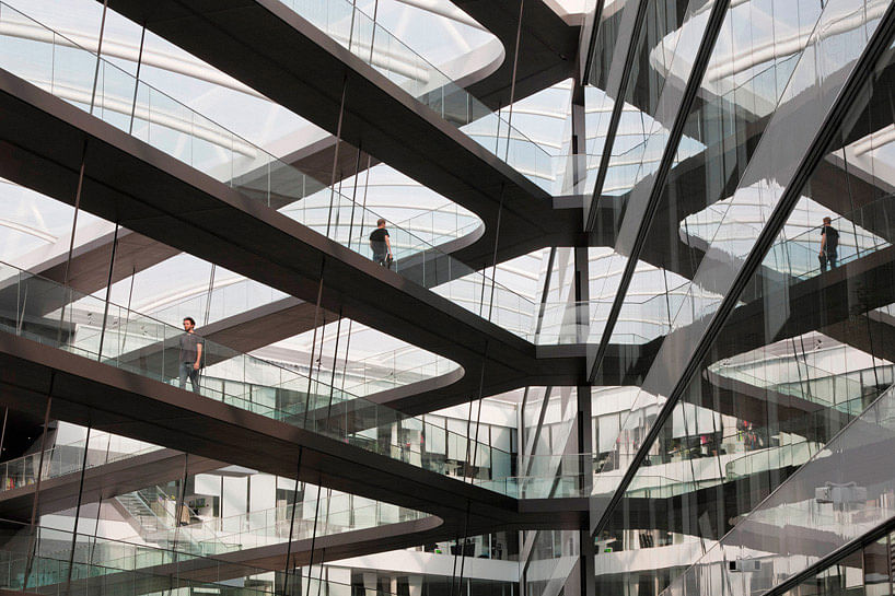
German firm kadawittfeldarchitektur has sent us fascinating first photographs of the recently completed new adidas research and development building "adidas Laces". The new structure houses 1,700 working places at the adidas World of Sports campus in Herzogenaurach, Germany. In contrast to conventional office typologies, the ring structure developed by kadawittfeldarchitektur lends to the building a double relationship to the landscape – both to the outer surroundings and to the communicative landscape of the atrium.
In 2007, kadawittfeldarchitektur emerged as 1st prize winners of an international competition for this design task.
Project Description from the Architects:
Adi Dassler was inspired by a single idea when he made his first shoes: all athletes should get shoes that were ideally adapted to them and their discipline. Almost 100 years later, this motto still applies at adidas.
Task
The adidas brand is characterised by permanent development, as it was in the days of the company founder Adi Dassler. Innovations don’t happen by chance, however, and they happen not only in the development department but every day, when employees apply their minds, are committed and collaborate with passion on the creation of new products. The further extension of the “World of Sports” by means of the sustainable office building called Laces makes a significant contribution by providing employees not only with functional and optimised working conditions but also with inspiring surroundings that encourage creativity.
In the competition that was held in 2006, the challenge was to match the high functional and architectural standards of the buildings previously constructed here, and at the same time to represent the individual character of the adidas brand.
Intention
Adi Dassler’s endeavour to make the perfect product can be transferred to architecture in many ways.
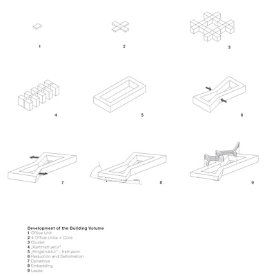
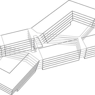
The aim of the proposal was to create a building that fitted the adidas brand. This applied to the design of the building, on the one hand, but above all to the atmosphere and everyday creative work. A building in which employees work with both success and enjoyment, and one that makes it possible to experience every day what it is that makes the location in Herzogenaurach so special. It was not to be a typical office building with zones separated according to department, but an unmistakable place for the mainly young employees from all over the world to identify with the company. Starting from countless different approaches, what finally emerged was the idea of a ring-shaped building with a spacious atrium and connecting walkways, the “laces” (like the laces of a shoe), which give the structure its name on account of their particular geometry: crossing the airspace of the atrium, they connect office areas lying opposite each other on each level and thus “tie” the volume together to form an office building that is rich in multi-faceted relationships. The themes of movement and dynamism are ever-present in this way and convey to the employees the feeling of being part of the creative work process.
Embedding in the Landscape / Context of HerzoBase
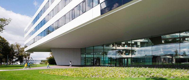
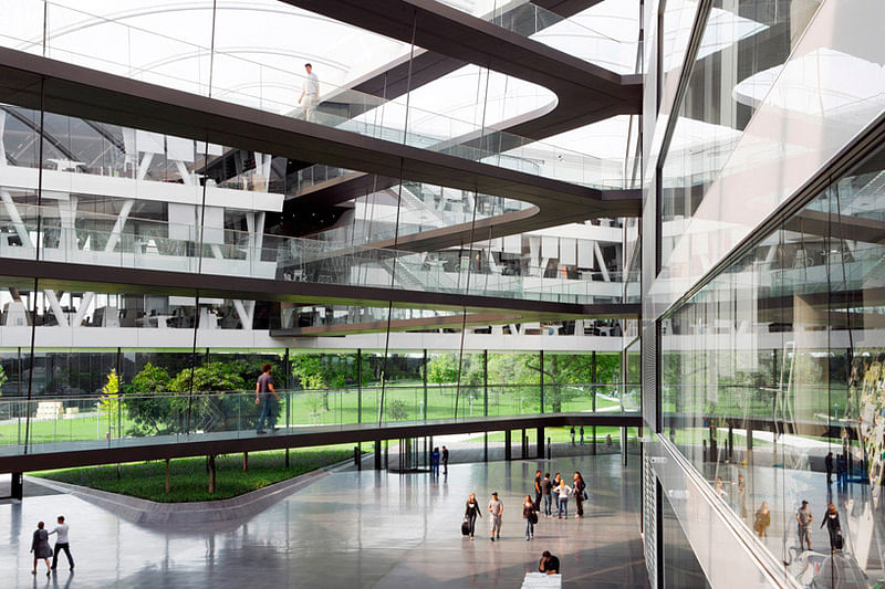
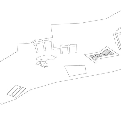
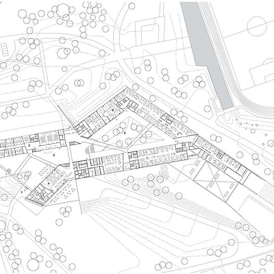
The campus is formed from a loose arrangement of individual built volumes, each of which speaks a distinctive and unique architectural language in it own right but at the same time takes its place in the diverse ensemble of the World of Sports. Laces is situated in the southeastern part of the site, between the adidas Brand Center and the Adi Dassler Sports Ground. The topography is used to let the landscape flow into the transparent covered atrium and the building via the two-storey entrance area, and thus to extend the extraordinary quality of the campus in the form of an artificial landscape. The green space of the park is present in the atrium at all times through the two-storey glass façade. The clear contour of the ring-shaped structure permits an uninterrupted view of the surrounding country from every department. Only the part containing the Test Hall lies outside the shell and is integrated into the topography as a greened-over hill.
Complex of Buildings
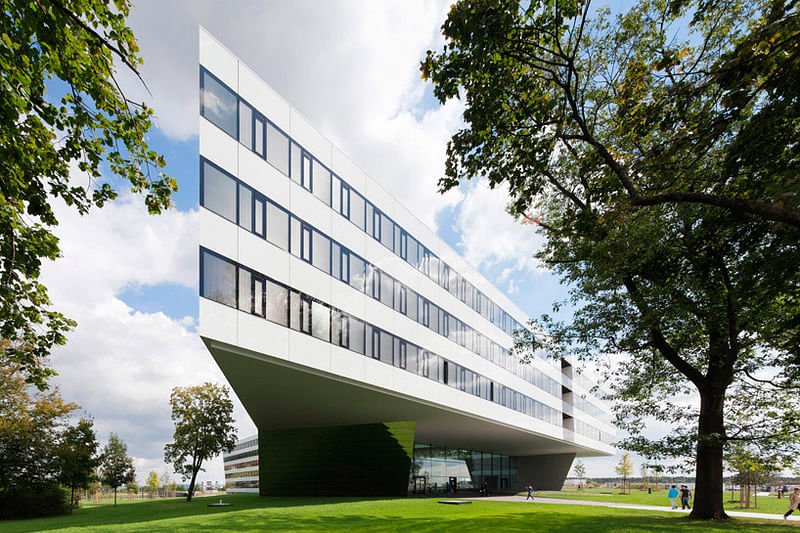
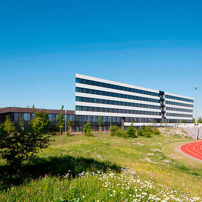
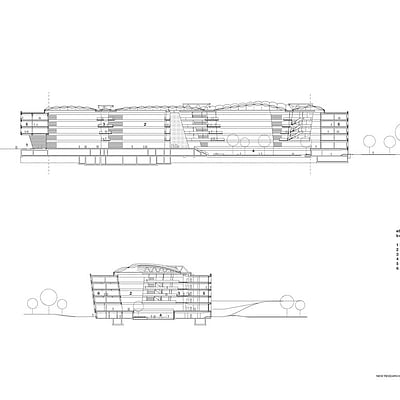
As a counterpart to the black and somewhat flat volume of the adidas Brand Center, Laces fits into the existing complex of buildings with its white banded façade and its dynamic architectural volume. The clearly contoured volume positively invites the surrounding campus to find a continuation inside as a climate-controlled atrium. Lined up in a ring, the office spaces open up to the atmospheric interior and the remarkable landscape with their large glazed surfaces. Within the individual storeys the “laces”, free linking walkways that span the atrium, permit a maximum of interaction and quick connections, and allow areas of open communication to arise. The walkways “tie” the building together in terms of structural engineering, too, making it a multi-layered office environment with abundant relationships. As delicate connecting bridges, they weave a poetic spatial structure into the interior and thus make the special creative atmosphere of the building legible. The result is an inspiring place for research and product development. The external appearance of Laces is characterised by its clearly contoured, reflective smoothness, which is thus courteously unobtrusive and visually reduces the built volume. The smooth façade surfaces are structured and articulated by set-back loggias corresponding to the walkways.
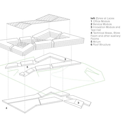
Laces can broadly be divided into four zones:
- the office area on the four storeys above ground level, the so-called Office Module;
- the areas for special use on the ground floor, the so-called Service Module;
- the model workshops, materials laboratories and research areas including the Test Hall, the so-called Innovation Module; and
- the technical areas, store rooms and other auxiliary rooms.
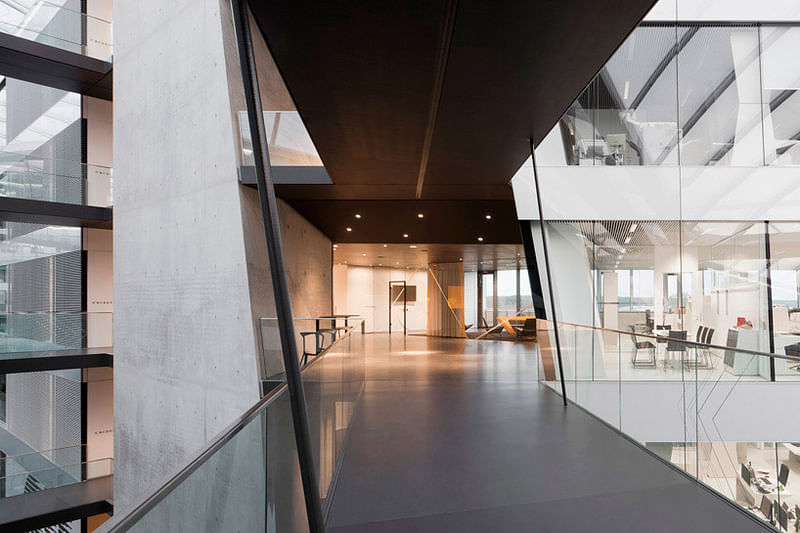
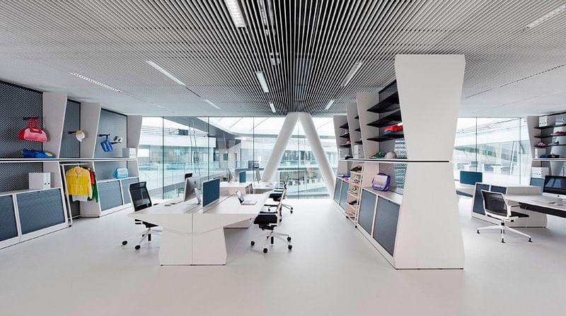
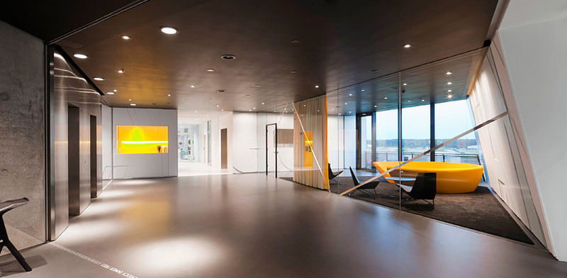
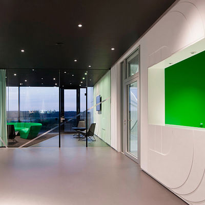
Inside Laces the zones known as the Office Module account for the largest part of the building in terms of volume and surface. This is where the “creative units” will move in, whose working materials consist not of paper and files, as is normal, but of textiles, shoes and accessories such as bags, balls etc. In their understated white or grey colour scheme the office areas produce a studio-like atmosphere for creative work on products, designs and ideas. Here the purpose of the mainly neutral colour scheme is not only tranquillity in view of all the colourful variety of the products, but also to ensure a working atmosphere that is as bright and pleasant as possible. In a conscious contrast to the light-coloured Office Module and the white, transparent inner façade, the eponymous “laces” take the form of dark grey catwalks, connecting belts which pass through and lend structure to the spacious atrium with their all-round charcoal colour.
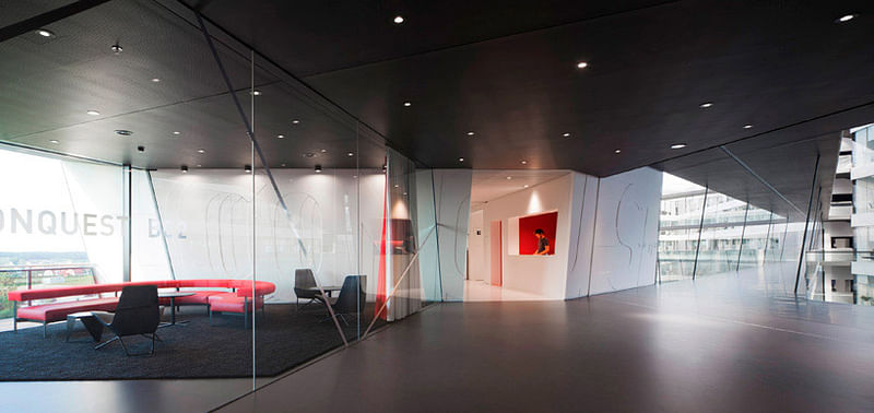
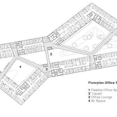
At the points where the walkways enter the surrounding office spaces, the so-called Office Lounges form open areas for communication that are oriented to the outside thanks to the loggias placed in front of them and represent an invitation to stay and relax. The interplay of the walkways and the encircling Office Module provides maximum flexibility in the placement of departments and takes account of security requirements: there must be no crossing of other departments. Moreover, the disturbance caused by people passing through departments no longer exists. At the same time internal relationships between different departments are created by a high degree of transparency. The central atrium becomes a zone of communication adjoined by meeting areas for common use by different departments and by the bistro lounge.
Appearance
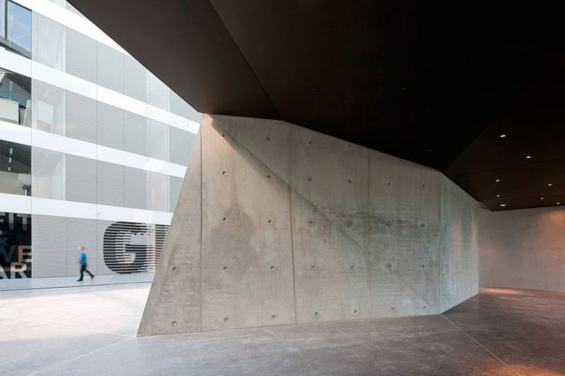
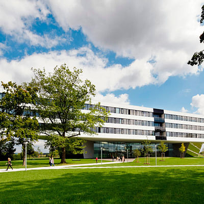
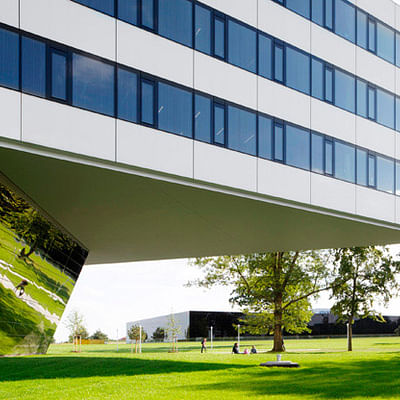
Without resorting to showy acrobatics of design, the building has been given an appearance that matches the adidas brand. Its perceived volume is reduced by the striped character of the façade, a result of the alternation of white surface bands with dark bands of windows. The smooth, reflective surface of the façade further reinforces this reduction. Depending on the angle from which the façades are viewed, the building melts into a mirror image of the surrounding landscape.
The walkways that mark the interior are also apparent on the exterior, where loggias give a structure to the long façades in the shape of three-dimensional vertical cut-outs.
In order to lend dynamic expression to the sharp-edged volume and to extend upwards the spatial impression of the atrium, two of the six sides of the building lean outwards slightly. This incline is continued through the whole building via the walkways that are connected to these sides. In this way the loggia zones, cut out at a slight diagonal, refer to the dynamics of the interior.
The two façades that flank the two-storey entrance area have also been turned, in order to make visible as much as possible of the horizon of the campus. By this means the campus remains connected to the surrounding countryside despite the size and width of the building.
Façades
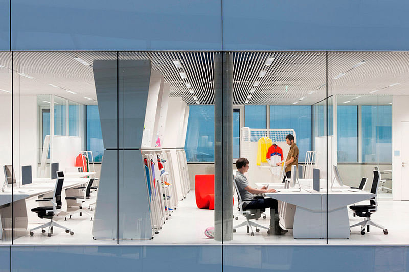
The starting point for the design scheme is a smooth and sharp-edged contour of the built volume, which takes its character from the white-enamelled exterior bands. The building is also articulated by the dark-looking horizontal bands of windows, which are broken and divided by loggias, placed vertically one above the other with their black facings. The smooth appearance of the façade is achieved through the use of a construction of aluminium elements in the form of a structural glazing façade, with triple-glass insulation windows and integrated sun and glare shield in the intermediate space between the glass panes.
At the south-west of the building, the circular shape opens up over two storeys to create a large, roofed porch area as the entrance to the campus. In order to assist the flow of the landscape into the atrium interior by means of maximum transparency of the façade and to maintain delicate façade profiles, the steel construction is suspended from the section of the ring-shaped volume that lies above. The inclined sides and ends of the adjoining sections of the building on both sides of the main entrance reflect the surrounding landscape thanks to high-gloss, invisibly attached wall cladding of polished stainless-steel sheets.
The high proportion of glazing on the outer façade and the floor-to-ceiling windows of the inner façade towards the atrium ensure that the work areas are extremely well lit and that their communicative ambience has a transparent character.
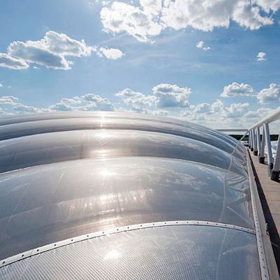
Thanks to the fact the whole atrium was roofed with a printed foil-cushion roof and has a controlled temperature, it was possible to fit the inner façades with single glazing without vertical bars.
Holistic Approach
An additional feature of this building is that it was possible to include other design themes such as orientation and office furnishings into the planning process at an unusually early stage. This led to the creation of an exceptionally homogeneous whole. The building, interior design, graphics and furnishings are all of a piece.
Concept for Office Space
Laces was conceived as a flexible office building. Changes in the composition and size of teams or of the entire occupying units are every bit as normal in a globally active company like adidas as the temporary integration of employees from other locations worldwide or groups of external persons. This means that the use of space within the Office Module can be adapted to organisational changes more easily than hitherto. This reversible concept for office space is based on modular units of occupancy following the planning grid of 1.60 metres, a flexible partition system to create individual offices and meeting rooms, and on an elaborate technical pre-installation enabling media provision that also functions according to the planning grid.
An essential point here is the allocation of the office space into three functional zones: two workplace zones, one each along the outer and inner façade, and a multifunctional zone between them. While the workplace zones contain both closed spatial units and also open group offices, the multifunctional zone is conceived as an open area that connects the two other zones. It provides space for informal meetings, temporary workplaces and space for storage, printers and other functions.
Sustainability
In planning and building Laces, numerous measures were adopted that combine to form a coherent overall strategy for sustainability.
Building shell and energy economics: the glazing of the highly insulated outer façades is a three-layer structural glazing construction that complies with the highest standards in respect of the thermal and moisture-protection qualities of the shell of the building. By covering the atrium with an extremely light ETFE cushion roof which is UV-permeable and requires very little cleaning, it was possible to optimise the outer surface (i.e. improve significantly the ratio of outer surface to volume).
Laces over-fulfils the requirements of the German directive on energy saving (EnEV) by 38.8%. The climate conditioning of the atrium is carried out by streaming conditioned air from the office areas with higher air pressure, so that no additional operating costs are incurred for the atrium. In this way it was possible to reduce the area devoted to air ducts in the cores, for example, and thus optimising the usable area. The energy from the exhaust air is recirculated via an energy recovery system.
Considerable electricity savings were achieved by means of intelligent light control such as dimmable lighting controlled by daylight and presence. The illumination of the “laces” in the whole atrium is supplied by means of a 750-metre-long LED lighting strip. The power requirement and the need for heating and cooling were further optimised thanks to controllable sunlight and glare protection (extremely high rate of use of daylight).
Geothermal warmth: The use of renewable energy through 28 geothermal probes with a length of approximately 4300 metres results in a carbon saving of some 80 tons per year.
Green roof: The whole 1700m² surface of the test centre roof was greened, planted with native species of vegetation and landscaped to integrate it into the surroundings.
Use of rainwater to reduce the consumption of mains water and minimise use of the waste-water infrastructure: For WCs and urinals rainwater is used all year round. Precipitation on the main roof of Laces is channelled to a subterranean rainwater cistern with a capacity of 180m³. Surplus rainwater is used for irrigating the grounds. The use of water-saving, no-touch faucets was a further means of reducing water consumption.
Project Details:
Typology: office building
Construction volume: gfa 62,000m², cubature 356,000m³
Realization: 2008-2011
Client: adidas AG World of Sports
Competition: 1st Prize 2007
Architect: kadawittfeldarchitektur
Project partner: Dirk Zweering
Awards: Office Application Award 2009: Best Innovative Concept
Find more photos and drawings in the image gallery below.

Share
0 Comments
Comment as :