NAU + Drexler Guinand Jauslin Transform Swiss Bank
By Bustler Editors|
Wednesday, Aug 21, 2013
Related
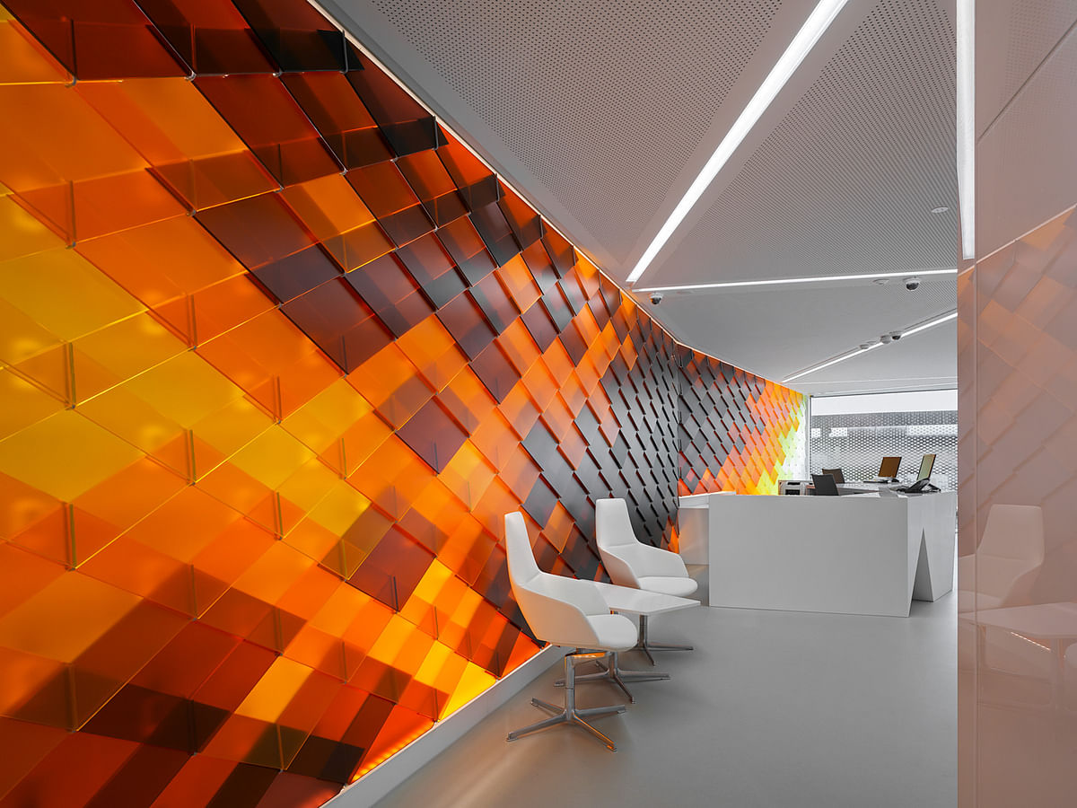
The new Raiffeisen Bank branch designed by NAU Architecture and Drexler Guinand Jauslin Architekten was completed this past May in the historical city center of Schaffhausen, Switzerland, after the design won first place in a competition back in May 2012. The design as a whole appeals to the senses, going beyond the basic functions of a bank to creating an open, welcoming place for customers through light, color, and efficient use of space.
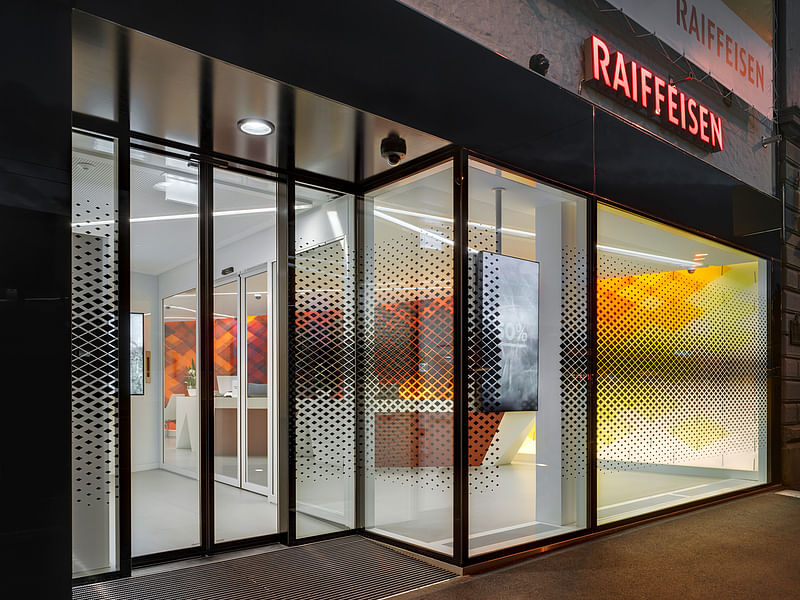
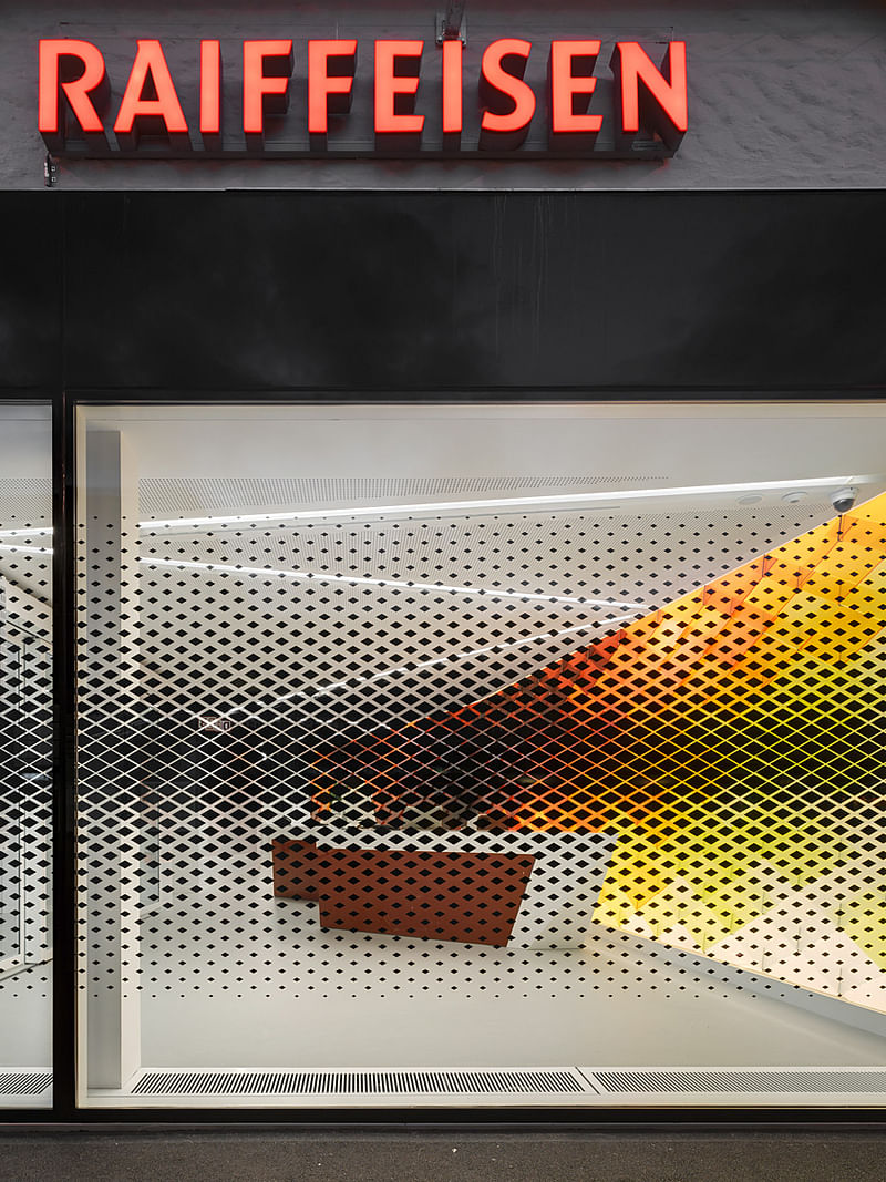
The bank's interior is a calm neutral white contrasted with warm-colored glass panels whose designs were derived from the colorful murals of Schaffhausen's historical facades and then digitally processed by Rippmann Oesterle & Knauss. To further create a welcoming bank atmosphere, numerous transparent windows allow an ample amount of natural light inside, which the firm describes as "the bank using transparency to open itself to the city." Additionally, the different uses of light and glass throughout the design come from the tradition of stained glass in Schaffhausen. Advanced virtual-banking technology easily integrates with the rest of the bank, therefore reiterating the design's concept that the bank is transforming into a space for customers to exchange not only money but also ideas as they learn about new products and services.
Take a look at some images of the new Raiffeisen branch and learn more about the design right below.
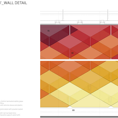
"For the design of the bank interior space, the project draws on the tradition of painted façades in the historic center of Schaffhausen, which characterize the city’s public realm. Together with ROK, Rippmann Oesterle & Knauss, these colorful murals were digitally transformed for the interior of the bank into a pattern of rhomboid glass shingles, establishing both a reference to the Raiffeisen brand’s original honeycomb logo and anchoring it with the local history. The project creates a subtly composed space of encounter, which piques the interest of passers-by through color, lighting and reflections, and provides customers with a welcoming, stimulating atmosphere. The traditional features of Schaffhausen’s public façades are transported into the interior, and in return, the bank uses transparency to open itself to the city..."
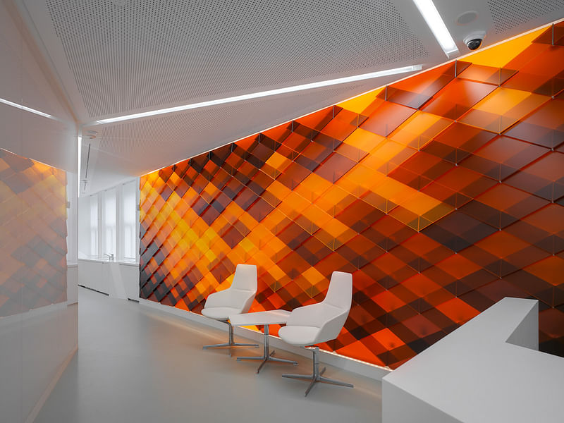
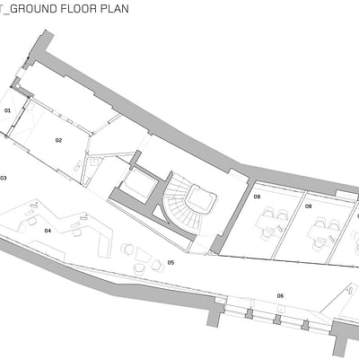
"The new ground floor of the Raiffeisen Schaffhausen is conceived as a spacious, open meeting place. The flowing bank interior extends into the full depth of the original medieval plot, with the customer zone stretching from Bahnhofstrasse through to the inner courtyard. This allows for good natural lighting, straightforward orientation for the customer and clear organization of the bank’s internal processes. Using a contemporary architectural language, the elongated plan is structured as a spatial sequence, with increasing discretion towards the rear..."
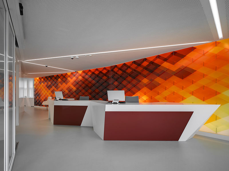
"The spatial concept defines a clear zoning in the depth of the plot, with access to the bank through the 24H-zone, which serves as a vestibule. The main room is structured as a spacious reception area in the front and a lounge-style waiting area towards the courtyard. Subtle zoning is achieved with built-in furniture. As an extension of the customer zone, the team room is designed as an open office with natural lighting from two sides. The new layout allows a straightforward functional solution with clear flow and good visual connections..."
"Through e-banking, ATM services, and payment with debit card, the function of the bank branch has shifted from a place of physical money exchange to a place of customer consultation. The client is warmly welcomed, expertly advised, and free to exchange ideas. Beyond serving as a local physical representation of the bank and of the Raiffeisen brand, the branch equally represents a real pillar of the virtual bank. Through the use of new media, the branch achieves increased visibility for the Raiffeisen brand and its associated values as well as direct access to customers..."
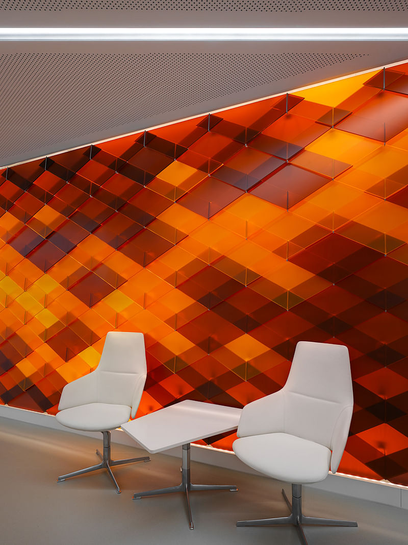
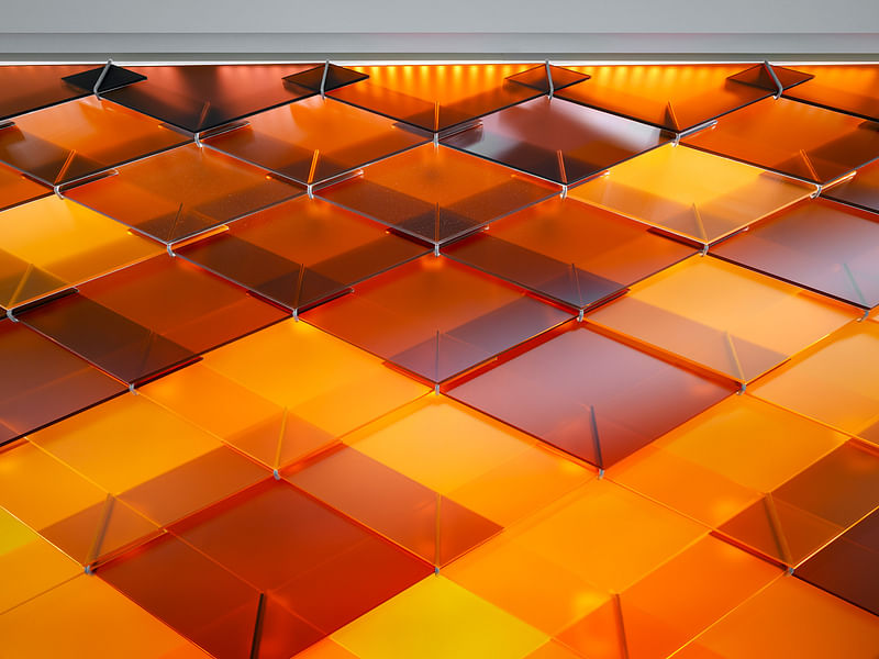
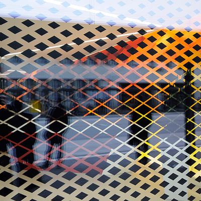
"The central motif for the design of the customer hall is inspired by the colorful murals in the historic center of Schaffhausen, which were reinterpreted using contemporary computer-based technologies. This pattern is implemented with different colored, overlapping rhomboid glass shingles. Through reflection, color and transparency, a versatile and modern atmosphere is created..."
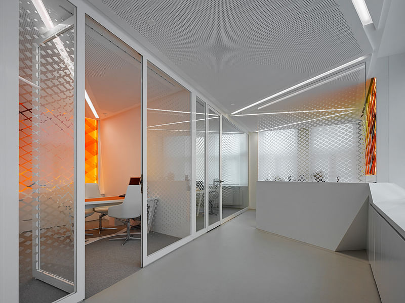
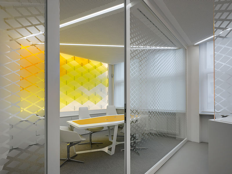
"The new plan arrangement optimizes the use of daylight. The inclusion of courtyardfacing windows and the lateral placement of all secondary rooms allow for a bright and welcoming atmosphere and a clear view of Bahnhofstrasse..."
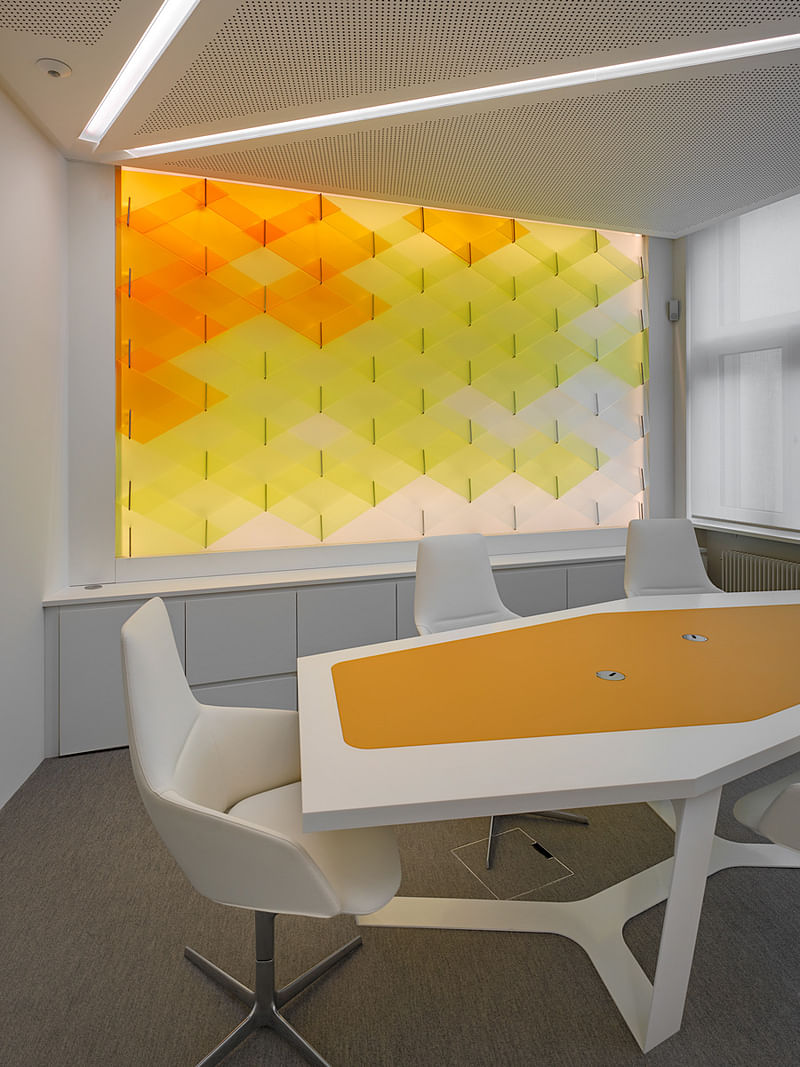
"The colored glass shingle walls are backlit with LEDs and thus provide a bright, warm atmosphere, particularly in the central customer zone. This luminous construction is inspired by the tradition of stained glass in Schaffhausen. The atmosphere is accentuated by the use of thin lines of light in the ceiling, which provide a general lighting with a high degree of comfort. The use of LED technology enables a sustainable approach to energy."
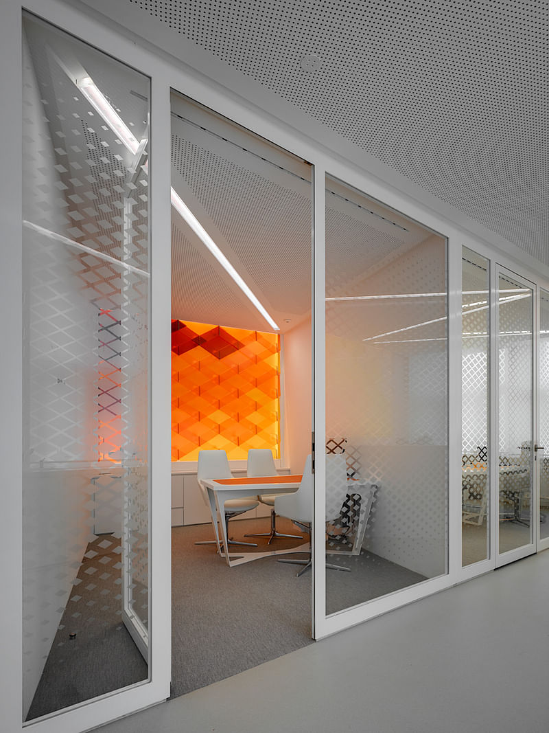
"In serene contrast to the colored glass panels, the floor and ceiling are finished with light, neutral colors. Diagonal lines provide rhythm to the ceiling surface and allow for the discrete integration of technical installations."
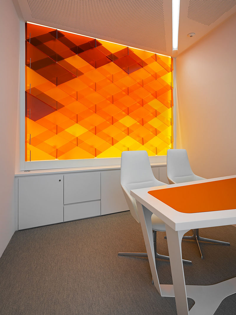
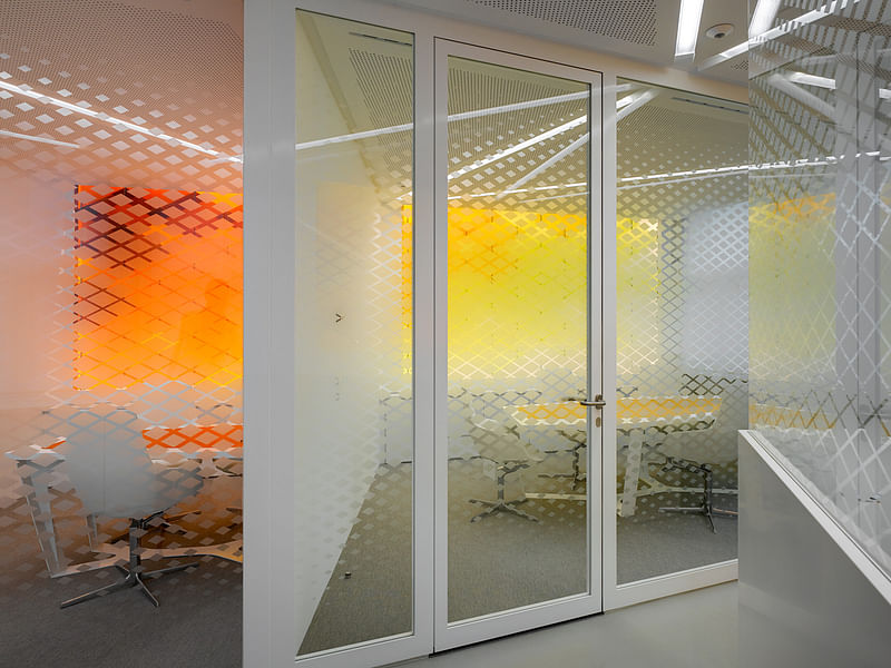
"As a continuation of the walls, the built-in furnishings such as the reception counter, kitchenette and information desk were fabricated out of glass combined with white Corian. Acoustic and discretion requirements were fulfilled with the installation of a highly absorptive acoustic ceiling as well as privacy film on various glass partitions. The overall design conveys the impression of transparency while providing the necessary discretion for personal banking consultations."
Click the thumbnails to see more design details and the floor plan.

Share
0 Comments
Comment as :