Winners of Warming Huts v.2015
By Bustler Editors|
Wednesday, Nov 26, 2014
Related
The Warming Huts competition is back with its 2015 edition! The blind jury sifted through over 100 submissions from around the world for this season's most creative warming huts. The top three winning designs will be constructed at the Red River Mutual Rivertrail in Winnipeg in Manitoba, Canada.
This year's competition awarded two Shelter category winners and one Installation winner. The 2015 Warming Huts additions included one from a separate University of Manitoba competition and another invited selection from Rojkind Arquitectos of Mexico. Last but not least, another hut design will become a class project for Kelvin High School’s drafting program.
Have a look at them below.
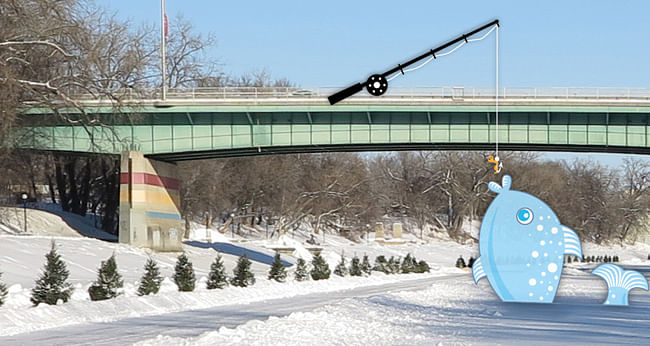
SHELTER WINNER: This Big by Tina Soli & Luca Roncoroni from Dorebak Akershus, NORWAY
Project description: "Eric drills a small hole in the ice. He unfolds his chair and sits down. He pours a cup of hot coffee, and he sinks a bait in the deep, dark water. He waits. He drinks some more coffee. He waits. Finally, Eric gets a fish so big that it doesn’t make it through the hole. He cuts the line and he goes home with a story to tell … 'It was this big!'
The story is a good one, the fish gets bigger by the day, and the myth grows. Somebody is impressed, somebody is curious, somebody is laughing. But one day the fish wants to tell the story itself, the fish wants its 15 minutes of fame … That day is today. No more story telling. No more myth.
THIS BIG is the connection between two worlds: under and over the ice. We could say it is a 'semantic installation' or a 'social anthropological statement', but it is actually an ice sculpture, a big toy."
SHELTER WINNER: "The Hole Idea by Weiss Architecture & Urbanism Limited from Toronto, CANADA
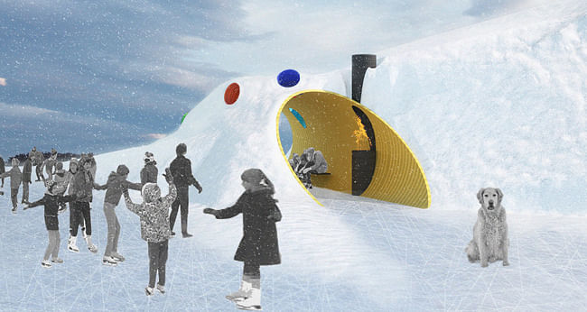
Project description: "The portable hole - first developed by Prof. Calvin Q. Calculus in the 1955 Looney Tunes animation, “The Hole Thing” and later sold by the Acme Company - has a troubled history. Almost right from inception, the ominous, mobile void was put to use for evil purposes - first as an effective enabler for a vicious crime spree and later as a means to capture the American desert fowl Geococcyx californianus or as it is commonly known as, “the Roadrunner”. It is important to note that the later use always ended up with the direct opposite result than that of the intended; which is likely why the portable hole is no longer commercially available.
This proposal takes as a starting point the portable hole, and by utilizing modern paint technologies, adds color. The resultant 1’-6” diameter holes - which can be located anywhere along the snowy banks of the Assiniboine or Red River – are resistant to being co-opted by evil forces (including the greyness of soul-sucking foul weather) due to the sheer cheeriness of the palette of introduced color. Further, a large, bright and yellow 10’ diameter hole is horizontally located in a 35’ long snow drift and provides skaters a warm and sheltering burrow in the snowy river bank. Since they have an inside and outside, the holes also furnish the shelter with an abundance of light and sky views."
INSTALLATION WINNER: Recycling Words by KANVA, from Montreal, CANADA
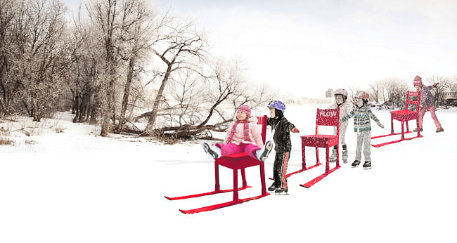
Project description: "Recycling Words is an interactive art installation that assembles everyday objects and words to create a playful river narrative. Drawing reference to the physical and vocal exchanges that historically flocked the Red and Assiniboine rivers on canoe, Recycling Words offers a new cultural and social means of gathering along the Red River Mutual Trail. The installation is composed of fifty recycled chairs and fifty pairs of recycled skis that are fastened together using metal connectors. Each unit is painted neon-pink and stenciled with a unique word along its back. Diffused across the length of the Red River Mutual Trail, Recycling Words creates a visual explosion and recognizable marker for the various access points of the Assiniboine and Red rivers.
The chair-ski combo invites the user to push, pull, sit or glide in tandem or solo, while also setting into motion other chair activities such as musical chairs, or learning how to skate. The fifty words assigned to each chair will be mindfully selected by a local art historian to enable users to physically construct improvised phrases or reconstruct narratives or memories of Winnipeg based on the infamous fridge magnet game. Using words and materials of the place, Recycling Words offers a sustainable art installation that allows users to reconstruct old stories and make new memories along Winnipeg’s Red River Mutual Trail this winter. KANVA looks forward to the opportunity of participating in this collaborative endeavor."
WARMING HUT ADDITIONS:
Mirror Cloaking by University of Manitoba from Winnipeg, CANADA
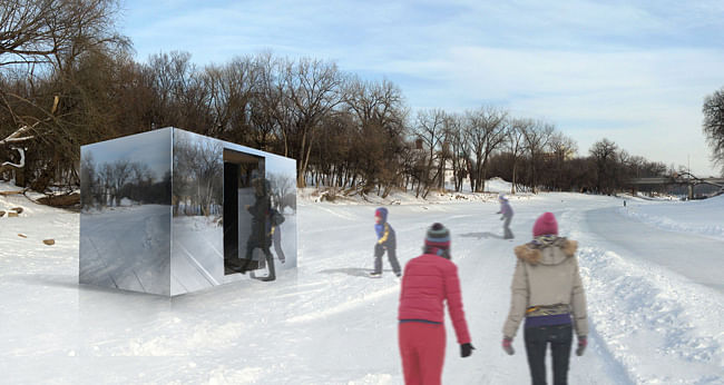
Project description: "Using the concept of one-way mirrors and polished stainless steel panels to create a mirror box, skaters will perceive the warming hut as part of the winter landscape, yet closer inspection will find that the hut appears to reflect the surrounding. As skaters walk into the hut they realize that the one-way mirrors provide the precious scenery of winter. The design plays with the idea that the enclosed structure become transparent and visitors can still find warmth within an 'open' space."
RAW:almond from Winnipeg, CANADA
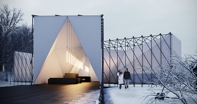
Project description: " The design creates an expressive frame that floats across the ice like a frozen jetty, whilst providing a dining experience that is clear from structure. The exterior and interior are expressed as separate forms, one enclosed inside the other. The structure references the bridge with its repetitive rhythms. The skin that defines the interior space is more sculptural like drifts of snow. The plan is made up of two clashing geometries inspired by the joining of the rivers. This grounds it in the context and defines dining, kitchen and entrance spaces. Our approach was to develop a simple repetitive frame using standard scaffolding elements to create an elegant structure.
The structure comprises of square frames repeated at close centres. These are cross braced to provide stability and give the structure its distinct chevrons. The simplicity of the structure allows for minimal joint variations resulting in an installation system that is quick and easy. The structure is expressed externally to allow that interior space to be clean and free of visual clutter. The external frame also gives depth to the architecture by creating shadows across the façades during the short days. The structure sits above the ice and the decked floor projects out of the restaurant towards the river bank to define an entrance. The entrance façade is presented as a white square containing a glowing triangle. This serves as a metaphor for the restaurant as a warm space within a cold form. Once the diners have entered a fabric curtain descends completing the white square and retaining the heat inside.
The interior space is enclosed by a white fabric skin fixed in tension to the inside of the frame. The fixing method creates a folded space that is completely different from the external experience. This produces a space that is a surprise to the diner and offers a sense of escape. The skin pinches and expands creating areas within the space that are both private and communal. The folds gradually reveal these areas as the diner moves through the restaurant. The entrance lobby acts as a buffer from the outside and provides a place to wait. It gives the opportunity for daytime events without disrupting preparations for service. The bar then opens into the first dining area where the two geometries cross. This reveals the kitchen to the right and a more private dining space to the left. A third dining area is created at the end of the main axis which terminates the vista. The kitchen is placed within its own wing to allow for clear movement around the space and separate access from the outside.
The space is lit by hanging luminaires specifically developed through a series of prototypes. The polished steel cylinders are the only reference to the external steel structure. They provide down light onto the tables and the perforations scatter spots of light onto the folded surfaces."
BY INVITATION: The Hybrid Hut by Rojkind Arquitectos from México D.F. MÉXICO
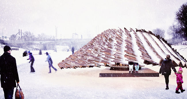
Project description: "Creating new hybrids through computer-aided design and traditional craftsmanship. With the evolution of technology in the industry, it puts into question the participation of artisans in the construction of the design space to the extent that the trades are disappearing. What is the use of contemporary technology if it can’t learn to grow with the processes already acquired by artisans and traditions? And how can an accomplished craftsman learn new process through technology? What is the role of the architect that has access to both scopes?"
6043 designed & constructed by Kelvin High School from Winnipeg, CANADA
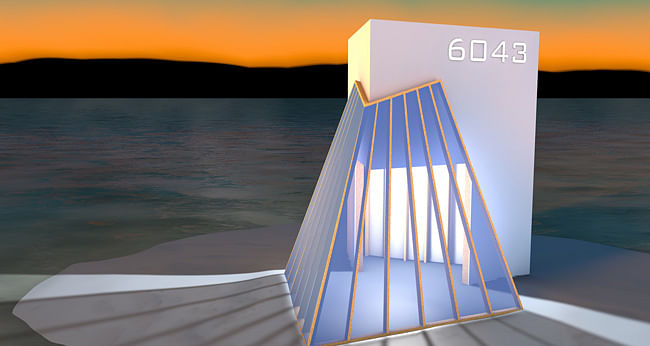
Project description: "The inspiration for this hut stems from two things; the iconic train at Assiniboine Park - CNR steam locomotive No. 6043 and the tradition of riding the rails during the great depression. During that time people used to hitch rides on trains and travel for free all around the country. When users sit in the hut they will experience a similar viewpoint to those people riding the rails, looking out past the grill with tracks laid out in front of them. The structure itself is quite simple. Five monolithic faces intersect to create a well-protected meeting place. Users, young and old, will find the space both playful and reminiscent of days gone by."

Share
0 Comments
Comment as :