Taichung City Cultural Center Entry by Tom Wiscombe Design
By Bustler Editors|
Monday, Jul 15, 2013
Related
We keep receiving a steady stream of design entries to the Taichung City Cultural Center competition in Taiwan (previously on Bustler), some of which we have already been able to publish. Today's entry was designed by LA-based studio Tom Wiscombe Design.
Project Description from the Architects:
Urban and Architectural Concept
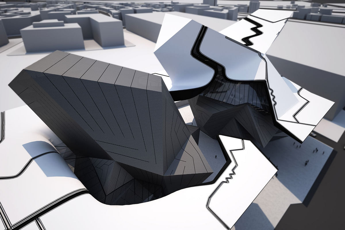
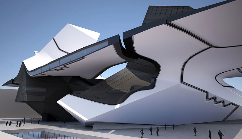
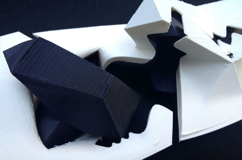
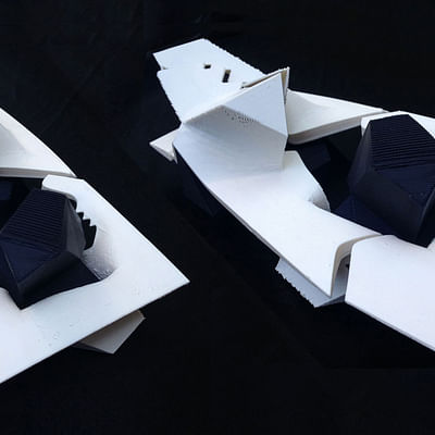
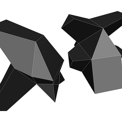
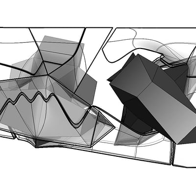
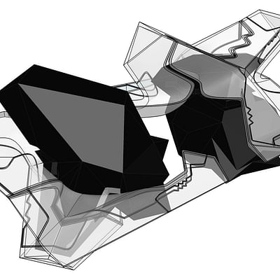
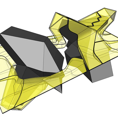
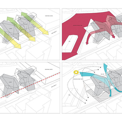
This proposal seeks to create a cultural space which is simultaneously a destination and a gateway. By dividing the program into two distinct Figures, rather than a monolithic subdivided block, we allow for a visual and physical connection between the city to the north and Gateway Park to the south. The different character and silhouette of each Figure, along with their verticality, creates visually arresting interstitial spaces and views of city and nature.
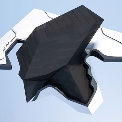
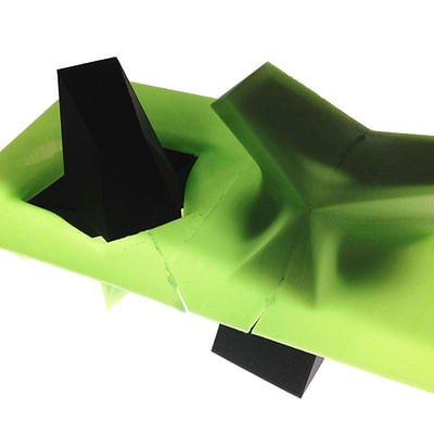
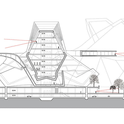
A third object, the Canopy, connects the two Figures without fusing them into a homogeneous mass. The Museum Figure squishes up into the Canopy, while the Library Figure squishes down into the Canopy from above, creating mysterious elastic formal effects and complex sectional spaces. Despite these local deformations, the cornice height of the Canopy remains at 30M., which is the projected height of the convention center to the north, and also the height limit of the park side setback. This datum creates visual continuity with the urban corridor, helping to avoid the sense of detachment often associated with iconic buildings.
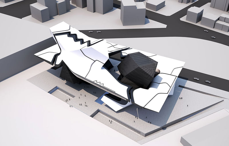
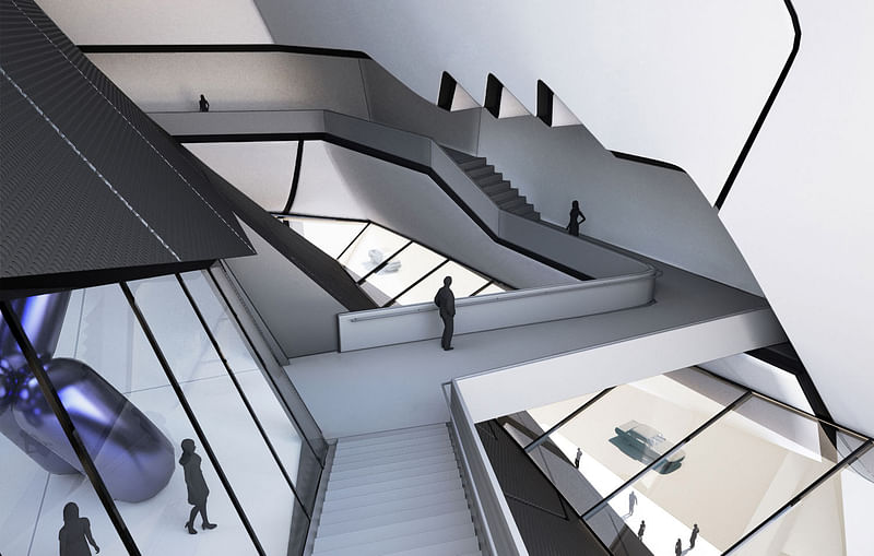
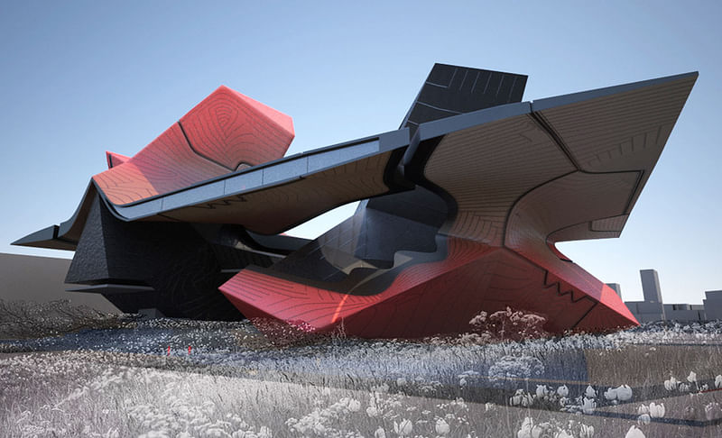
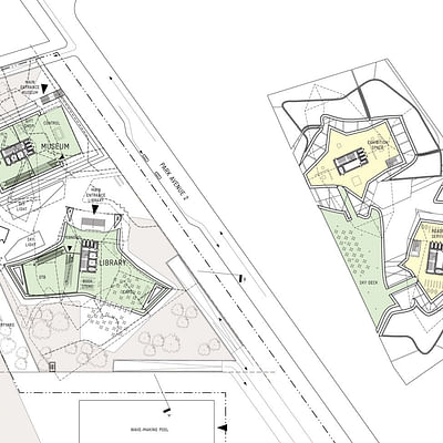
The Canopy varies in thickness from razor-thin to thick to allow for structural depth as well as inhabitable spaces. A Sky Deck is located inside the thickest area, connecting the Museum and Library at mid-level and allowing views out over Gateway Park. The design of the skin is influenced by the craft of stitching and seaming in fashion design, where joints are often employed for their visual figuration rather than simply to attach pieces of fabric together. The Canopy is broken down into a patchwork of super-joints which are sometimes real and sometimes fake. Super-joints sometimes track with underlying geometry and sometimes ignore it. The result is a chunky, varied tapestry rather than a relentless panelization aesthetic.
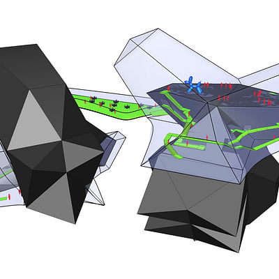
By pushing much of the building program into the ground, and lifting the rest up into the Figures and the Canopy, we are able to open up the ground and allow Gateway Park to flow into the site. This loosely bounded space is a sanctuary, featuring green space as well as protection from sun and rain in the harsh tropical environment of Taichung. This sanctuary can be shared by both buildings to host cultural events such as festivals, art markets, and book fairs.
Building Organization
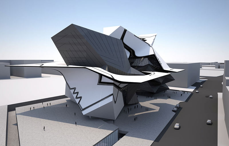
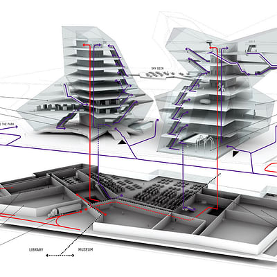
The reading areas and book stacks of the Library, as well as its entry lobby and amenities are all located in the Library Figure above ground to the south. Functions such as meeting rooms, studios, administration, and technical back-of-house services are located directly beneath with visual connection to the functions above. Daylight is provided for underground functions when required through courtyards and skylights. Elevator and escalator circulation is provided for all levels. The space between the Canopy and Library Figure is a loose-fit interstitial space that allows for ground level public space and reader services. Because the Library Figure is actually (topologically speaking) on top of the Canopy, there is significant day-lighting available from all sides for reading spaces.
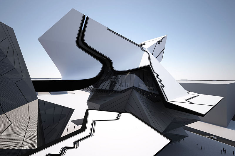
Exhibition, education, and research spaces of the Museum are located above ground in the Museum Figure to the north. Functions such as the theater, art storage and preparation areas, and administration are all located below ground with daylight provided where required through courtyards and skylights. Elevators and escalators connect all levels. The space between the Canopy and the Museum Figure is a loose-fit interstitial space that allows for secondary circulation and views down into the urban space below. Because the Museum Figure is underneath the Canopy, daylight exposure in the exhibition spaces can be controlled and minimized.
Delivery access to the building is removed from ground level and placed on the first underground level. A ramp and loading dock is provided which serves both buildings. A central corridor connects this dock to the freight elevators of each building. Other support functions are kept separate. The parking for both buildings is on the second underground level. Because it is all located on a single level, it allows for flexible allocation during peak use.
Cost Strategy
The program of the project is organized in such a way that approximately 55% of the floor area is built on the ground, using the most economical parking garage type construction. By economizing such a large part of the project, we are able to transfer resources into the superstructure. The Figures are constructed from all planar surfaces which allows for economical construction of structure and envelope. While the Canopy has complex surface geometry, it is primarily uninhabitable and permeable, and can therefore be realized using lighter weight structure and skin systems.
Structure and Construction
Reinforced concrete will be used in the underground parts of the project as well as for the cores of the Library and Museum. Flat slabs and an economical 7.5M column grid will be used in all underground spaces. Excavated soil will be re-used in the Gateway Park topography design. The superstructure of the Library and Museum Figures will be built of steel frame and composite deck attached to the concrete cores for lateral stability. The Canopy will be constructed from full height two-way trusses at 5M intervals, which will allow for long column-free spans and keep steel weight to a minimum. The only inhabitable area of the Canopy is the Sky Deck, located between the Figures, which acts as a structural diaphragm for overall building stability.
The envelope of the Figures will be made of large composite units to avoid unintended panel joints as much as possible. Glazed areas will be kept to below 35% in east and west facades and low-e glass is proposed. The Canopy will be clad in composite panels with open joints in order to minimize wind and rain loads on the structure.
Energy Concept
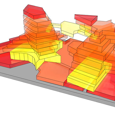
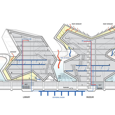
The Canopy is designed to open the Library up to daylight and shield the Museum from daylight. This way the building is self-shading and particular day-lighting needs are met architecturally at the front-end rather than technically at the back-end. The spaces where the Canopy forms around the Figures are thermal and visual buffer zones, mediating the outside environment. The light colors of the Canopy give it a high albedo, reducing solar gain. The green spaces at ground level also reduce solar gain on site. Together, these measures create a breezy, pleasant microclimate in the surrounding urban spaces.
In addition, the freeform patterns of seams on the Canopy collect rainwater for a building-wide grey water recycling system. These channels are also embedded with a solar thermal hot-water heating system to provide the building complex with all hot water needs.
The internal spaces of the Library and Museum buildings will have conventional air conditional displacement ventilation systems to assure tight temperature and humidity control. However, a chilled floor and ceiling system is also proposed, using chilled water provided by geothermal heat pumps. Heat-exchange devices will be used throughout the building service system to reclaim energy.
Find more diagrams and plans in the image gallery below.

Share
0 Comments
Comment as :