Winners of the Emirates Glass LEAF Awards 2010
By Bustler Editors|
Thursday, Sep 16, 2010
Related
The winners of the seventh annual Emirates Glass LEAF Awards have been announced. The award panel was looking for strategic excellence, marketplace impact, innovation and practical developments that challenge and change the way we evaluate the buildings of today.
Previous overall winners include 2009 winner Qatar Science and Technology Park, Woods Bagot, Qatar, Performers’ House, Schmidt Hammer Lassen Architects, Denmark in 2008, ARB Bank Headquarters, Riyadh, Saudi Arabia, the America’s Cup Foredeck Building in Valencia in 2007, Spain by David Chipperfield Architects and b720 Arquitecos in 2006.
Overall Winner: Boogertman + Partners, Soccer City National Stadium – “The Melting Pot”, Johannesburg, South Africa
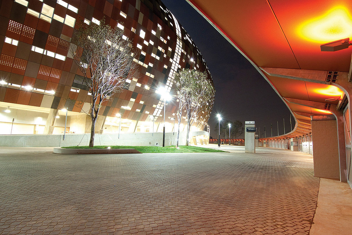
The architecture of Soccer City represents a regional approach designed to integrate the urban context of Johannesburg, its society, the historical mining industry and African culture as a whole. The main form, inspired by the traditional African calabash, results in a stadium form that is immediately recognisable as being African. This form is used as a layering device and it enables an overall spherical form to emerge influencing the spatial quality of the intermediate spaces between the exterior skin and that of the seating bowl.
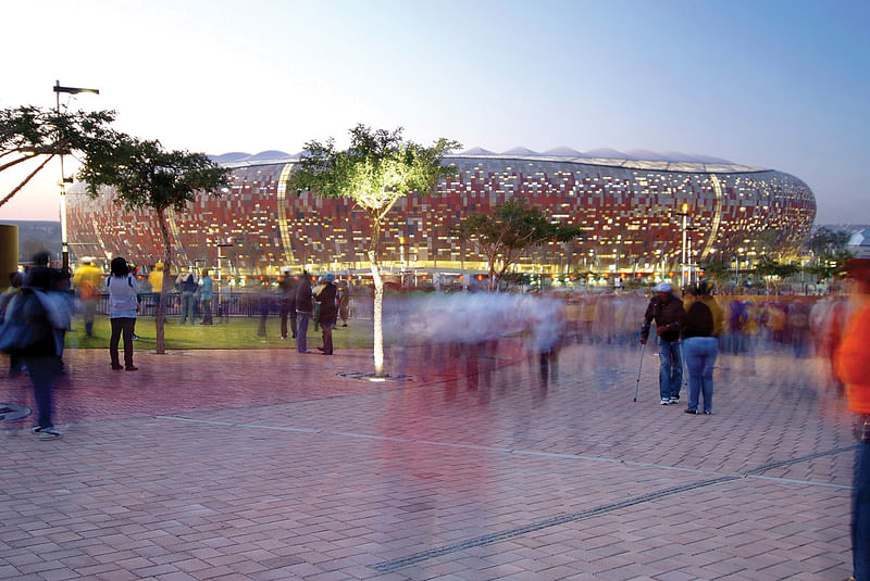
The layered façade results from an overlay of several ordering devices and patterning ideas and is alternatively made up of open or glazed panels, and fibre-reinforced concrete panels, in eight colours and two different textures. Ten vertical façade slots are aligned geographically with the nine other South African 2010 stadia, as well as the Berlin Stadium. These represent the road to the final, and it is envisaged that after the World Cup, the scores of each game at each venue will be placed in pre-cast concrete panels on the podium.
During the day, the gradations of colour represent the African earth, gradually fading to the upper reaches of the stadium where the lighter colours are representative of the mine dumps and the mining history. At night, the pattern inverts as a reminder of the history of pattern making and its significance within African culture.
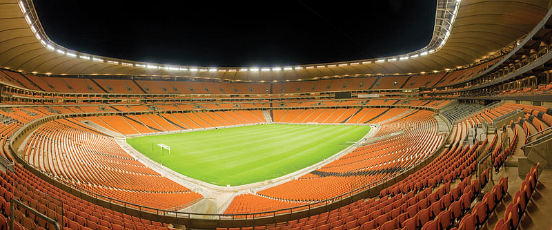
The stadium is made up of three tiers – the lower embankment, upper embankment, two skybox or suite levels, and the upper tier. The lower embankment and the upper embankment are accessed off the main lower concourse. The skybox levels and the upper tier are accessed via the eight three-dimensional ramp structures built inside the façade of the calabash. The skyboxes are also accessed via a dedicated VIP entrance in each of the four corners of the stadium with access directly off the podium level. These entrances have lift and stair access up to the suite levels with reception and secondary turnstiles. The upper levels open up into business lounge facilities before access is gained to the secure skybox concourses.
The upper roof is viewed as an extension of the façade and is cantilevered from a triangular spatial ring truss covered by a PTFE membrane.
Mixed Use Building of the Year: Feilden Clegg Bradley Studios - Broadcasting Place, Leeds, UK
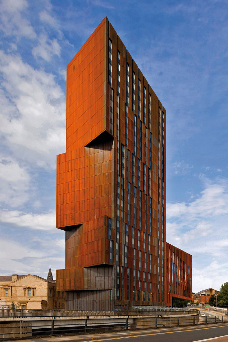
Broadcasting Place is a mixed-use development close to Leeds city centre. Conceived as a public/private partnership for property group Downing and Leeds Metropolitan University, it provides academic space and student residences in a landmark building rising to 23 storeys, and a new Baptist church. The brief for the project was developed as a combination of three primary uses on the site – academic accommodation providing facilities for 250 staff and 1,500 students, 240 student residential units and a church.
The scheme provides 110,000ft² of teaching and office space for the cultural studies; social science; architecture, landscape and design; and contemporary arts and graphics departments.
Broadcasting Place consists of two main structures that wrap around the existing buildings and scale up towards the north-eastern edge of the site. The buildings are conceived as a solid landscape forms that draw on Yorkshire’s rich geological and sculptural heritage. The strong roof pitch is reflected in the massing of the buildings, which have sharp triangular corners and angular cantilevered projections.
This design intent is reinforced by the selection of Corten steel as a solid, sculptural and weathering material, constructed as a rain-screen façade. The Corten panels have oxidised down to a rich orange/brown colour over a period of about three months. The curtain walling/window system has been designed based on a series of repeated modules set back from the steel face. The dark grey colour of the glass and frames further emphasises the eroded, cascading form of the steel panels.
A key element in the design of the buildings is the irregular elevations that have been tailored to optimise daylight and reduce solar penetration. The proportions of the glazed façade have been derived using software to calculate the optimum quantity and distribution of glazing/shading at all points on the façade in order to ensure high levels of natural daylight without overheating. The computational analysis was undertaken using Excel, a VBA programme and a stand-alone programme to analyse the compiled renderings.
As a restorative ecology, the Horizontal Skyscraper/ Vanke Centre landscape works to maintain native ecosystems, minimise run-off, erosion, and environmental damage associated with conventional modes of development. The raised nature of the building allows for a unique scheme of ecosystem restoration; of the 60,000m² site, 28,000m² are left unbuilt. With the addition of the planted roof area of the main building (approximately 15,000m²), the total planted area of the project is roughly equal to the site before development. By lifting the building off the ground, the project is both a building and a landscape, a delicate intertwining of sophisticated engineering and the natural environment.
Residential Building of the Year (Single Occupancy): Mount Fuji Architects Studio - PLUS, Shizuoka, Japan
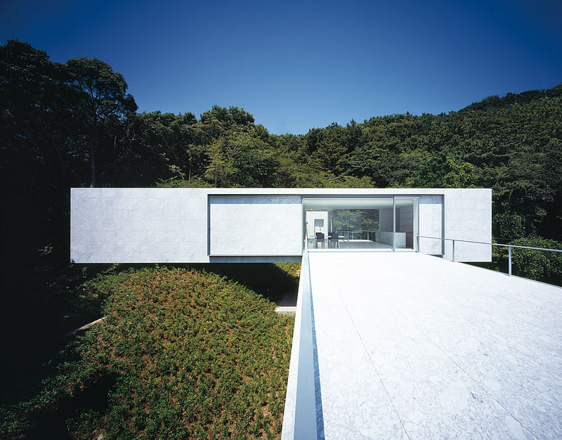
PLUS is located on the side of the Izu-san mountain in Japan, with views of the Pacific Ocean to the south. The untouched wilderness, covered with deciduous broad-leaved trees including cherry trees and Japanese oaks doesn’t leave much room for construction, but there remained a little architectural possibility along the ridge to create a weekend villa.
The building was created by crossing two rectangular parallelepipeds at right angles. The lower mass contains private rooms and a bathroom, and sticks out onto existing level ground. The upper one incorporates a salon and kitchen, and lies across the lower building and the mountain ridge.
One axis of the cross-shaped building stretches toward the Pacific Ocean in the south, while a forest of Japanese oak and white birch is located to the west. Water-polished white marble was chosen as the interior finishing material as it glows softly, like Greek sculptures, to blend blue light from the south and green light from the west gradationally, creating a delicate continuous landscape of light that suggests the character and usage of the space. The exterior is also finished with white marble, its surface gets smoother as it approaches the southern/western end of the build, until it takes on a mirrored gloss at the end.
Residential Building of the Year (Multiple Occupancy): Henning Larsen Architects - The Wave, Vejle, Denmark
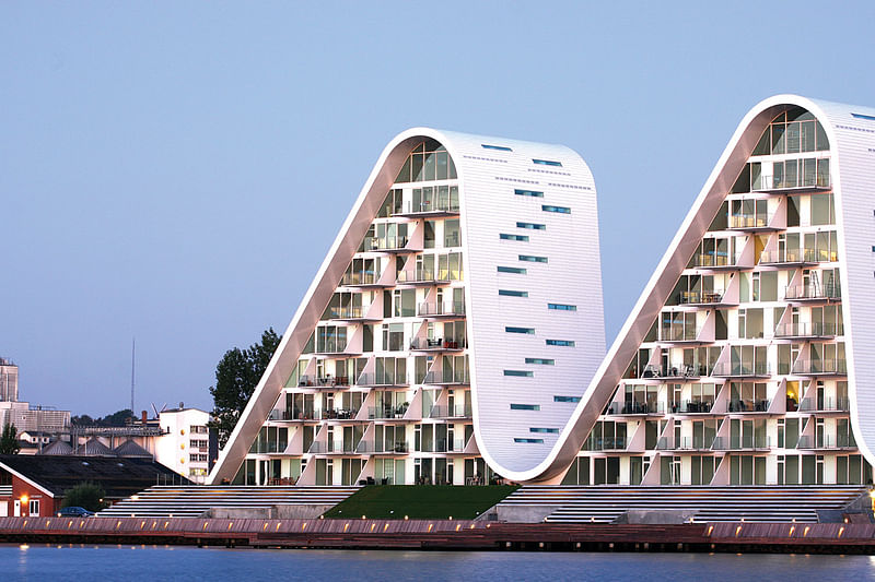
The Wave is a landmark project that is part of the recent proliferation of architectural innovation in Vejle, Denmark. The multiple-occupancy development is located in Skyttehusbugten, directly adjacent to the Vejle Fjord
The Wave covers a total area of 14,000m². It incorporates 140 apartments distributed through nine levels – all in close proximity to the Vejle shoreline. Many apartments occupy two levels and all overlook the Vejle city promenade. The Wave’s exterior is encased in durable porcelain tiles to effectively reject debris and all apartments include access to balconies approximately 2.5m in depth. The housing development includes a ground-level cafe 100m from the Vejle marina.
The complex is located within close proximity to golf resorts, shopping areas and forested terrain. No restrictions on residency requirements exist for the project, granting individuals of any nationality entitlement to an apartment.
The Wave embodies a distinctive and highly recognisable visual form. Its shape consists of a rippling pattern of arcs, with an exterior that appears organic and highly sculptural and it formulates a coherent connection between the waterline and cityscape. The Wave playfully challenges the traditional Vejle skyline with its undeniably bold modernity. In daylight, the white structural silhouette is delicately reflected upon the shoreline, and at night, the characteristic profile resembles vividly illuminated undulating mountains.
The Wave represents a young development, with an ambient aura with high degree of transparency, natural light and inhabitable outdoor spaces.
Commercial Building of the Year: HASSELL and Lend Lease design - ANZ Centre, Melbourne, Australia
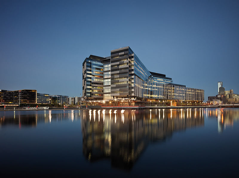
ANZ Centre is one of the most open and permeable banking headquarters in the world. This “urban campus” houses 6,500 people – as many as a small town – within the largest single-tenanted commercial office building in Australia. Incorporating a raft of first-time green initiatives, the building is also a global environmental and social sustainability benchmark.
Located in Melbourne’s Docklands, the building’s fluid forms are inspired by its riverside setting and the external colour palette is derived from nature, ranging from earthy tones at ground level to light blue sky hues on the upper levels. The materials and detailing of the building architecture reflect Melbourne’s urban character. Recycled timber cladding provides a link to the maritime past of the precinct and a green wall along the eastern elevation links the building to Docklands Park.
Despite its large scale, ANZ Centre provides an opportunity to make small-scale engagements with its local community. The building form steps down to engage with the waterfront and operates as a permeable extension of the existing urban precinct. Large floors at lower levels and smaller floors at upper levels allow for a changing floor-to-floor character within the building.
The urban campus design concept focuses around a central publicly accessible daylight-flooded “common”. The scale and complexity of the space allows it to operate like a microcosm of the city itself – with plazas, laneways, streets and formal and informal meeting places. Cafes, public art, a visitor centre and community event spaces all contribute to creating a lively community hub. Bluestone paving on the common echoes Melbourne’s famous bluestone paved laneways and further helps to bring the city’s public realm into the interior.
The inclusion of the permeable public common within the workplace brings stakeholders, shareholders and the community into the heart of the organisation. This demonstrates a bold new direction for a banking institution seeking to balance the competing need for security and transparency.
Awarded a 6 Star Green Star Office Design rating from the Green Building Council of Australia, the building’s innovative carbon reduction strategies include: underfloor air distribution (UFAD); river cooling; and a tri-generation system that comprises four natural gas-fired reciprocating engines, a rooftop photovoltaic array and six vertical axis wind turbines. A comprehensive water management and recycling system is among other key green initiatives.
Public Building of the Year: Boogertman + Partners - Soccer City National Stadium – “The Melting Pot”, Johannesburg, South Africa
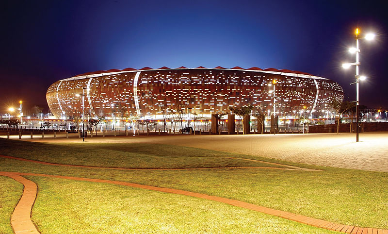
For project description, see above.
International Interior Design Award: Isay Weinfeld Arquitetura - Bar Número, São Paulo, Brazil
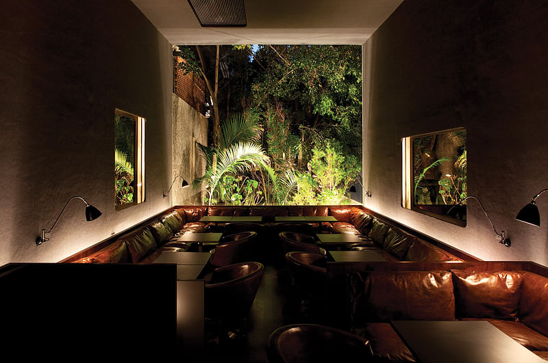
Bar Número was built on a very narrow, long strip of land in the Jardins area of São Paulo in Brazil. A walkway runs from the street through a tunnel-like mirrored hallway, which leads to the main hall.
The ceiling is extremely low at the entrance, meaning that the view of the hall, which cascades away from you, is unimpeded. Progressing towards the rear, the height gradually increases: the descending ground levels feature comfortable lounging areas under a ceiling that extends as a continually rising surface.The low and indirect lighting throughout creates a pleasant and cozy atmosphere, perfect for a relaxing drink with friends at the end of the day, accompanied by the sound of good music.
A room reserved for private functions takes up the lower floor, which features a low ceiling, with couches placed down the central axis of the room, and built-in overhead lighting throughout. The walls are completely covered by antique posters and poster fragments.The façade is completely covered in numbered wooden blocks – laser-cut and resin-coated naval plywood – similar to those used in typography.
Master Planning & Landscaping: URBE Architects - Estoril Open Space Strategy, Santiago, Chile
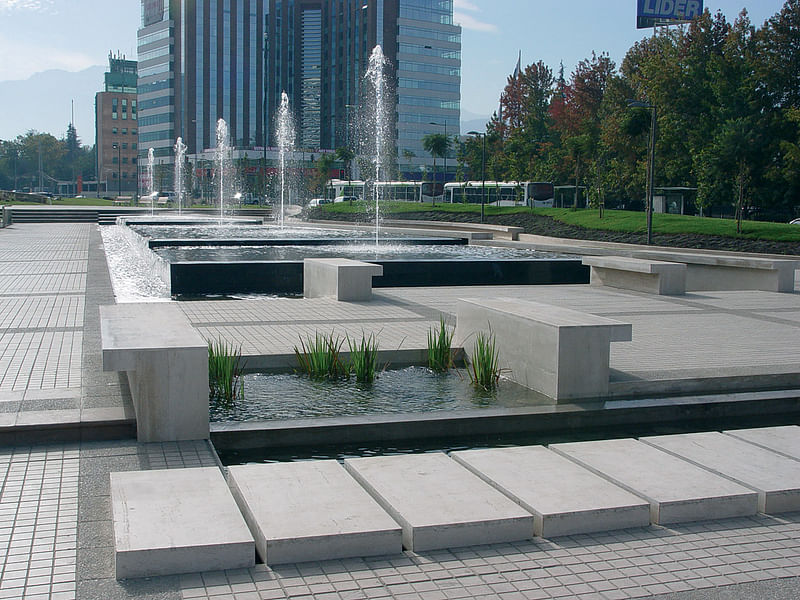
Since 1995, the city of Santiago has been criss-crossed by new highways under private concession models. Though necessary at the macro level they have destroyed the underlying texture of the city. The street pattern has been interrupted and most importantly communities broken in halves.
The Estoril Open Space Project has become a landmark initiative by local residents to prove that through strong citizen participation and specific design for specific neighbourhood needs, a community can be sewn together around open space without the cost of large scale planning and mega budgets like the Big Dig in Boston. Besides being one of the first urban projects to be put forward by local leadership in Chile, it also had the merit of being conceived and implemented while the highway was already in its final stages of construction.
This open space-bridge project became a beacon for local residents that wanted to improve the quality of the city following large infrastructure being introduced. It was also responsible for letting the communities speak and oppose elevated and uncovered highways. Specifically, the Estoril project inhibited the elevated segments originally planned for the highway.
The first section at Estoril, part of the Costanera Norte Highway project, consists of two plazas. Estoril Plaza is an urban environment that replicates the mountain streams that end in the valley given the spectacular views to the Andes mountains. Incluyes also the bus stops and a future community cafe-library as an anchor to attract visitors and assure late time security. The other plaza, Las Condes, is designed to serve as a family gathering and serves as bridge between the residential areas and the services, retail, schools and the church district. It offers relaxation areas and childrens play areas. The plazas protect themselves from surrounding traffic noise with berms, while at the same time allowing for larger trees to grow.
Young Architect: Arquitecturia - Ferreries Cultural Centre, Tortosa, Spain
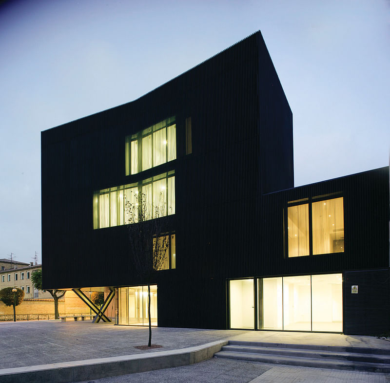
After falling into disuse for several years, the old local market of Ferreries has been restored and extended to become the neighbourhood’s new cultural centre.
The market’s old main nave is preserved, and through its extension, a new transition space is generated to enable the connection between the existing building and Joan Monclús Square. The old nave becomes part of the public space, intertwining its interior to the exterior through a new access.
The new dark façade, of accentuated shadows generated by the grooved texture of the material contrasts with the nave’s white interior, blended and homogeneous light and acoustics muffled by wood strips.
The Joan Monclús Square intervention provides the opportunity hold open-air activities related to the cultural centre.
Best Structural Design of the Year: Skidmore, Owings & Merrill LLP - Burj Khalifa Tower, Dubai, UAE
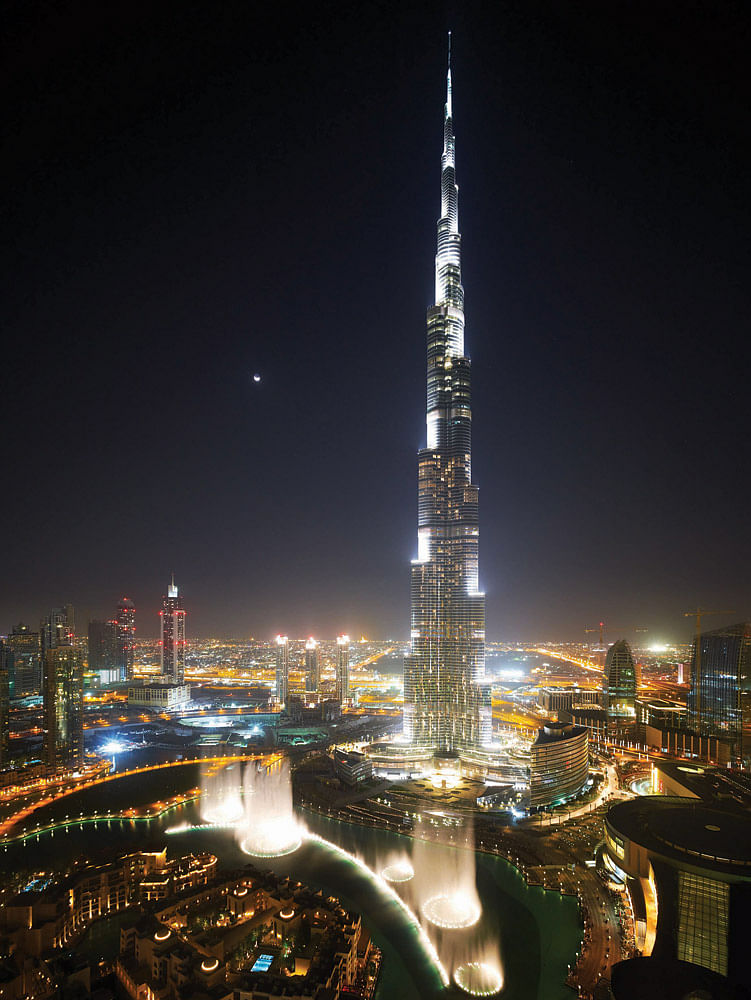
At 828m tall, the Burj Khalifa Tower is the world’s tallest building in all three categories defined by the Council on Tall Buildings and Urban Habitat.
It is the centrepiece of a $20-billion development located just outside of downtown Dubai. The project consists of the tower itself, as well as an adjacent podium structure, and separate six-storey office annex and two-storey pool annex. The 280,000m² reinforced concrete multiuse tower is predominantly for residential and office usage, but also contains retail and a Giorgio Armani Hotel.
The tri-axial, Y-shaped floorplan is formed by three separate wings connected to a central core; as the tower rises, one wing at each tier is set back in a spiralling pattern. In addition to its aesthetic and functional advantages, the spiralling Y-shaped plan reduces the wind forces acting on the tower, and as well as keeping the structure simple, it fosters constructability.
The structural system can be described as a buttressed core, and consists of high-performance reinforced concrete wall constructions. Each wing buttresses the others via a six-sided central core, or hexagonal hub. Corridor walls extend from the central core to near the
end of each wing, terminating in thickened hammer-head walls. Perimeter columns and flat-plate floor construction complete the system. At mechanical floors, outrigger walls are provided to link the perimeter columns to the interior wall system, allowing the perimeter columns to participate in the lateral load resistance of the structure; hence, all of the vertical concrete supports both gravity and lateral loads. The result is a tower that is extremely stiff laterally and torsionally. It is also very efficient in that the gravity load-resisting system has been utilised to maximise its use in resisting lateral loads.
The top of the tower consists of an approximately 230mtall structural steel spire, and the entire building is founded on a 3,700mm-thick reinforced concrete raft foundation, supported by 194 reinforced concrete bored piles that are 1,500mm in diameter and 43m in length. Wall reinforcement was prefabricated on the ground in 8m sections to allow for fast placement. A specialised GPS monitoring system was developed to monitor the verticality of the structure, due to the limitations of conventional surveying techniques.
The construction sequence had the central core and slabs being cast first, in three sections. The wing walls and slabs followed, and then the wing nose columns and slabs.
Best Sustainable Development: Ben Nakamura - Nanasawa Kibonooka Elementary School, Satoyama, Japan
NanasawaKibonooka Elementary School is located in Kanagawa Prefecture’s Satoyama area, a zone of forested foothills between the mountains and arable flat land.
It was intended that the site would operate as a selfcontained environmental cosmos, where building materials, energy, rainwater, greywater, and other waste materials would combine to create a micro-ecosystem, originating within the site and returning to it.
The design also aims to create a versatile educational space, while maintaining the character and biodiversity of Satoyama, and create environmental architecture sensitive to the area that makes the most of local microclimate.
Nanasawa Kibonooka is a small school of 120 pupils where children are encouraged to mingle beyond their own school year, fostering a sense of collaboration and solidarity all under one roof.
The plans were adjusted four times, left and right, to avoid tree felling and for symbiosis with the Satoyama landscape. Local materials are used for the wooden structural parts, fixtures and furnishings. Fresh air drawn in from the forest is circulated under the floor, heated in hot-cool underground pipes, and by a wood-chip biomass boiler, then converted into low-temperature radiation floor heating.
Rooms are ventilated by discharging air naturally using draft power of solar chimneys, while infiltration of rainwater, sewage is conducted within the compound, avoiding the prevalent dependence on region-wide energy supply and disposal systems. The completed building is an example of zero-carbon environmental architecture.
Due to government cost-cutting, infrastructure budgets will be decreased in urban fringe areas, and will be required to maintain their own services, such as water supply, drainage, waste disposal, roads and other infrastructure. This building offers a solution to this and also contributes to creating a low-carbon society for Japan.

Share
0 Comments
Comment as :