London's Design Museum wins 2018 European Museum of the Year Award
By Hope Daley|
Monday, May 14, 2018
Related
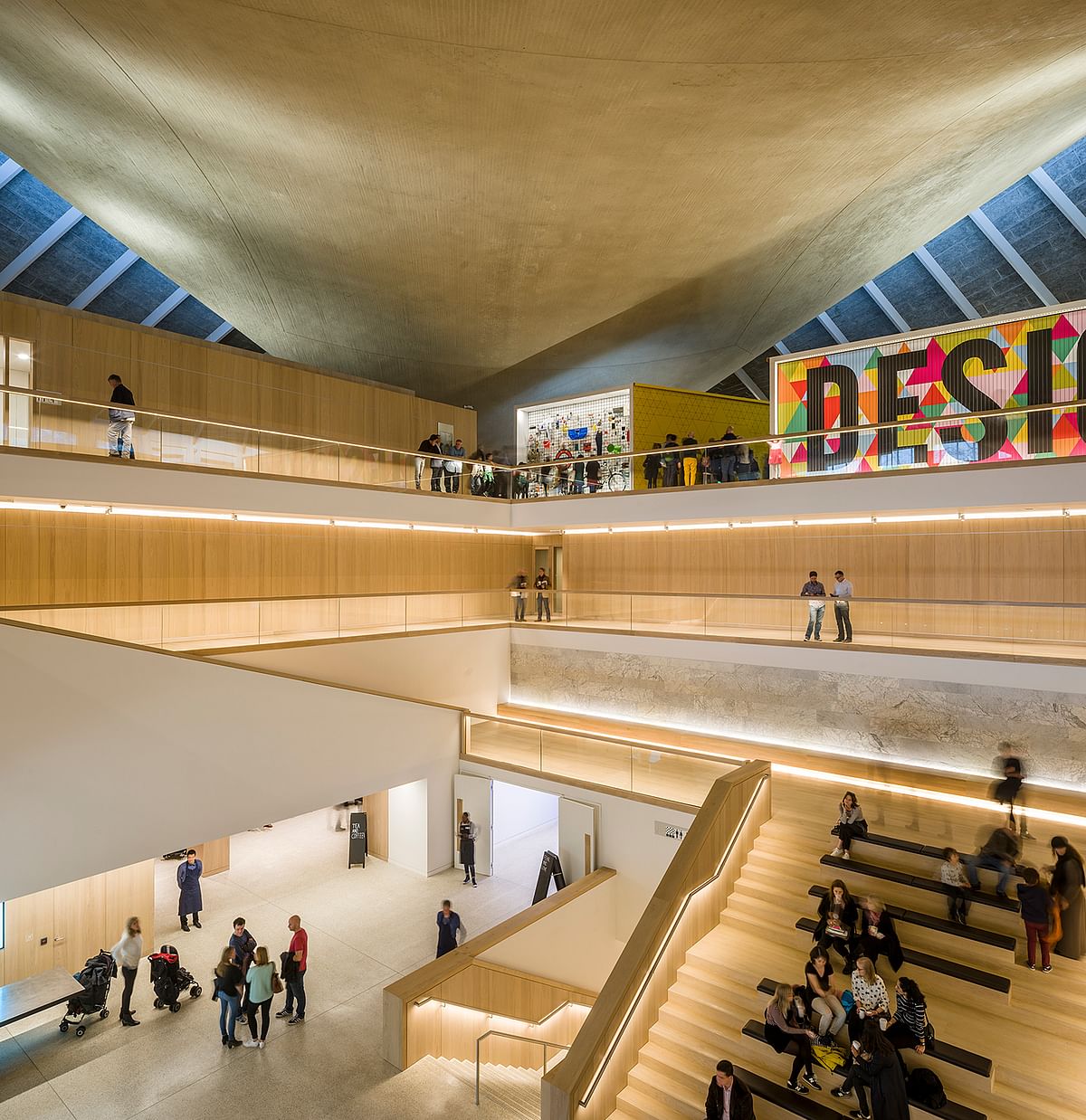
Through an interdisciplinary effort, the Design Museum's new building has been awarded the 2018 European Museum of the Year. In 2016 the museum moved to its new west London location, a 1960's modernist building renovated by John Pawson with work from a range of top studios such as OMA, Allies and Morrison, and Arup Architecture.
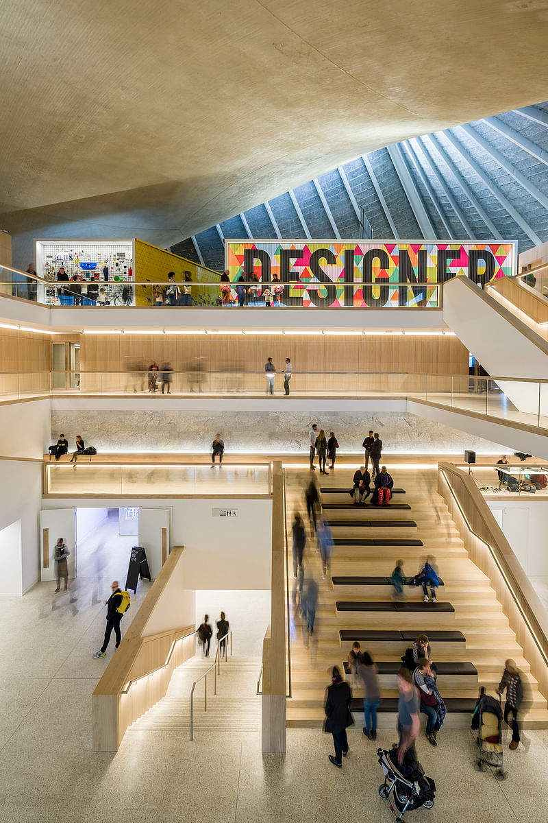
The new building allows for three times more space than its former location in Shad Thames London and includes two major temporary gallery spaces, a free permanent collection display, a restaurant overlooking Holland Park, an auditorium, studios, a library, an archive, and new learning facilities.
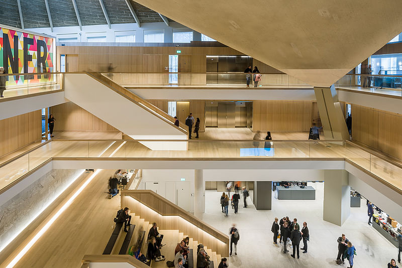
In 1989 the Design Museum first opened in a former banana ripening warehouse on Shad Thames, following its successful origins in the V&A's basement. Now the museum's expansive building revolves around a central atrium with striking views up to the iconic hyperbolic paraboloid roof.
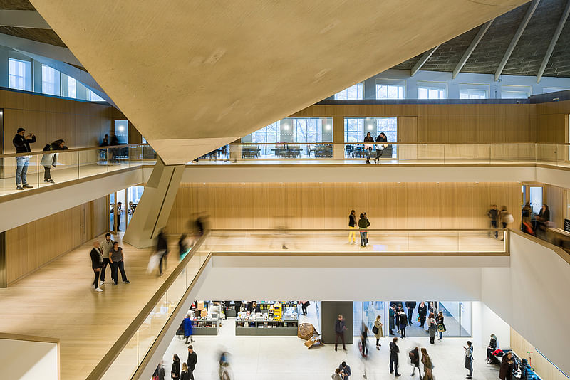
This concrete roof spans the length of the building, rising on the two opposing corners to create a manta ray-like structure above. Event spaces and a shop are arranged around the main atrium, with a 200-seat auditorium in the basement for public programs and lectures.
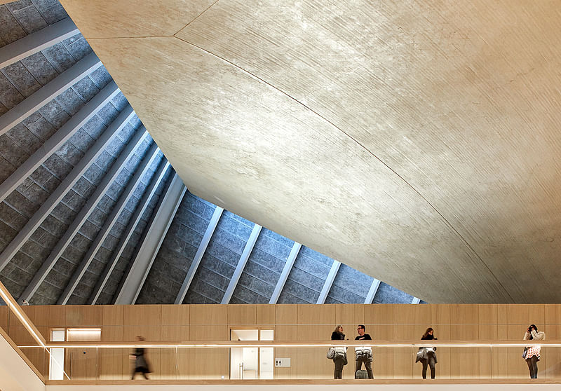
Over a five-year construction process, the structure has been transformed into one of the world’s leading institutions dedicated to contemporary design and architecture. OMA, Allies and Morrison, and Arup have restored the building’s spectacular concrete roof and distinctive facade.
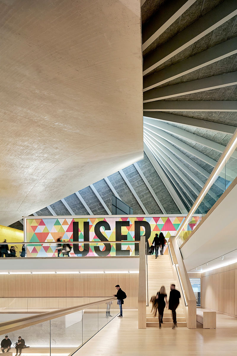
Remodeling the interior, John Pawson has created a series of spaces ordered around an oak-lined atrium, incorporating key elements from the original structure.
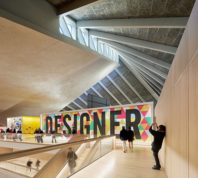
The Design Museum also boasts a permanent collection display designed by Studio Myerscough, a restaurant and members’ room by Universal Design Studio, a Centre for Learning made possible by the Swarovski Foundation, flooring by Dinesen, furniture by Vitra, shelving by Vitsoe, lighting by Concord, a visual identity by Studio Fernando Gutierrez and way-finding by Cartlidge Levene.
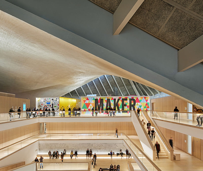
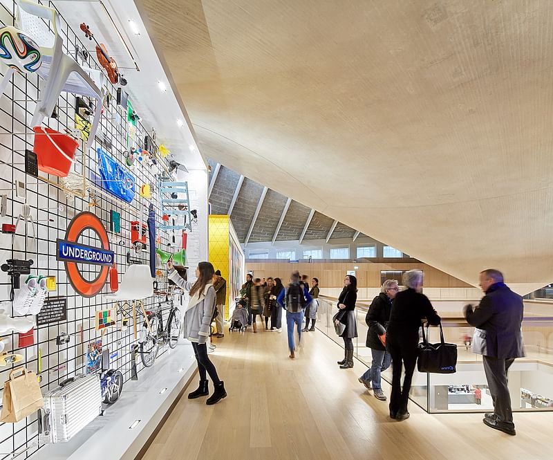
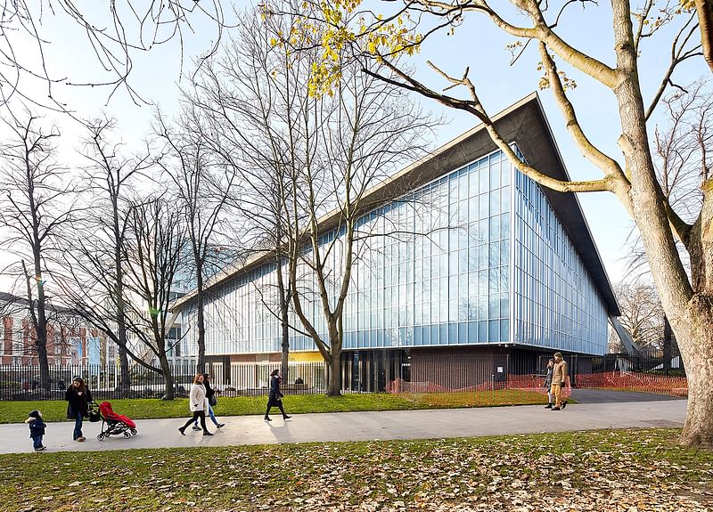
Through new engineering techniques, the original concrete floors were removed – a process that entailed propping the roof on a temporary steel structure about 65 feet above the ground. The original façade has been replaced with a double glazed skin, significantly improving insulation standards and allowing daylight into the interior.
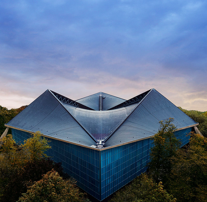
The new exterior has been detailed to resemble the original blue skin of the building, with matching mullions and a fritted pattern of printed dots.
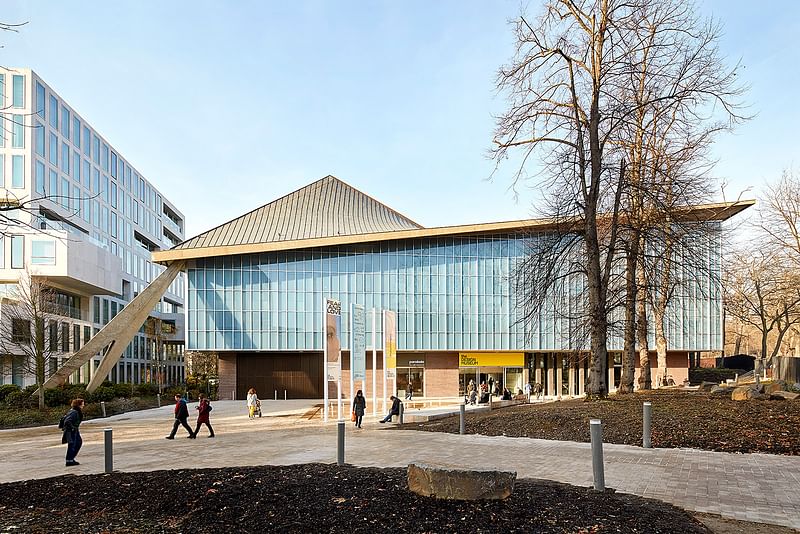
A new public plaza complete with fountains has been installed at the entrance to the museum, within a landscape designed by West 8.

RELATED NEWS Redevelopment competition of Montréal's contemporary art museum presents winning and finalist projects


Share
1 Comment
adora · May 15, 18 4:01 PM
In the lady's room, the hooks at the back of the partial doors are just 1" wide round discs 3/4" in depth. It's impossible to use. You can hear everyone talking about it in the bathroom, outside the bathroom, in the cafe... "For a design museum, they have very bad design."
It might not seem important. But I don't even remember the exhibits, all I can remember was having to manage my stuff on the toilet.
Maybe this is another one of those men's design that didn't take women into account. We carry a lot of stuff because there are no pockets on our clothes. So we need hooks in the bathroom for our stuff.
Comment as :