Michael Graves, Joey Shimoda & others Honored at 34th Annual Interiors Awards
By Bustler Editors|
Monday, Jan 28, 2013
Related
The winners of the 34th Annual Interiors Awards, presented by Contract magazine, have been unveiled. Besides the top entries in each of 13 project categories, ranging from large and small offices to public space and adaptive re-use, the jury also chose LA-based architect and designer Joey Shimoda as recipient of the 2013 Designer of the Year Award. The 2013 Legend Award was bestowed upon Michael Graves.
Joey Shimoda: Contract magazine's 2013 Designer of the Year from Contract Magazine on Vimeo.
Following are the winners of the individual project categories.
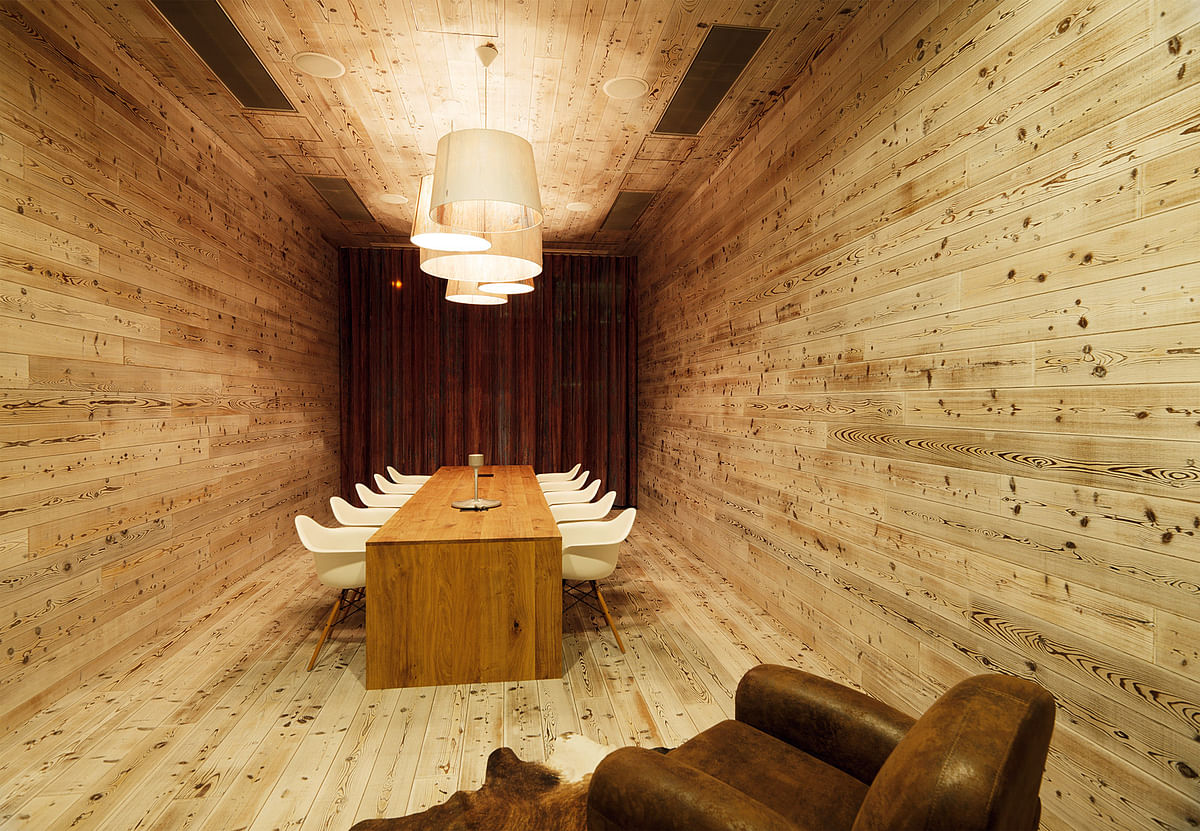
LARGE OFFICE: Microsoft Vienna by INNOCAD
Vienna, Austria
Microsoft's Austrian headquarters in Vienna challenged INNOCAD to create a space that would entice mobile workers to come into the workplace, so the designers strove to create an environment that would give employees the feeling of being on a "working holiday." The unique and lively spaces in this 48,450-square-foot office are playful, "melding refinement, detailing, and materials with fun," according to Interiors Awards juror Alan Ricks. The highlights of the space include a gleaming silver slide and a nearly 30-foot-long vertical garden—a clear nod to the "anything goes" spirit of startups.
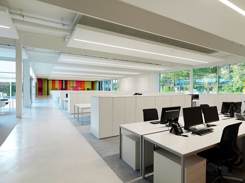
SMALL OFFICE: XAL Competence Center (XALcc) by INNOCAD
Graz, Austria
For this 20,500-square-foot renovation of an aging 1950s warehouse, INNOCAD focused on lighting and acoustics to set a tone and create an ambiance conducive to productivity and innovation. The large, open volume was divided into three zones that preserved the warehouse's industrial quality while turning it into a modern space with daylight. The offices stand out for their openness and light, but also for an unseen quality: peace and quiet. INNOCAD used advanced technology and innovative materials like the sound-absorbing BuzziSkin for acoustic dampening, as well as custom acoustic ceiling panels that incorporate XALcc's own LED lighting.
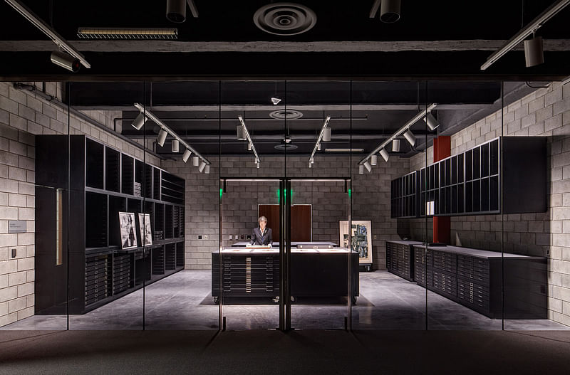
EDUCATION: Cranbrook Art Museum Renovation and Collections Wing by SmithGroupJJR
Bloomfield Hills, Michigan
The Crankbrook Art Museum shows that renovation goes hand in hand with preservation. The design team added 31,000-square-feet of space and made vital upgrades to the existing structure while maintaining the integrity of Eliel Saarinen's original design. The Collections Wing—essentially a storage building for thousands of celebrated artworks—has an added function: that of an active learning center with workshops, a seminar room, and vaults that allow stored pieces to be viewed up close. Although the Saarinen-designed museum systems were updated to put the museum on par with today's cutting-edge facilities, the space survives as a time capsule that allows visitors to experience the museum as Saarinen intended.
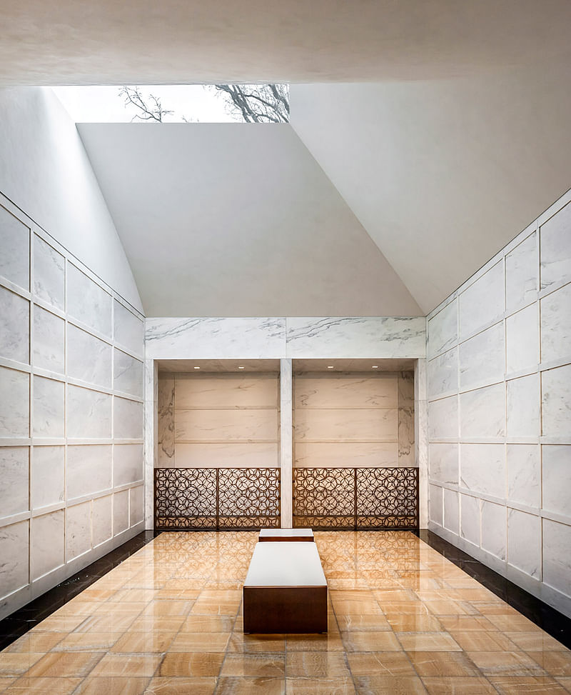
PUBLIC SPACE: Lakewood Cemetery Garden Mausoleum by HGA
Minneapolis, Minnesota
Melding beautifully into the cemetery landscape, the Lakewood Cemetery Garden Mausoleum commemorates life and legacy with contrasting yet subdued textures and circular motifs. To truly create a space for remembrance, the design process was carefully considered and backed with research. Thus, three quarters of the 24,500- square-foot structure was tucked into a hillside, creating a clear connection with nature. Joan Soranno, FAIA, the design principal at HGA, explains, "Many people feel connected to God or a higher being in nature. We wanted to heighten that experience, to create an environment where this transformative experience happens through a close connection between the architecture and nature."
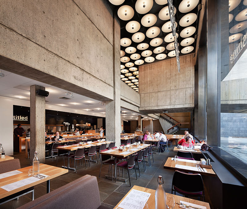
RESTAURANT: Untitled by Rockwell Group
New York, New York
Untitled—the latest addition to New York's Whitney Museum of American Art—is an architecturally flexible café that is remarkable for its ability to transform into a variety of spaces to suit the museum's ever-changing programmatic needs. The 1,500-squarefoot cellar-level space is a modern reinterpretation of the classic New York City diner that subtly blends into Marcel Breur's landmark midcentury modern museum building. To address the museum's flexible programming needs, the designers incorporated neatly stacking chairs, collapsible tables, adjustable light fixtures, and detachable threefoot- high oak pony walls into the space, enabling the entire room to be quickly containerized and hauled away on two or three palettes.
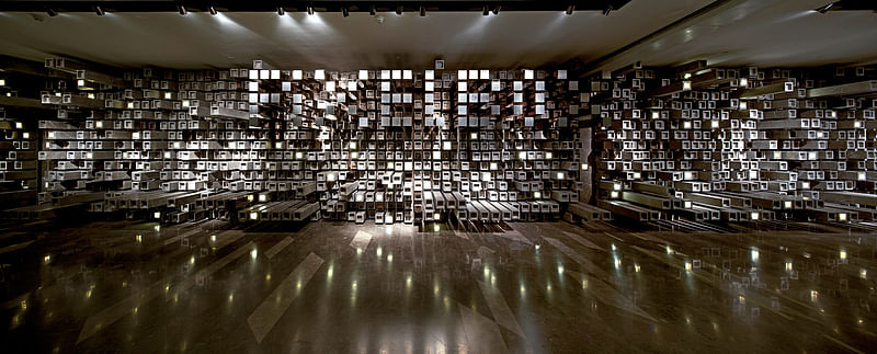
ENTERTAINMENT: Wuhan Pixel Box Cinema by One Plus Partnership
Atlanta, Georgia
For this 95,000-square foot cinema in Wuhan, China, One Plus Partnership selected a single motif—the pixel—and used it as the fundamental element throughout their design, creating the most avant-garde movie house in the city. To create the sensation of moving pixels, the designers used cubic units of different sizes and textures; the box office rotunda space is covered in stainless steel panels that reflect visitors' movements through the hall. The cubical design elements are present everywhere: from the ceiling to the walls and carpets, from the seating to the display units in the bookshop. The plentiful variations and exquisite presentations result in a vivid and playful atmosphere that incorporates form, function, and fantasy.
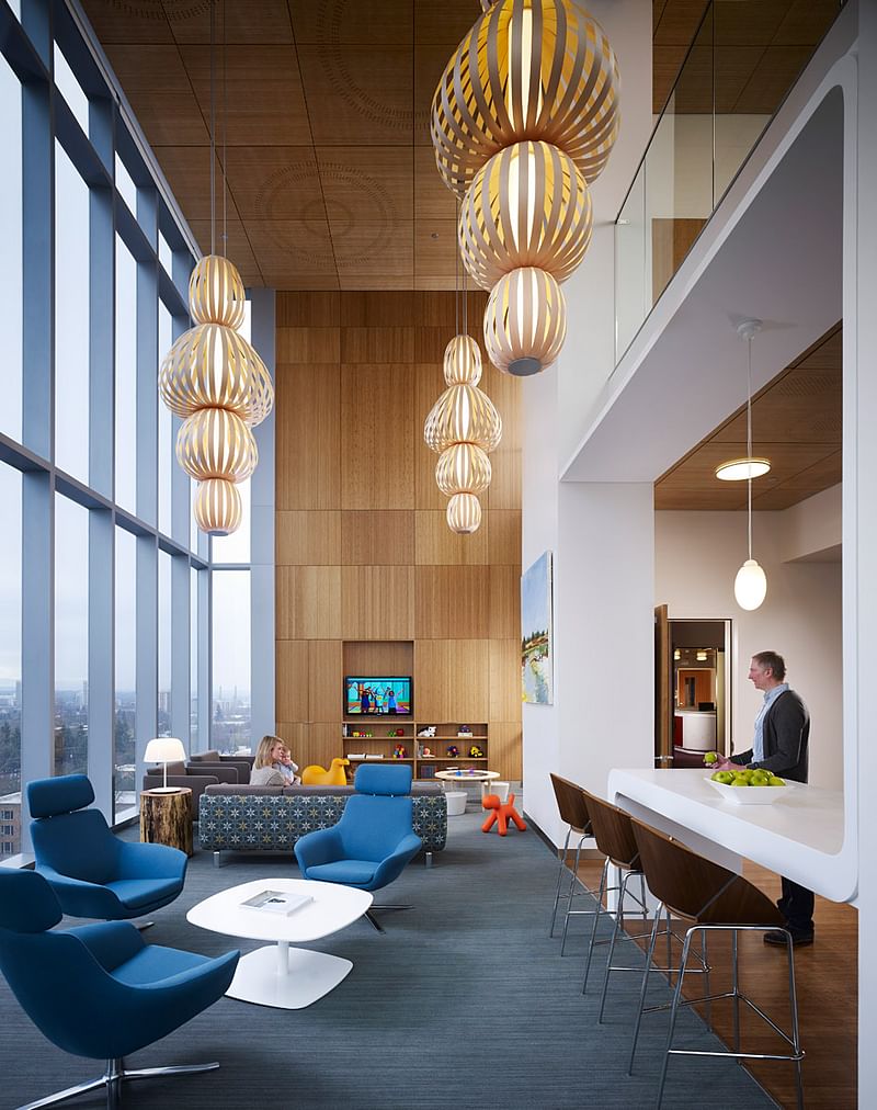
HEALTHCARE: Randall Children’s Hospital by ZGF Architects
Portland, Oregon
When designing this 334,000-square-foot facility that consolidates previously separate healthcare services, ZGF Architects had one goal in mind—to combat the fear and anxiety of patients and their families. Taking cues from the facility's Pacific Northwestern context and hospitality design, the designers incorporated visuals to which children respond positively throughout the complex: curvilinear elements, warm wood furnishings, natural color palettes and imagery found in nature. The designers went above and beyond "to help inspire, soothe, and improve the quality of care and health outcomes" for both patients and their families, adding an abundance of amenity spaces like family lounges, art studios, and exercise spaces.
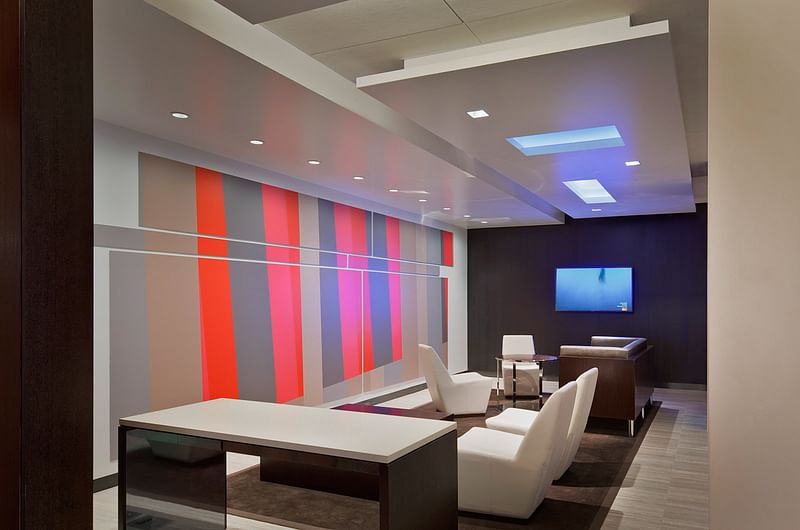
HOTEL: Grand Hyatt New York by Bentel & Bentel Architects/Planners
New York, New York
Over a two-year period, Bentel & Bentel Architects/Planners transformed the public areas in one of New York's busiest hotels into a functional yet sophisticated urban public space, while allowing the hotel to keep its doors open during the renovation. To achieve this feat, the designers went the route of "transformation rather than replacement," largely using existing materials in the lobby and updating them with new colors and finishes. Rethinking the lobby as a public space, the designers opened up the massive 20,000-square-foot space with soaring ceilings and unimpeded sight lines, and added an element that is essential to memorable urban spaces: powerful, oversized artwork.
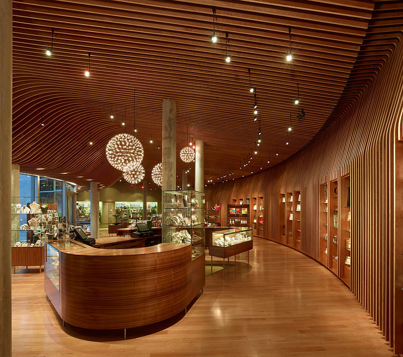
RETAIL: Crystal Bridges Museum of American Art Store by Marlon Blackwell Architect
Bentonville, Arkansas
Functional, tactile, and a clear extension of the Moshe Safdie-designed museum building: this was the challenge presented to Marlon Blackwell Architect for the design of the 3,040-square-foot curved, concrete space that was to become the museum store. The design team drew inspiration from Mark Niehues' unique basket weaving style to provide the space with a character that reflected the regional pride and identity of the Ozark Mountain Range. The standout feature is an undulating ceiling of slatted wood that seamlessly becomes a soffit, and extends onto the back to frame glass display shelves. Blackwell also considered acoustics and merchandise organization to carry the quiet museum feel to the retail space.
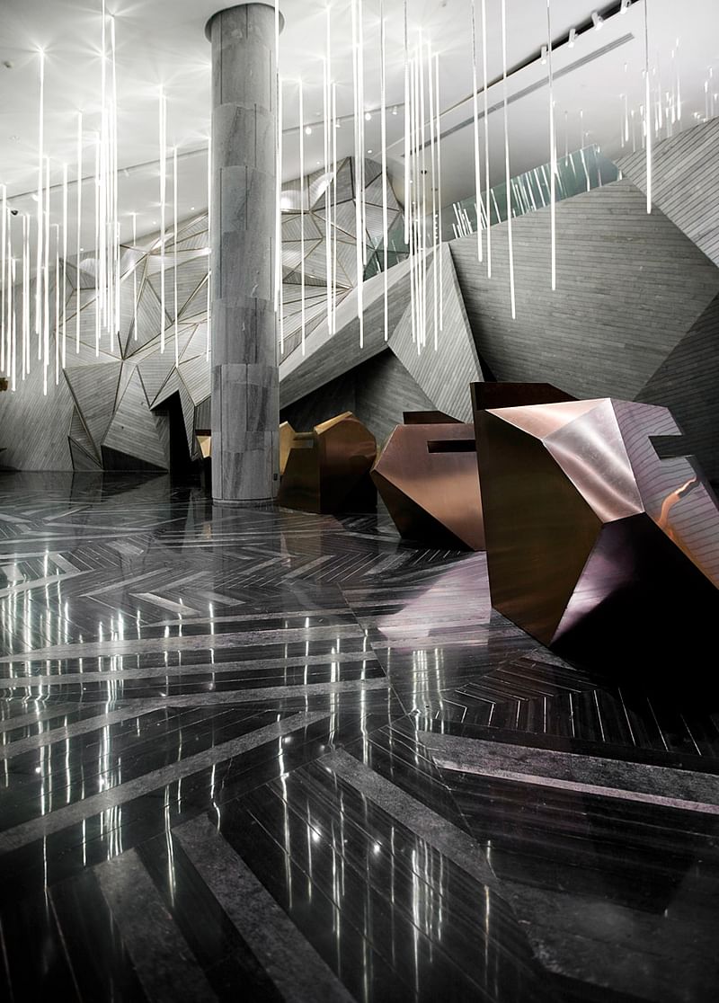
SHOWROOM: Chongqing Mountain and City Sales Office by One Plus Partnership
Chingqing, China
Taking inspiration from the mountain profiles of the Nanshan District, the Chongqing Mountain and City Sales Office reinterprets nature in high chic style. This idea materializes in the interior architecture's terrain of "valleys" and "caves." The 19,375- square-foot, two-level sales office is unlike any other real estate showroom: its various rooms are accessed by journeying through a topography of slanted, triangular masses of grey marble. In the basement level, a composition of suspended slim LED tubes evoke the imagery of rain. This modern and abstract design invites visitors to a stunning conceptual space, leading them through an exciting spatial experience, as if they are wandering through the mountains themselves.
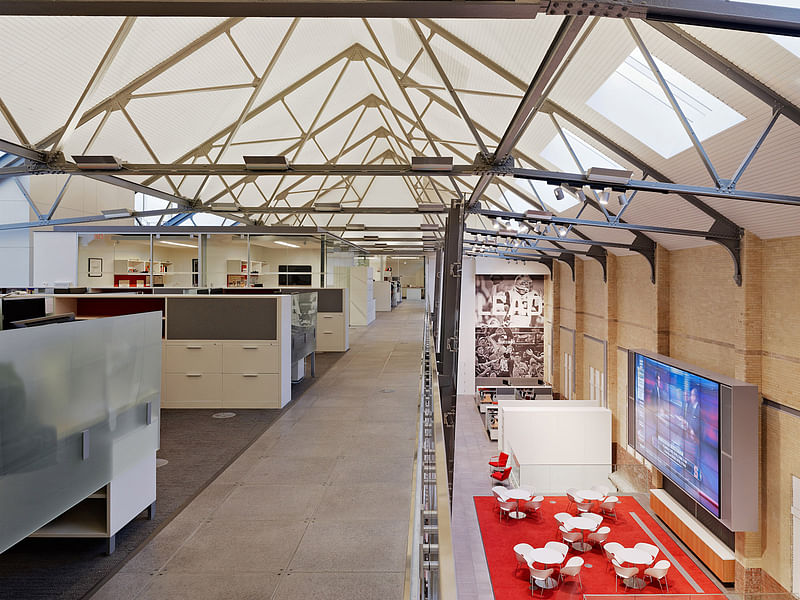
ADAPTIVE REUSE: Confidential Multimedia Entertainment Company by FXFOWLE Architects
New York, New York
FXFOWLE Architects expertly transformed the historic New York armory building from the 1900s into a space where remnants of its past life co-exist with modern design. While restoring the landmark exterior of the armory, the design team gut-renovated the interior spaces, making sure the original architectural details could meld into a hightech, modern environment. Amongst other updates, the renovation added new skylights for natural lighting and two mezzanine floors of open-plan workspaces that add square footage and conceal an air distribution system that contributes to the project's pending LEED® Silver certification.

SUSTAINABLE: 22squared by Gensler
New York, New York
22squared's Atlanta headquarters—originally a dark space with walled-off offices and segregated departments—was at odds with its innovative cross-disciplinary business model. To increase collaboration among workers and departments, Gensler designed spaces that encourage run-ins, replaced walls with glass panels, and coated most of the remaining walls in a writeable finish, so nearly every square foot is a potential work surface. An abundance of natural light, recycled flooring, and reused furnishings contributed to the headquarters' LEED® Gold for Commercial Interiors certification.

STUDENT: Play Lab by Nicole Germano
San Francisco, California
For her Senior Capstone Project at the University of Cincinnati's College of Design, Architecture, Art & Planning, Nicole Germano chose to design a learning environment for children. "As a child, I felt like the learning environment suppressed my imagination," she recalls. Her thesis project, Play Lab, cultivates "controlled chaos" by balancing structured activities within a stimulating and flexible environment. Her design includes soft landscapes; a theatre; a science and technology lab; and an art studio. Germano also incorporated the site's terrace into her design with a glass wall that folds open for access to gardens and outdoor play and learning areas, blurring the line between indoors and outdoors.
Contract Editor in Chief John Czarnecki, Assoc. AIA, also presented the magazine’s two highest honors to individual designers: the 2013 Designer of the Year Award to Los Angeles architect and designer Joey Shimoda, and the 2013 Legend Award to design icon Michael Graves, FAIA.
2013 DESIGNER OF THE YEAR AWARD: Joey Shimoda
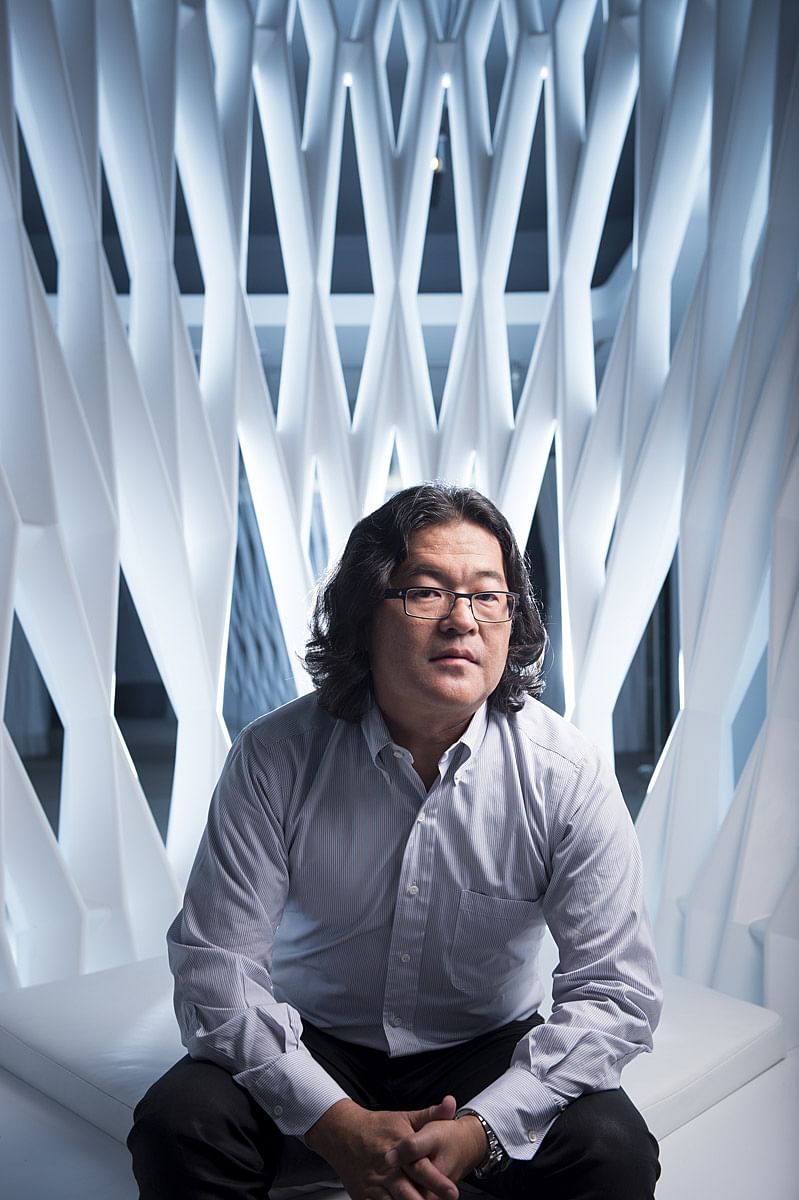
Joey Shimoda was named the 34th Designer of the Year, which is the highest honor that the magazine bestows on a designer who is on a trajectory toward greatness. He established his firm, Shimoda Design Group, in 2000, and his 10-person studio balances several projects at once, ranging from large interior retrofits to ground-up office development. Flexibility and creativity have become hallmarks of his work, earning him a number of dream clients including Steelcase, Mikimoto, Rolex, and MTV Networks. It is for the quality and breadth of his design work, his ability to transform the mundane, his consistently strong client relationships, and the respect he garners in the profession that Contract honors him with a coveted Designer of the Year Award.
“My selection as Designer of the Year came as quite a surprise, and it is absolutely gratifying,” says Shimoda. “The process of making meaningful and beautiful spaces is a fragile and precarious journey. By receiving this honor, I am fortified in believing that all of our effort inspires excellence in design.”
2013 LEGEND AWARD: Michael Graves
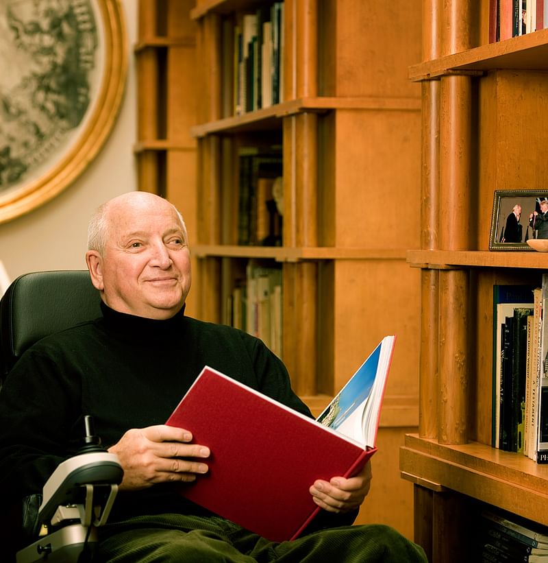
For the 2013 Legend Award – the award program’s highest honor for lifetime achievement – Contract selected Michael Graves, FAIA, for his rich and diverse contributions to the field of design. Since founding Michael Graves and Associates in 1964, Graves has been producing richly colored Beaux Arts-inspired houses, hotels, libraries, museums, and civic buildings both here and abroad, earning him the AIA Gold Medal in 2001. His product design, graphics, and branding studio, Michael Graves Design Group, has also seen prolific success with products such as the famous whistling-bird teapot for Alessi and over 2,000 products for Target. With the 2013 Legend Award, his influential career comes full circle since receiving the Interior Awards’ Designer of the Year Award in 1981.
The 2013 jurors were: Stephen Apking, FAIA, interior design partner, SOM; Dina Griffin, AIA, IIDA, NOMA, president and partner, Interactive Design, Inc.; Nancy Keatinge, president and partner, Felderman Keatinge + Associates; Alan Ricks, cofounder, MASS Design Group; and Margaret Sullivan, director of interior design, H3 Hardy Collaboration Architecture.

Share
0 Comments
Comment as :