UIA competition unveils the winning designs for a twenty-first-century symbol of accessibility
By Josh Niland|
Thursday, May 5, 2022

Related
A winner has been selected in the recently announced competition to create a new international symbol of accessibility, organized by the International Union of Architects (UIA) in collaboration with Rehabilitation International (RI).
Jurors met virtually on April 11th to select the best designs out of a pool of 355 anonymous entries from across the world along lines of graphic quality, symbolism, and communicative effectiveness. A press release from the organization mentioned that they were “impressed by the serious and sensitive consideration toward people living with disabilities,” and that the “abstract, simple, easily replicable and recognizable winning designs suggested a fullness, not absence.”
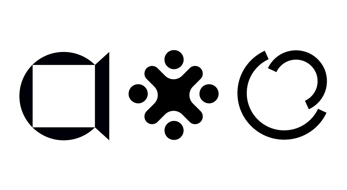
Ukrainian architect Maksym Holovko was the eventual winner. The jury mentioned his design as being “easily recognizable, demonstrating the originality of form while indicating an openness, simply and powerfully conveyed using basic shapes and principles.”
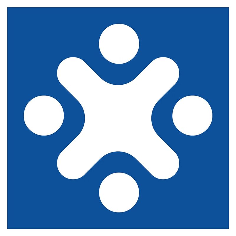
Holovko was followed by German architect and graphic designer Lena Seifert, whose four-way design, the jury says, was “indicative of equality and inclusivity.” A third-place prize was awarded to an entry from Czech student Barbora Tučanová, who created an “enveloping and simple design with some reflection of the original wheelchair symbol.”
Three honorable mention titles were awarded as well. The winning entries will now be submitted to the ISO/TC 145 committee’s Graphical Symbols Work Group for further consideration and implementation. Cash awards totaling $5,000, $2,500, and $1,500 were given to each winner respectively. A $500 award was given to the Honorable Mention entries as well.
Scroll down to see more information about the winners and their design proposals.
FIRST PLACE: Maksym Holovko

Description excerpt: First of all, the new accessible symbol in any case should not show a person. There are a lot of other signs that required to show a person of different age or sex, and it’s became too complicated when you need to show that some object is accessible for example child with disabilities.
During the conversations with people with disabilities, it became clear that no-one really know all the posibble disabilities that people could have. That’s why people are not always clearly understood symbols of different disabilities. Also we will always have the problem to iconized all possible disabilities that people could have. That’s why the sign should not also indicate a concrete disability of a person.
So It is important that new accessible icon will show that the building is available to the needs of all different people at once and not to separate them by their disabilities.
SECOND PLACE: Lena Seifert

Description excerpt: The focus of the new accessibility symbol is the inclusion of all people, independent if they have any restrictions or not. It also symbolizes social cohesion achieved through acceptance of diversity, social relationships, and strong connectedness. Furthermore, not one specific disability is addressed, as likewise to the established symbol. Therefore I aimed to create a symbol that stands for everyone without addressing something specific. Additionally, the symbols should be easy to understand for everyone independently from their culture, language, or nation. For me, it was essential, that everyone around the world can understand and interpret the symbol by just looking at it. The explanation for example in public transport can create uncertainty for everyone and will lead to a symbol that will not be acceptant by everyone around the globe.
The symbol is based on two major components. In the middle of the symbol, I placed the letter „x“. It represents the diversity of all people and their various restrictions. In addition to diversity, however, the letter „x“ at the same time includes the entire crowd. For me, the letter „x“ also stands for diversity independent from gender, ethnic background, and culture. On the outside of the „x“, I placed circles around. Every circle is imaging one person, which symbols in total four people in the image. Visually, the four bodies of the people merge into one „x“. This fusion is representative of social cohesion and trusting relationships with each other. This underlines the strong inclusion background of the symbol. Looking at the individual shapes of the symbol, you can see that the symbol is composed of circles and lines with rounded corners. Since, in contrast to angular elements, a swinging rather than a static effect is created, mobility and agility are thus signaled once again. The circles as a form in itself have neither a beginning nor an end. Therefore, the circle symbolizes infinity, connection, and protection. The outer shape of the symbol forms a square, which stands for strength and security.
THIRD PLACE: Barbora Tučanová

Description: The design of the new accessibility symbol is based on the original wheelchair symbol, so that the same circular section as the wheelchair wheel is used in the design. This slice is then duplicated, reduced, and diagonally mirrored so that these shapes create a bounded space. Its shape and definition can symbolize the internal and external environment. The motif of the circle that is used also refers to the commonality of human society, reciprocity, support, tolerance. Two basically the same, but differently sized shapes in the pictogram show the difference and similarity of each of us. The green color, which is used in the color version of the symbol, is supposed to evoke the peace, life and, above all, the hope that each of us needs in our lives, whether or not he or she is handicapped. The theme of the new international symbol of accessibility was assigned to us as an interesting project for one hour of the Art Design course. Unfortunately, for this reason, none of the people who should be affected by this symbol have been consulted on the proposal.
During the design, I relied mainly on my own experience gained during the study of architecture, which included several workshops on accessibility and design for various groups of disabled people.
HONORABLE MENTIONS


RELATED COMPETITION International Accessibility Symbol Design Competition

RELATED NEWS UIA and UN Habitat unveil finalists for the UIA 2030 Award to showcase sustainability


Share
6 Comments
ChrisDx · May 06, 22 6:57 PM
I'm still mulling this over since none, IMHO, seem to nail it based on message, interpretation, and design.
tancheesing · May 08, 22 10:34 AM
Great effort by all the participants. However, I am more concern about whether these new accessibility symbols ( with different levels of abstraction ) can be identified without difficulty and without the need to de-code the abstraction, especially in the developing countries where not all people are highly educated and intellectualized as people in developed countries.The current accessibility symbol seems to be able to be identified instinctively and easily without the need to de-code. Of course the current accessibility symbol can be improved in terms of inclusivity and aesthetics.
Just my humble opinion with regards to the works of the participants featured here.
cameram70960134 · May 08, 22 7:20 PM
The results has shocked me !
First and third design is very disappointed ! How could they accord the third one if it was considered that the competition were based on create new concept away from wheelchair symbol ! aside from his afield meaning .
The first one for a moment I think it was a camera !
I think they had to revise their chosen about winning designs.
Ramesh Gulatee · May 13, 22 2:53 PM
really...selected symbols do not resonate.
sharontoji · May 13, 22 4:15 PM
Some years ago, I worked extensively with Paul Arthur, well-known authority and designer of pictographic symbols, on this exact project. After some discussion, we too focussed on the open door as the best way to show that the built environment was usable by all. We thought an open door said, "Welcome everyone. Come in, because our facility is open and usable by all, regardless of your physical ability or disability." Sadly, Paul became very ill from cancer and died before we could finalize our choices and get them out to others to evaluate.Perhaps the symbol chosen could use a little tweaking -- I'm not even sure what that would be. I like the circle, because it stands for inclusiveness, without beginning or end. I like that there is not even a hint that could be defined as gender, ethnicity or specific ability or disability. I think it's good that the architecture is symbolized, not the people who might use it or what aids they might use. In order for the symbol to become as well-known as the ISA, we need to start using it, and then eventually include it in our regulations and guidelines.
My comments on the second and third choices: Number two is attractive and easy to remember, but looks a little too much like a figure spread-eagled on the ground, possibly some sort of human sacrifice! And if you do see a human figure there, then you see one who has all four limbs. Those are tiny objections but I still don't think it has demonstrates the universality of the first place symbol, and I think getting away from the person and emphasizing the architecture is best. Number 3 did not make me think of a wheelchair at all, but made me think of an entrance with one of those revolving doors that are so difficult for people like me -- old people, people in wheelchairs or with canes or crutches, people with vision impairments. But if it suggests a wheelchair to others, that disqualifies it also.
I don't think we will ever find a perfect pictogram -- one that will make everyone go "Eureka! We have found it." After all, the ISA was never perfect, either, but it has done its job pretty well for all these years, and is recognized all over the world. The major problem it has is not that it is awkward or doesn't show the many abilities of people who use wheelchairs. That is not its purpose, anyway. The major problem to me, a person who has acquired the disabilities of aging, and someone who has worked extensively helping to make the environment more accessible for those with sensory based disabilities, is that it is led people to believe that once the building has a ramp, and perhaps an accessible restroom stall, it has fulfilled the promise of the ADA to make buildings accessible. We need the new symbol, and I think the winner was the right pick from those I saw.
ChrisDx · May 13, 22 10:06 PM
sharontoji excellent points. The first one is certainly has an architectural drawing feeling to it. Understandably, it was submitted by an architect, to an architectural competition sponsor, and most likely adjudicated by a panel of mostly architects. The “accessible” message with an “open doorway” interpretation is a sound approach. However the design [delineation of shapes, proportions, and relationships] is a bit clumsy.The second was a very graphically pleasing design considering it was submitted by someone with graphic design credentials. The message was “inclusion”, with an interpretation of a gathering of “people". The rotated multi-axial symmetry is always a safe approach for an attractive design. The components and proportions work well viewed up close, but might read as a blob at a distance since its overall shape can be considered circular and there is no readily identifiable anomalous differentiation.
The third definitely misses the mark on message, interpretation, and design.
In short, the first may indeed, IMHO, be the best of the lot. I would say it would be at a concept stage with more work needed in the schematic and development design.
Comment as :